
WordPress heatmap plugins are increasingly popular. It’s much easier to access these data analytics tools from the plugin section, providing a sense of security as they must meet stringent requirements to be listed there.
Our first meeting with website heatmaps significantly increased our conversion rate. But we knew there was still room for improvement, so we created our own heatmap analysis tool, which is more powerful than many other tools today and can now be installed as a WordPress plugin.
We know how to maximize conversions with heatmaps since we work with them day by day. In this article, we will share the best heatmap-oriented tips with you!
Table of Contents
Why start using website heatmaps?
The worst thing about running an online store is when you don’t understand your visitors. Despite investing resources into increasing traffic or conversions, you still struggle to find solutions. A heatmap plugin is the treasure to not experience this again, but this article is the key for that case. The key to understanding this tool and maximizing its positive effects.
Introducing Capturly WordPress Heatmap Plugin
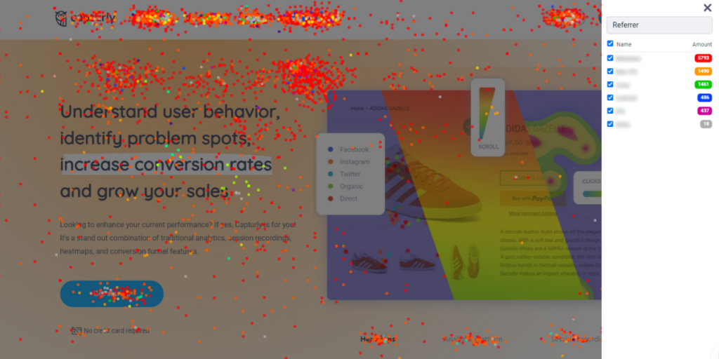
Let’s talk about a few words for our data analytics tool. Capturly Analytics offers you a wide range of data analytics tools including an in-depth heatmap analysis. Besides heatmaps, Capturly Analytics also offers a session recording tool, funnel options, survey functions, JavaScript analysis, and an advanced analytics platform.
In our heatmap section, we provide three distinct heatmap options, one of which is a unique feature in the online data analytics industry. Here, we’ll introduce these.
Capturly’s website heatmap types:
- Click heatmap – It tracks and summarizes user clicks
- Scroll heatmap – It illustrates your visitors’ scrolling behavior on predefined pages
- Segment heatmap – It tracks and summarizes segmented user clicks based on 5 different factors.
- Referrer
- New vs returning visitors
- Operating system
- Browser
- Device type
It’s important to recognize that your visitors are not uniform; they react differently to your site’s features and perceive content differently. Therefore, it’s essential to analyze your visitors individually, or in smaller groups rather than treating them as a homogenous group. The “segment heatmap” feature proves valuable in this regard.

Here are the tips that we will talk about later:
- Improve content relevance and readability
- Introduce A/B testing
- Pinpoint those segments that can lead to your customer’s frustration
- Optimize your site on mobile devices
- Above the fold contents: the real deal
Ask yourself: Are your visitors engaged?
The most obvious reason why your visitors are clearly not engaged on your site comes from: your poor writing skills, rare updates, and the poor overall content that you give to your audience. Outdated, ineffective, and irrelevant content all lead to worse conversion rates.
Why? How do your customers understand why your products are the best, and why they even choose you, if they haven’t really read anything? You need to convince your buyers through marketing campaigns, that’s clear, but one of your main attractions is your website.
Take care of your content quality
It’s the heart of your online business, a very complex tool to present your value proposition and sell your products or services. And here, you need to use the best practices to be highlighted across your competitors. First, you need to acknowledge that your customer’s time is finite. They don’t want 100 pages long books about your product, they want crystal clear reasons why they need to buy this one.
According to research made by Nielsen Norman Group, only 16% of the visitors read content fully out. Word for word. After this very depressing result, they conducted another research. They found out that people read 28% of the whole content on average.
Of course, this is an average number, and you can improve on these statistics a little. For instance, by just acknowledging that visitors do not want to read the most complex blog article ever full of technical terms, rarely used expressions or 12 versions of verb tenses.
Optimize your style for your audience
There is a great way of understanding who is capable of understanding your content. Through a mathematical equation made by Flesch and Kincaid, you can easily predict who can interpret your texts. This formula concludes the number of sentences, syllables, and the total word counts that appear on your content, and after the end of the equation, you get a number between 1 and 100.
A score between 60 and 80 should be easily interpreted by 12 to 15-year-olds, that’s a great target to achieve. The more easy-to-read your contents are, the more people can interpret it, and understand what you want to say to them.
Tips to Maximize Conversions with a WordPress Heatmap Plugin
Connecting heatmaps with conversions – it seems useful, but the route to get there is quite bumping. At first, it may not be crystal clear why this analytics tool is helpful for your daily work, and how you can implement it to reach better numbers, not just in the long run.
If you are in this situation, these tips are created for answering your own questions.
1. Improve content relevance and readability
How can you be sure that your customers struggle with interpreting your content? They won’t tell you that they are not capable of understanding them, right? Well, no the situation is a little bit more complicated.
The fact is, you need to figure this out with other methods instead of asking them about this. And here comes heatmaps to the picture! Capturly’s heatmap WordPress plugin provides you with a scroll heatmap option. We already introduced it to you, but we have yet to speak about its advantages more in-depth. That’s what we will do now!
The more your customers scroll, the more engaged they are. On average there can be a 10% drop in user attention per vertical inch scrolled below the fold according to the statistics. This is what the scroll heatmap can detect. If your drop rate is even more drastic than this average number, you probably need to do something about readability, the quality of the content, or the content relevance itself.
However, we emphasize always that scroll rates can vary based on industries and different content types. Your landing page probably has fewer scrolls than one of your blog articles, and that’s not a problem. You need to look after those pages that really need to be read by your customers.
Key takeaways:
- Scroll heatmap can help you detect how engaged your customers are
- Average scroll rates always depend on the industry your company is in
- It can also vary based on content types
2. Introduce A/B testing
Sometimes you are not sure about an upcoming hard choice. The fact is: you can’t read your customer’s mind out, and that is clearly a good thing. But if we can’t do that, how can we be sure that we don’t make an absolutely horrendous call? We do, yes these are unavoidable. But we can decrease them as low as we can.
A/B testing is one of those activities that can lead you to this positive decrease. A/B testing is a method where you compare two different ideas, and based on your customer’s preferences you introduce the better or the more engaging one at least.
But on an online interface who can you compare to different ideas? It seems like too many resources to ask them about the two possible ideas, and after that conclude their answers. Moreover, it would not show us a natural picture. WordPress heatmap plugins can be the key solution to this problem.
How does the A/B testing work naturally?
- On your landing page, you place a CTA button that throws your customers either the “A”, or “B” version of your idea. It is important that this method should work at random.
- A bunch of customers will use the A, and the B versions, where they will click and scroll a lot.
- After a few days of grabbing every little data about your customer’s behavior at the two sites, you close the research and conclude the results.
Concluding the results makes your heatmap plugin work night to day. Here, you analyze which site concept they scroll more, at which they click the most, and once and all: where they engage more.
After comparing this crucial information, you will decide which one to introduce. A more engaging site will definitely bring you more conversions, and save you a lot of money since you can ensure they like what you have done with their loved site.
Key takeaways:
- Website heatmaps can help you analyze the results of A/B testing
- It’s way quicker than doing this without any non-human help
3. Identify customer frustration points
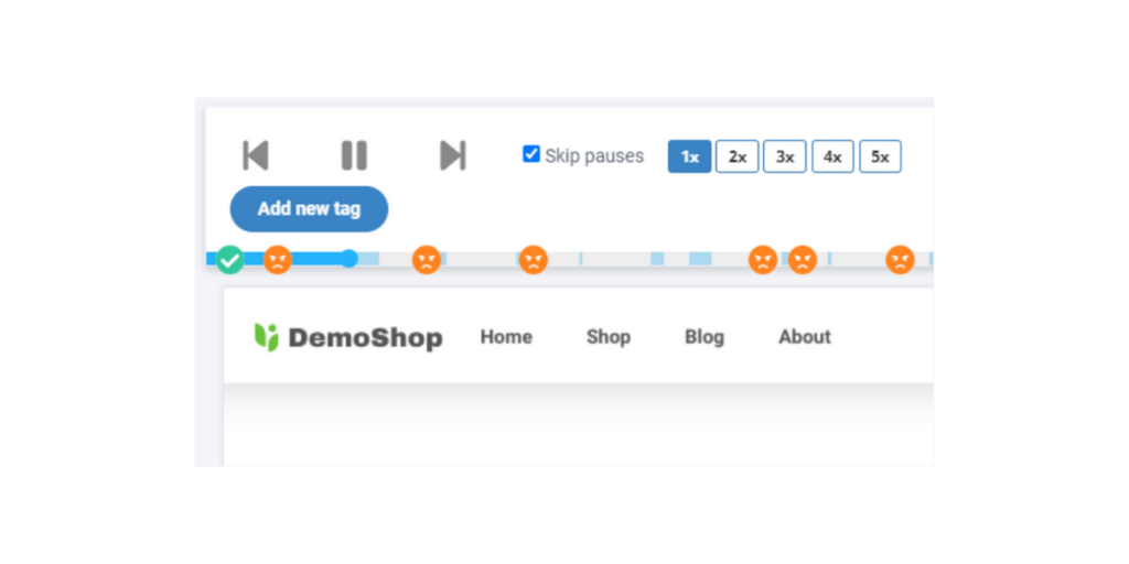
There’s a great feature on session recording analysis, which is one of my personal best. It’s called the “rage click”.
What is the rage click?
Based on Quantum metrics definition: “Rage clicks occur when users click repeatedly on a particular element or certain area of your app or website over a short period of time, usually less than a minute.” For me, it took me 10 minutes to realize that I indicate the same way if I’m mad at one of the non-working features of a website.
This kind of bug is one of the worst. It scares your website visitors forever. But that’s just one thing why you don’t want frustrated customers around your company. Different people have different methods of decreasing frustration, but one of the few is notifying as many people as they can that
“Hey buddy, this website is a complete disaster, do not put your foot on that if you want good for your health!”.
They tell these negative feelings to their friends and relatives, but that is just the beginning. They spread this information across all channels to reach more and more people. The time you understand that something is wrong, you lose half of your clients and possible visitors.
How to deal with rage clicks?
But there’s something I can do right? For once and all: mistakes always occur, humans are not perfect, and do not categorize yourself as a total loser if you spoil something out. The solution to this crucial problem is quick problem-solving. You need to detect the issue as soon as you can and repair it while it’s not too late.
Well, WordPress heatmap can help you in the first half of this solution process. They can pinpoint segments where your customers get stuck or just don’t understand what’s going on. If you experience a high number of clicks in some areas of one of your pages, or subpages, you really need to think of it a little more.
Watch individual sessions, and check exit rates to really be sure about the cause of the given activity. After being sure that we are thinking of a bug, and not simple readability or relevance-type issues, you need to fix the issue as soon as possible. The good thing is, with Capturly’s help you get access to the following:
- A session recording tool
- A Javascript error detector
- An advanced analytics platform
So you can go through this analytics process, without the need of switching to other analytics software. Capturly offers you complete help!
Key takeaways:
- Rage clicks can indicate huge problems, check out the cause
- Mistakes always occur, and fast problem-solving is the key
- Heatmaps can help you detect non-working elements
- Linking heatmaps with session recordings completely reveal the elements, and areas of your customer’s frustration
4. Optimize your site on mobile devices
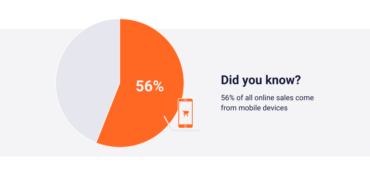
Although you may think it’s just a few percent of your total buyers purchase from your online shop through their mobile phones, that’s not always true. In fact, most of the time it is a lie. According to Outerboxdesign, there are equal percentages of desktop and mobile traffic in an average ECommerce store. Surprising? Clearly not. The very well-said research mentions that 56% of all online sales come from mobile devices.
This data should make you think of watching out for your mobile traffic more significantly. However, most of the time they experience the same customer experience. They can buy the same products, use the same functions, and walk through the same routes to reach conversion. Then, what’s the difference?
Well, their screen displays are not the same size and they can only use their fingers to go forward. These two changes can mean drastic changes: even if your desktop users really like your site, it can be the case that your mobile users don’t really enjoy the same.
But how can you acknowledge that there is a problem? The thing is, it will only affect one-half of my clients statistically, so a simple click heatmap may lead me to wrong conclusions. That’s where Capturly’s segment heatmap function comes into the picture.
With Capturly’s segment heatmap, you can sort between different device types, and pinpoint if your mobile users don’t really enjoy spending much time on your site. In a case like this, you can introduce responsive designs, rebuild your site based on your mobile user’s differences, or remove click-per-cost advertisements for a greater experience.
Key takeaways:
- Believe it or not, mobile users are a real deal
- A simple click heatmap won’t tell you data about a slice of your visitors
- Capturly’s segment heatmap can help you in this by just segmenting on mobile and desktop users.
- Here, you can watch mobile user’s clicks and scrolls eventually
5. Use your above-the-fold content!
Did you notice that you have a greater chance to create an efficient call-to-action button if you place it in an area that the customer can see even without scrolling just a centimeter down?
That’s a good observation, as this is not just a myth! Due to many customers leaving your site without scrolling down on the page (as we already mentioned), you better place your most important information above the fold! But what’s that term mean exactly? The term “above the fold” refers to the content visible on a webpage before scrolling, while “below the fold” refers to content that requires scrolling to access.
To establish an effective above-the-fold content strategy, you need to know what are the key areas that your customers observe in this area. Be aware that the space is limited here, and you can’t increase it, no matter what you do. So you must take advantage of it, the best way you can.
Do you know an online analytics tool that is good for highlighting the hottest areas inside a territory? Yes, I am thinking of WordPress heatmap again! This tool can indicate those areas where visitors clicked the most during different time periods.
Based on these findings you can place your CTA’s on the most viewed parts of your website, to be sure it reaches the number of clicks you always dreamed of!
Key takeaways:
- Your above-the-fold content should be always more powerful than your below-the-fold content
- For this reason, it is crucial to create well-optimized above-the-fold content
- Heatmaps can help you decide what parts should stay on top, and which parts should move to below the fold
Conclusion
In conclusion, a WordPress heatmap plugin proves to be an invaluable tool for various reasons. Whether it’s pinpointing bugs to protect your online brand, analyzing A/B testing results, understanding customer frustrations, or dissecting different sub-groups, the ultimate goal remains the same: improving conversion rates.
I hope you found these tips useful, and understand once and all: website analytics is not a devil-made way to give better service to your customers! Use them as many times as you can!