Improving someone’s webshop to make it more user-friendly is like crafting a welcoming storefront in the bustling digital marketplace. It’s about creating a seamless and enjoyable experience for every visitor. In this article, we’ll show you how you can jazz up your online store and make it super user-friendly.
We’ll discuss optimizing your website for faster loading times and utilizing tools to track user preferences. Additionally, we’ll emphasize the importance of mobile-friendliness, appealing visuals, and secure transactions in creating a seamless and engaging user experience for a successful webshop.
Table of Contents
Use impressive images
Using high-quality images is not just for looks. They can highlight product details, reducing customer purchasing risks. This practice aids in reducing returns stemming from inadequate product understanding.
Moreover, these images elevate brand perception, showcasing dedication and professionalism to users. Furthermore, top-notch visuals contribute to enhanced search engine optimization by attracting more visitors through image searches.
The commitment to quality imagery not only bolsters customer confidence in purchases but also elevates brand reputation, fostering a positive perception and potentially attracting more visitors through improved search visibility.
Optimize loading speed to be more user-friendly
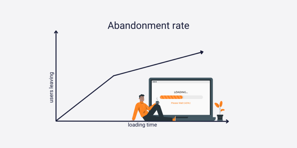
Loading time significantly impacts online buyer behavior, with extended periods correlating to increased website abandonment rates. According to Portent, conversion rates can drop by an average of 0.3 % every passing second as your page loads. Addressing this concern is crucial for retaining user engagement and preventing potential loss of customers.

Upgrade your hosting plan
If your website faces this issue, several viable solutions can correct the problem. Among these solutions, upgrading your hosting plan emerges as the most direct resolution. By investing in improved hosting infrastructure, websites can lessen loading time issues, ensuring faster load speeds and indicating that your website is user-friendly.
Upgrading hosting plans typically involves shifting to higher-performance servers or optimizing server configurations. These measures aim to streamline data delivery, reduce latency, and enhance website performance.
Optimizing loading times through hosting upgrades showcases a commitment to user satisfaction, fostering positive user experiences, and encouraging prolonged engagement with your website.
Optimize your images
If you don’t want to upgrade your plan but still want to become more user-friendly you can opt to reduce image sizes.
Images are one of the main factors that are slowing down your website. You can optimize images by choosing the right file format (generally JPEGs are the preferred ones). You can try to compress your images so there is less data to load in the users’ browser.
When optimizing images, you have to find the fine line between super high-quality pictures and too over-compressed ones since they weaken user experience.
Measure your online store’s performance with analytics
Website analytics is the process of collecting and analyzing data from your website to help you understand better how a user sees your website and with the right tools you can improve the errors.
Monitor your website with Capturly analytics
Capturly, a user behavior analytics tool, significantly enhances the user experience. This platform boasts features like session recordings, heatmaps, and conversion funnels that provide valuable insights for improvements.
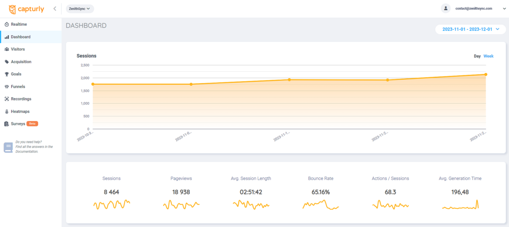
- Heatmaps: play a crucial role by precisely pinpointing optimization areas within a website’s layout, offering a visual representation of user interactions and preferences
- Session recordings: uncover obstacles encountered by users during their browsing sessions, bringing light on specific challenges and usability issues
- Conversion funnels: tools used in identifying drop-off points within the user journey. This feature allows for a detailed analysis of where users abandon processes, enabling website owners to refine layout, content, or functionalities to address these obstacles and improve overall user experience
- Email survey: send out questionnaires sent out to subscribers/customers to gather data directly from them
- JavaScript errors: monitor and analyze problems that have occurred in the coding of your website
Using Capturly helps your business become more user-friendly. Want more tips? Read more about user-friendly websites here.

Make navigation easier on your website
Even if you have taken these steps above, you should focus on how you build your webshop. Easy navigation can make the experience much better, which can lead to more purchases, so keep that in mind when putting together your webshop.
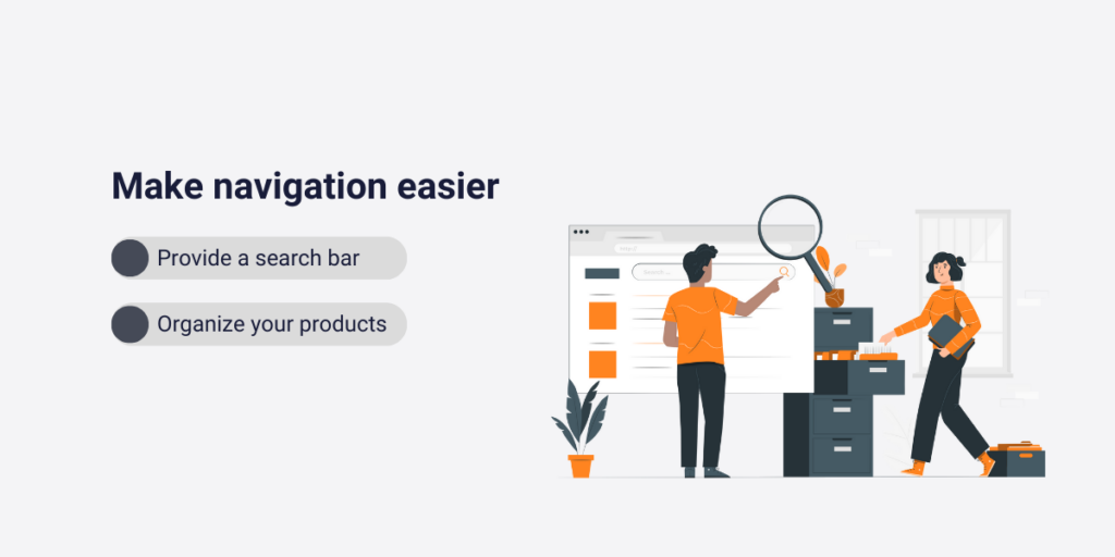
Provide a better search experience with a search bar
Users frequently turn to the search bar when seeking specific items not visible on the main page. This feature acts as a direct way to their desired product, enabling swift access to what they’re searching for.
Using search bars makes navigation efficient for buyers. It streamlines their journey through the website. By using search bars, users can easily navigate the site and swiftly find their desired items. This enhances their shopping experience. It fosters a greater sense of contentment and ease.
Organize your products into categories
Structured categories and organized product displays play a vital role in becoming user-friendly. A carefully arranged website assists users who browse without specific products in mind by guiding them through categories matching their interests. This organization enhances discoverability inside the webshop, prompting users to explore products they might have overlooked initially.
A well-organized interface not only facilitates easier navigation but also encourages users to broaden their exploration, resulting in an enriched shopping experience and increased engagement with a wider array of offerings.
Promotion deals are the way to go
Promotional offers, such as free shipping or bundled deals, and even Black Friday sales play a pivotal role in promoting user and customer loyalty. These tempting offers strengthen the bond with existing customers and attract new ones by offering added value.
Furthermore, they increase excitement and anticipation surrounding your brand. Strategies like flash sales generate immediate interest and consumer engagement. They create a buzz and urgency that prompt swift action.
Applying such promotional tactics elevates brand visibility, stimulates customer engagement, and cultivates a sense of anticipation and loyalty, ultimately contributing to sustained customer satisfaction and continued patronage.
Use reliable payment methods to become more user-friendly
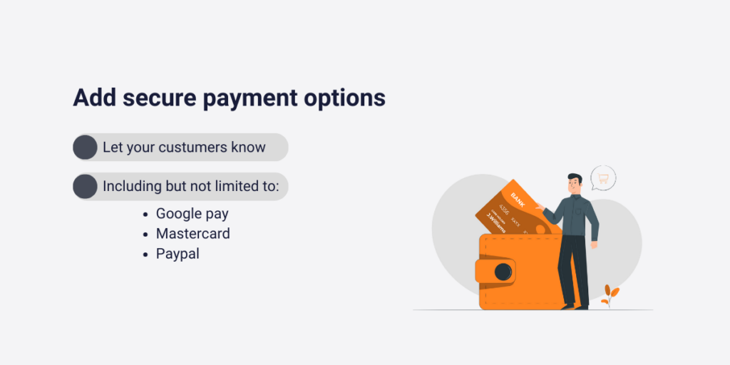
In the days of online shopping, security stands as a main factor influencing purchasing decisions. While integrating secure payment options like:
- Google Pay
- Mastercard
- PayPal
is essential, it’s equally crucial to display these choices.
By prominently showcasing secure payment icons or trust badges on your website, you proactively cultivate a sense of assurance and trust in customers. This visible display not only offers peace to the customers’ minds but also reassures them about the safety of their sensitive financial information.
Ensuring that these secure payment options are seen from the beginning eliminates any initial concerns about the potential theft of their card details, fostering an environment of trust and confidence right from the start of their shopping journey.
Improve your site accessibility and rank better
Webshops are increasingly embracing accessibility. Nothing screams user-friendly like an all-inclusive website. Enhancing inclusivity in your webshop emerges as a beneficial move. This practice not only expands your customer base but also induces customer loyalty.
Implementing inclusive features doesn’t always mean drastic changes; simple additions like descriptive texts for images or video subtitles suffice. This can also help you get a better ranking in SEO. If certain content remains inaccessible, offering alternative options such as varied communication channels or personalized assistance becomes essential.
By prioritizing inclusivity, you create a welcoming environment for a broader audience, fostering loyalty and satisfaction among customers while demonstrating your commitment to accommodating diverse needs and preferences.
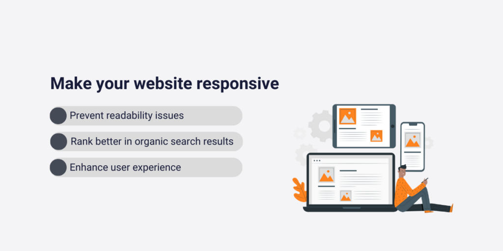
Make your website responsive
Ensuring your website is accessible across all platforms is vital as most users surf the internet via mobile devices. Accessibility on various devices prevents users from encountering issues while navigating your site, avoiding missed information.
Additionally, a mobile-friendly website contributes to improved search engine visibility. This can potentially enhance search rankings. Optimizing your site for mobile use enhances user experience and reduces navigation hiccups. It can potentially increase visibility on search engines. This ultimately benefits both user satisfaction and site performance.
Conclusion
As we wrap up this journey into making your webshop more user-friendly, it’s clear that the key is to make it easy, engaging, and secure for everyone who visits. From getting rid of slow loading times to checking out what tools like Capturly can tell you about your customers, each step counts.
Search bars and organized categories make it easy for shoppers to find what they want, even if they’re not sure what they’re after at first. Exciting deals and top-notch security features elevate the experience, building trust and excitement in your brand.
Keep in mind that ensuring mobile compatibility and inclusivity significantly impacts user experience. Additionally, employing high-quality imagery isn’t merely aesthetic; it serves as an effective tool for displaying your products and cultivating trust among your clientele.
By making these changes, your webshop becomes more than just a place to shop. It turns into a hangout spot where users enjoy coming back, building a loyal base of customers who love what you offer. Therefore, continue enhancing your webshop, allowing your business to boom within the digital marketplace.

Don't forget, sharing is caring! :)

