![How to create an effective homepage? [2024 Guide]](https://capturly.com/blog/wp-content/uploads/2024/03/How-to-create-an-effective-homepage-2024-Guide.png)
Imagine your site as one of the books of the world’s largest bookstores. In this case, it contains 200 million books – according to Forbes data, this is exactly how many websites are currently available. However, your book is about gardening. Although there are just 500 thousand rival books left, the market is narrow, as this genre only interests 5 million people all over the world.
In this case, will every gardening book become a bestseller? No, not at all! Maybe 50 from the 500 thousand. A quarter of the book’s revenues will cover the costs and if they are lucky enough they can earn some extra money, and the rest will lose. Well, there are some good strategies on how your company can be highlighted amongst the others, but in this article, we will only dive into one part: the covers of the books. But in this case, this cover is clickable, can play down videos, and lead the interested people to your products.
So, can you translate this metaphor to the world of online businesses? Your web page is your book, and you want your book to be read by your visitors. But there are a lot of competitors to hijack these limited numbers of people.
Your homepage is one of your most effective factors to convince these potential readers. In this article, we help you create your magnificent homepage which leads you to the way of becoming a “best seller”.
Table of Contents
How to build a homepage?
First, we should define exactly what the homepage is. The homepage is what most of your visitors see when arriving at your site. It is a misconception that all of your visitors see this at first glance, as they can also arrive from social media, email, or any other call-to-actions, which can directly land the visitors on other parts of your site.
However, by just clicking somewhere at the top of your web page (your logo, your name, or other subtitles) visitors will jump into your homepage. Also, if the visitor refreshes your site, or goes to one of your sub-pages and goes back, the visitor will face directly with your homepage. So the homepage is an entrance hall, you always go straightforward in it, even if sometimes you don’t notice this activity.
But this homepage can be so much better than a simple “in and out” page. This invisible, and irrelevant page can be turned into one of your main strengths. You only need to learn its basic structure, combined with some great tips to be highlighted amongst your competitors.
How can we establish an effective homepage?
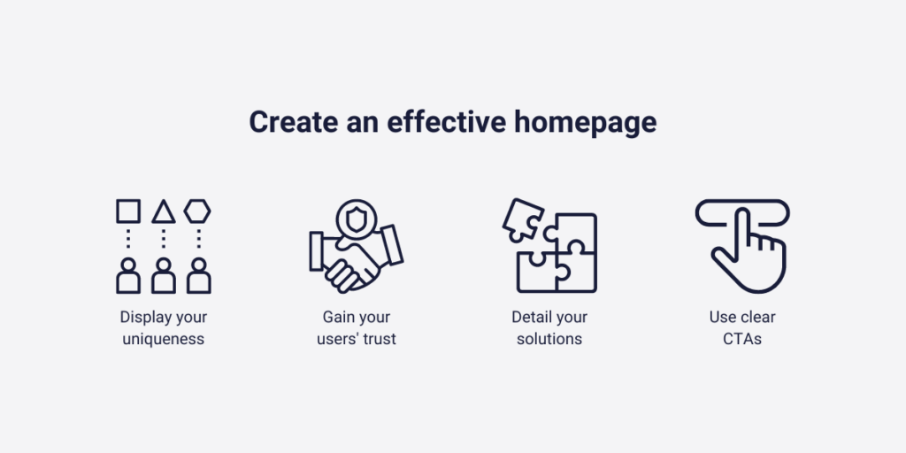
Until this time, I only mentioned one aspect of what are the main functions of having a homepage. The truth is, there are some more, and the biggest challenge is to pass these four criteria at the same time, with high efficiency.
These are:
- Highlighting why you are unique – it displays on your unique logo, engaging headline, and all parts of your homepage elements. The fact is, you need to emphasize it in every inch of your homepage
- Emphasize that the visitor is in the right place with the right solution – it usually appears on the sub-heading
- Ensure on the homepage that you can understand your visitor problem, and you can fix it, quicker, cheaper, or more precisely than your competitors – This requires longer content to explain why your products are the best for some reasons and illustrate it with understandable examples. That’s why it usually fits into the below-the-fold content of your effective homepage
- Give them an explanation of where to go next – well-established CTA-s that make their customer journey easy
It seems quite hard to combine these four criteria into one little homepage, right? Well, it may seem a little tricky, but it is not brain surgery, you can cool down.
What is the hero section?
All of these four criteria should be included on the hero section of your effective homepage. Hero section is the overall name of those elements of a homepage which I will mention later.
Outside of these four criteria that you should display in your hero section, there are at least two other requirements that you will see its benefits later.
- Grab attention to not let your visitors exit your site without reaching conversion.
- Visually demonstrate your value proposition, so use some graphical elements (pictures, and videos) to convince your potential buyers.
If you obey our following tips about the must-have elements of a homepage, you clearly can’t get into trouble. The next parts exist to accomplish the mentioned four criteria, and outside this you only need a big box of creativity.
What are the parts of an effective homepage?
In this part, I try to lead you step by step to make a simple, but expressive homepage that satisfies all your needs. However, you don’t need to go from one extreme to the other, learn that.
Show your values, but don’t write a novel. Be creative, but be brave to stick with the old methods as well. Ensure CTA-s, but do not want to restrict your visitors from discovering your whole site. Usually either end of the scale is losing: so rather be in the middle!

Logo and a navigation system
At an effective homepage, the top of the screen contains two different elements: a logo, and a menu bar.
Let’s start with the first. The logo is what you represent. There are certain books about how to build up an effective logo that represents your brand. These books can write up to 500 pages just about this topic! Organizations spend up to millions of dollars just to create new logos that more effectively represent their values. Is it worth that much?
Although I suggest that you shouldn’t spend millions of dollars for creating a perfect logo on the first try, it is a crucial aspect of your brand, and your homepage indeed.
Many people think the logo is the company. It introduces your core values, vision, and mission, and helps to distinguish your brand from the other in the head of the customers. Without the logo, you are just one from the others. Even on your homepage.
Next, move onto the menu bar, and a well-established navigation system that helps the visitors find what he is looking for quickly. It always appears on the top-left side of the screen, and the pages, and sub-pages need to be sorted in a logical order to ensure the visitors understand what button navigates them to the desired place and to discover your site more precisely.
Headline
If you start a homepage from scratch one of the first few things includes creating a headline. The headline is the most important aspect of creating an effective homepage. Why? This will be the first thing your potential customer discovers after reaching your site, and the first impression has the biggest effect.
One time David Ogilvy, a well-known businessman from the 20. century said according to Databox: “On the average, five times more people read the headlines than the body copy.”
Basically, a few words can decide about the effectiveness of your homepage. Some of you may say it’s not fair but think of it on another side: a little creativity can win you more customers. Of course, these creative instincts are coming from your own products, and the industry you are in, so unfortunately we can’t help working these out.
But there are some formal requirements you should also take care of, for instance:
- Stay between 6 to 12 words, but the general comment is: “The less the better”
- Use colors and other fonts to emphasize your sentence
And here are some of our advice:
- Focus on your target audiences, and target them with your headline
- Write numbers, reach them through their emotions, and emphasize your unique selling point
- Answer as many questions as you can
Sub-headline
A secondary headline exists to emphasize your offer and convince your customers in a few more words than your headline.
A sub-headline also has some requirements that you need to obey to reach the maximum effect!
This means:
- You must place it directly under the headline
- It must contain between 10 to 30 words
- It means you try to focus on creating a sub-headline which is twice as long as your headline
If there’s a hook inside your headline, you need to unpack it here. We will show you this through an example!
In this example, you are selling energy drinks, and you are thinking of creating your own website. You understand that to create an effective homepage, you both need an engaging headline and a sub-headline.
You chose this headline: “Providing power during the struggle” – it focuses on the university students, who sleep less than the recommended numbers, and learn all day long. Although I highlighted this explanation here, this belongs to the sub-headline part. But in a different way, with fewer words, and more curiosity.
So your sub-headline must be something like this: “Powering your path to success with our revitalizing energy drinks” – With this sub-headline your potential customers understand what you are selling, but still need to find more information.
- How do your energy drinks power your path?
- How do these drinks give you power during the hard times?
These potential questions help stimulate your visitor’s minds to read more about these products. They will probably scroll down on your site, and try to scan for more information. However, that’s not always true. Sometimes you need to show them something way more engaging!
Supporting image or video
Something graphical, which ensures that your potential clients not only imagine your products, since in that case, it may be less convincing. You need to demonstrate its functionality and lookalike! And is there a better way than a visual representation of your product? I don’t think so!
However, as always you need to follow some rules to ensure the maximum effect:
- It should represent your own product, not someone else’s (it could have a negative effect in that case)
- If it is a video try to reduce its length for at least 30 seconds. You can’t maintain attention for too long
- It must stimulate your audience to take action now, but try to reach this activity without referring to it too often
Don’t forget either: going to the other side of the horse can also create negative feelings. Don’t overdose with supporting images, create just a few convincing ones.
Primary CTA
CTA-s (abbreviation from the word “call-to-action”) are commonly referred to as special links that stimulate the visitor to subscribe, try, or buy something on a webpage.
Basically, it’s a shortened route for reaching a conversion. For instance, on an average site adding a product to a cart needs 4 different clicks. Also, they need to scroll down a little to sort between your products. This activity is too slow in our fast-paced world, we need quicker solutions. Primary CTA-s provide you with that!
With an instant click the potential buyer arrives at the end of the conversion funnel, and with one quick step, the visitor can go through it as well. A primary call-to-action should be something general to ensure your visitors know where, and why they click on that. Don’t write something special, or a good joke that relates to your company, since most of them haven’t got a clue about your company, your vision, or your mission.
Companies commonly use these types of primary CTA-s:
- “FREE TRIAL”
- “BUY NOW”
- “GET STARTED”
Why are these effective? Because even the first-time visitors know what these mean! These primary CTA-s usually take a place in the upper-right corner of your effective homepage.
Secondary CTA
You can never have enough CTA-s, that’s why – when you want to establish an effective homepage – you need to place at least one more call-to-action. It’s called the secondary CTA. The real reason for having another special link is quite understandable: you need to reach those who haven’t seen or haven’t been affected by your first attempt.
It’s also way better to demonstrate through an example:
Imagine that you are selling books, and creating a webpage to reach more buyers.
In this case, your primary CTA can be something like this: “ORDER NOW”
But is it possible that some part of the visitors don’t want to buy books right now, even if they are interested in your industry? Yes, totally! You need to focus on them in another way! For example, if you get their email address, you can notify them for later purchases, when they are finally able to buy products from you.
So the secondary CTA can be: “BE THE FIRST TO KNOW OUR NEXT SALES”
A secondary CTA is less prominent than the first, but as it usually takes place at the end of your hero section (we mentioned this in the third chapter), sometimes it’s more highlighted and easier to detect. Also, a secondary CTA can be more company-specific, since this time your visitors already read something about your company or your product.

How do online analytics tools help you with that?
In this article, you already found out what elements you should use when you want to create a homepage. But the thing is, how do you know that these mixed elements end up creating an effective one?
Even if you follow all of our instructions, each industry has different characteristics. It may come from the different demographic, and financial factors your potential customers are in, the different devices they use, or the ratio of your first, and second-time visitors. These are all matters when you not only want to create a simple homepage, instead, you want to create an effective one.
Then how do I gain information about my visitors’ characteristics, their behavior, and my site’s potential effectiveness? – You may ask! That’s where online analytics tools come into the picture! These tools are created for one single reason: to help you know your visitors better, and give you insights about their behavior on your site.
What is Capturly Analytics?
One of the most in-depth online analytics tools is called Capturly Analytics. Capturly not only uses one single technique to track the visitor’s movements on your site, or to understand their comments connected to your site. We offer you many different features, such as:
- Heatmap options – to know where your visitors click and scroll, and to understand the difference between target audiences and segments
- Session recording option – to watch individual sessions and understand personal inquiries
- Conversion funnel analysis – to analyze the success of your available funnels
- Survey function – to make conclusions from questionnaires
- Event analytics function – to conclude the most crucial information for your help
These will all help you on your journey to create an effective homepage that not only you and your colleagues, but your customers also like.
Do you want to compare two different designs to determine what you will introduce? With Capturly’s heatmap functions you can create A/B testing, where you can gain information about your customer’s preferences between the two options.
Or do you want better conversion rates, and you are not happy with your CTA’s performance? Capturly’s conversion funnel analysis, heatmap options, and individual session recording all help you detect and fix the problems.
Conclusion
It is not an easy job to create a brand-new homepage. It requires a lot of creativity, some web design skills, and one of the most important: acknowledging and following the rules, which website developers have been working out in the last decades.
An effective homepage is nothing without preparation. After you decide what website creator software you will use, and pick a template that you like, the hardest challenge comes afterward. Filling your homepage with life. That’s what we can’t do for you. However, the whole frame is given, you just need to paint the perfect art inside it.
Create logos, headlines, and CTA-s using our suggestions, and tailor them to your visitor’s specific needs. Learn this: an effective homepage is nothing without understanding your visitors, but understanding your visitors can be hard without using online data analytics software continuously.