Psychology and economics were always connected with each other, maybe just humans didn’t know anything about this. Yes, because up to the 20th century, there was no research on the connection between these two areas. People worked in these two parts of life separately, and maybe if they had observations, and clues about a possible connection, they did not want to explore this whole new area of life.
In the first half of the 20th century, – mainly because of Pareto – psychology and economics came one step closer to each other, but there was still room for improvement. Later, Kahneman and Tversky made famous publications about behavioral economics, which not only led them to the Economics Nobel Prize but also stimulated other researchers to learn more about the connection between these two areas of life.
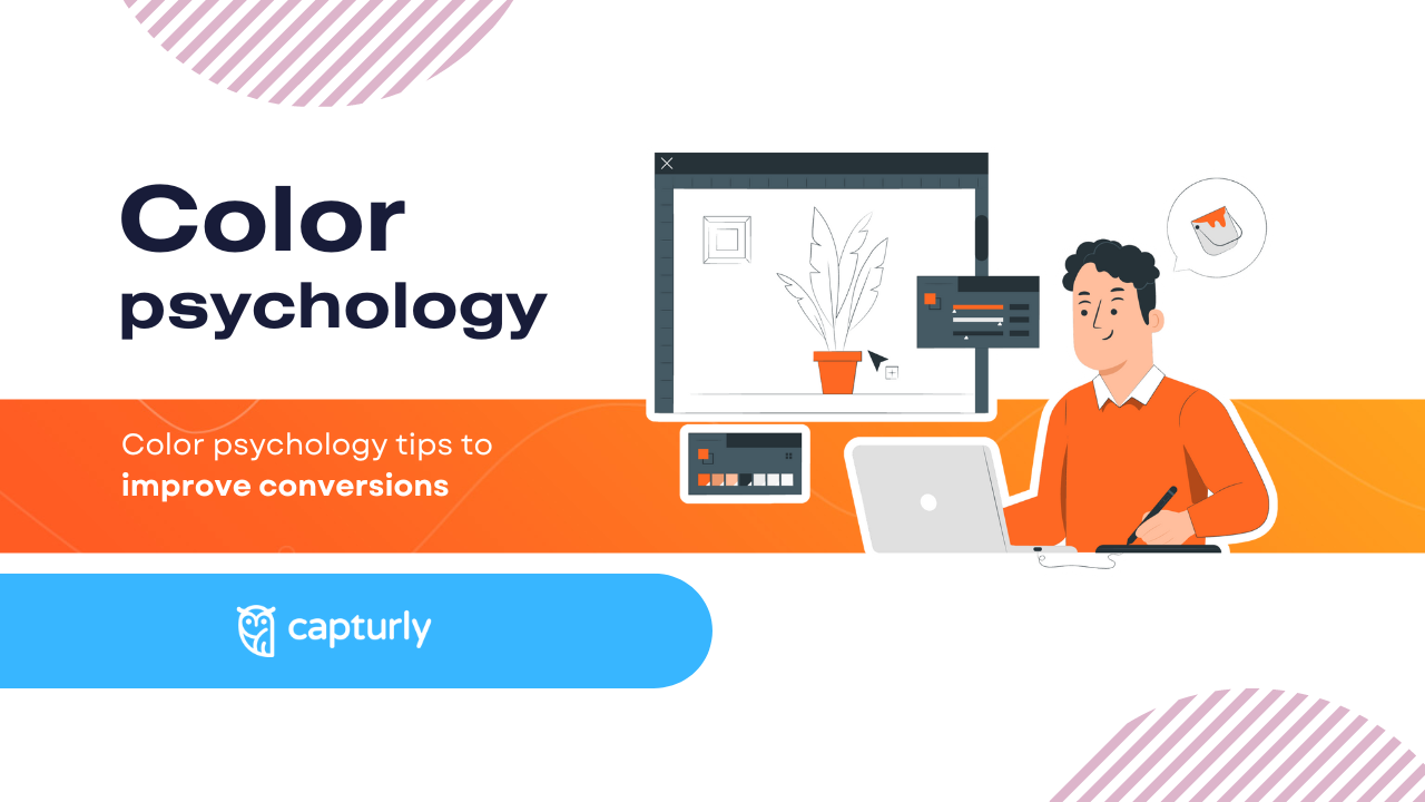
Nowadays, to economics, psychology is the nearest science, and businesses spend millions of dollars yearly to stimulate their buyers’ minds, and convince them to buy more and more products. In this article, we will discuss one aspect, or factor where these two sciences meet with each other: color psychology, and its influence on conversion rates.
We deeply recommend you to read this article from the start to the bottom, as you will see each color’s meaning, tips on choosing the best colors for your website, and real-life examples of how a well-established color, or the combination of more than one colors enhanced websites visibility, or improved their conversions.
What does each color mean?
In this part of the article we will meet with the regular colors, and their generally known meanings!
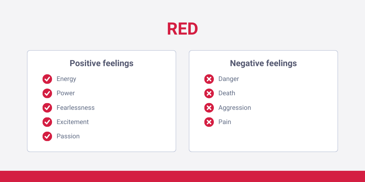
Red
Red is a very interesting color, as it stands for expressing many different emotions. It rarely gets combined with other colors, in that way it seems odd and strange.
Positive feelings
Red can express:
- energy
- power
- fearlessness
- excitement
- passion
These emotions usually give a sense of urgency to the possible buyers that you can take advantage of.
When a call-to-action pops up on a website, it usually gets displayed in a red rectangle. Even if the user doesn’t want to buy anything, sensing the emotions delivered by the color gives a higher chance that the potential buyer will resonate with the message.
Negative feelings
Red can also express negative feelings, like:
- danger
- death
- aggression
- pain
These can all be associated with this color.
In a horror-themed streaming platform, potential customers even want to feel these emotions, but that’s just one sub-group. Most people want to avoid it, but it seems a hard choice!
How to be sure that you pick the red color for the background of your site so that potential customers sense the positive feeling of this color, instead of the negative ones? The answer is, you need to find the right context. For example, if your website design contains funny elements, red will awaken positive feelings in the customers’ brains.
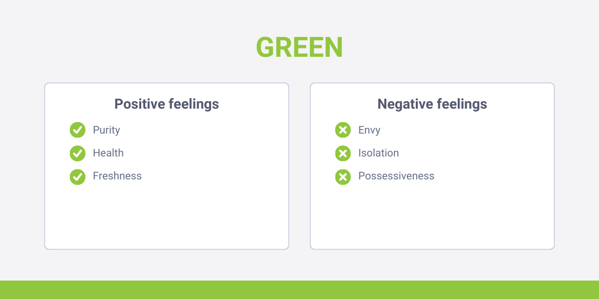
Green
Green is one of the most popular colors in this decade! It’s because this color can foster people to create a positive, “green” environment around them which has an important role when brands want to do something to prevent a possible unturnable global warming.
Positive feelings
However, nature has separate other positive connotations that brands tend to use, just as:
- purity
- health
- freshness
Although these emotions are not useful for too many companies (maybe health organizations), people tend to connect these emotions with other, secondary ones that can be inserted into brands’ values more efficiently.
Productivity and growth are both associated with the green color, businesses that categorize themself as “innovative ones” pick this color from time to time. Also, unlike red, green is great to combine with other ones.
Negative feelings
In terms of green, negative aspects rarely step to the middle of the stage. Of course, if we want to find negative connotations in all our hearts, it is possible: green can be connected with an envious person, and it can evoke a sense of isolation, but possessiveness and greed are two other negative characteristics that the color of green can emphasize.
However, these are possibly true for darker greens. Light green rarely causes negative feelings in the buyers’ minds.
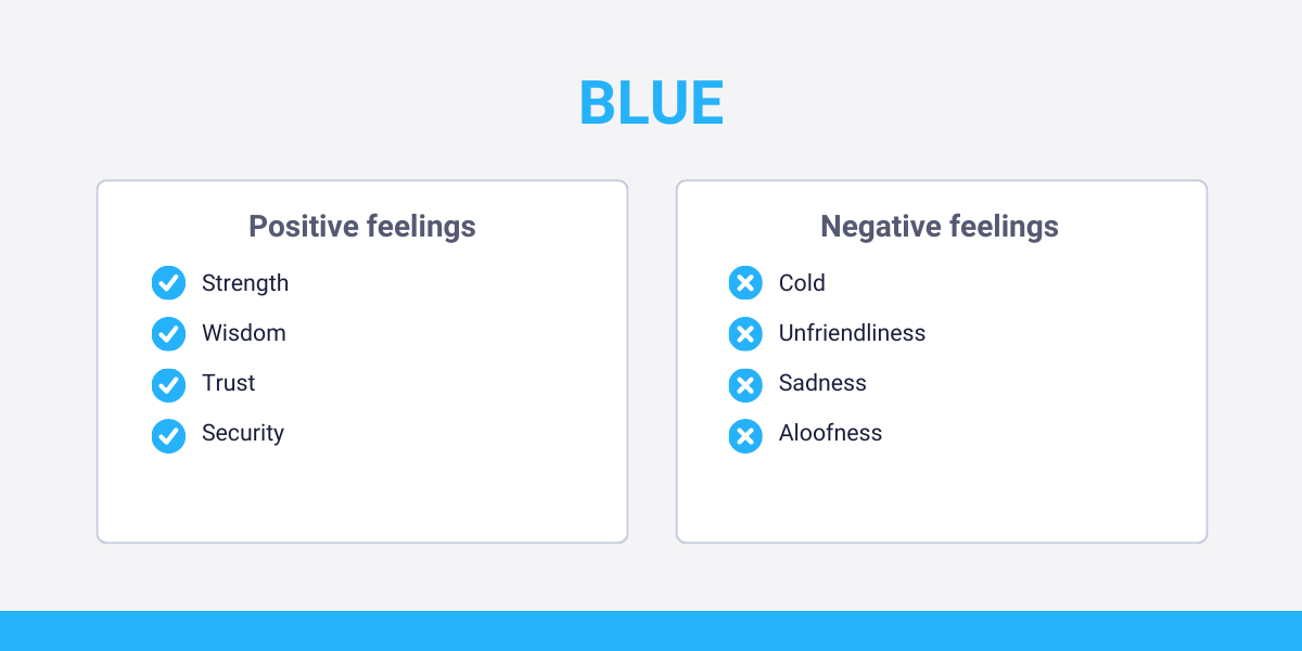
Blue
Based on research that measured ten countries’ color preferences, it turned out that the most popular color on the planet is blue. The research showed that 57% of all men, and 35% of all women categorize blue as their best color.
Positive feelings
First, examine the positive aspects of this color’s psychology. Blue bring up feelings, like:
- strength
- wisdom
- trust
- security
Companies that work with, or store their clients’ data usually use blue as their main color to emphasize their security. With the help of this, the client will be less worried about its decision, and accept how the site handles the data.
Negative feelings
Blue is also less likely to be categorized as a color that represents many negative feelings, but there are some.
Blue’s negative connotations are:
- cold
- unfriendliness
- sadness
- aloofness
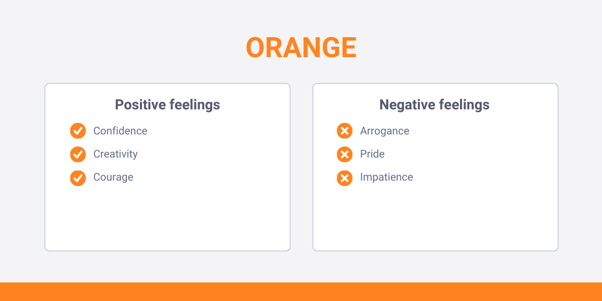
Orange
According to some sources, orange is the least likable color of all. It is even strange if we think of the dozens of companies, and other organizations that use this color from day to day.
Positive feelings
The most positive thing that orange can mean to the customer is the word “fun”. Almost all of the orange’s positive meanings originally came from this connotation. Positive feelings are:
- confidence
- creativity
- courage
Also, there is one more symbol here: orange is the color of the sun. That means that all characteristics that humans use for the sun (hot, warm, bright) also appear on their minds when the orange color comes into the picture.
Negative feelings
Orange is often used to describe something negative, so you need to fully measure how your target audience resonates with this color first. The negative connotations of orange include:
- arrogance
- pride
- impatience
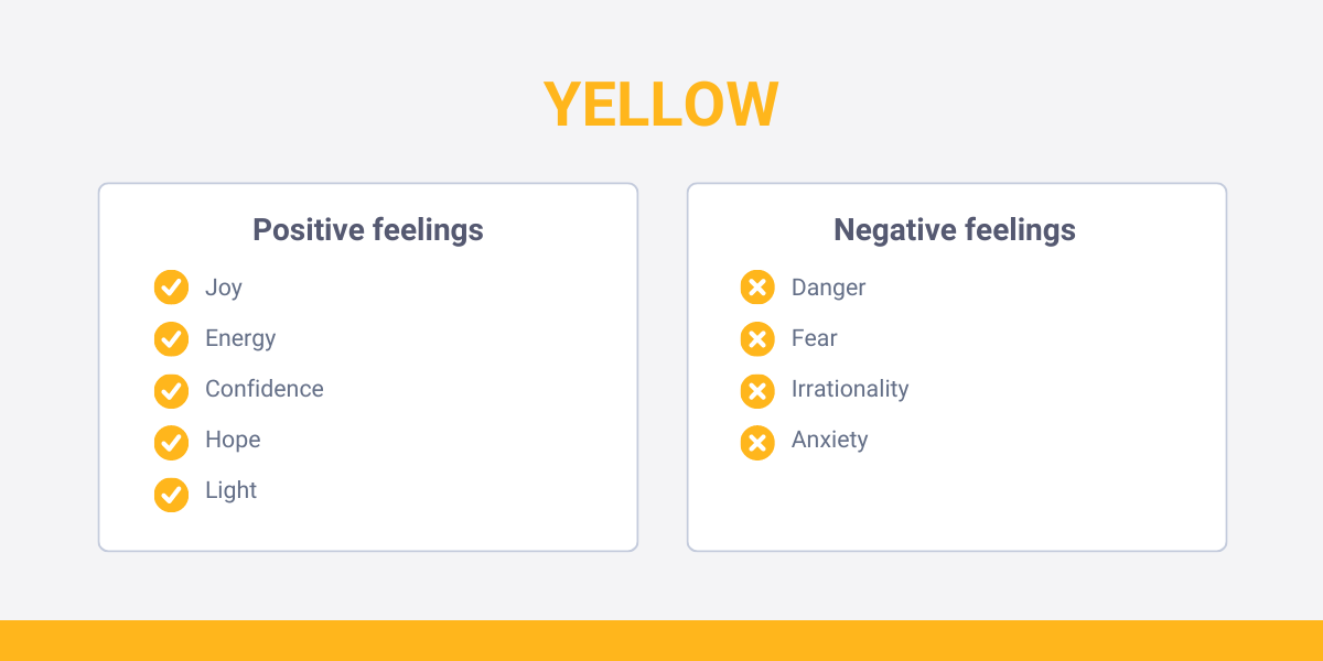
Yellow
Yellow is also not the most popular color, but using it as a mix with other colors is so much more accepted.
Positive feelings
Although yellow is attention-grabbing (think of the highlighters), it is also difficult to read by just its own. But that’s just one of yellows’ strength, it can emphasize:
- joy
- energy
- confidence
- hope
- light (the symbol of the sun is displayed here as well)
Negative feelings
Yellow has been the main color of jealousy for hundreds of years from now. It appears in many paintings, or this symbol can be found in many poems. However, there are some other negative aspects of yellow:
- danger
- fear
- irrationality
- anxiety
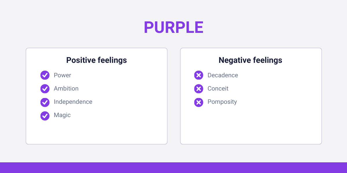
Purple
This color has the biggest difference between the percentage of males and females who claim purple as their favorite color. According to a questionnaire, 23% of female respondents’ favorite color is purple, while 0% of males claimed the same. That being said, use purple as a main color if your target audience is mostly a female group.
Positive feelings
Purple is always connected to luxury. It’s not a coincidence: many valuable minerals are purple, just like Quartz, Tanzanite, or Amethyst. Royal families and political leaders tend to use this color to emphasize their wealth, so almost all the positive characteristics of purple come from that origin.
It can emphasize:
- power
- ambition
- independence
- magic
Negative feelings
What we mentioned about the positive parts, can be easily twisted to the negative aspects. While royal families were lighting power to their protected nation, they still had some negative characteristics that the purple color still holds, just as:
- decadence
- conceit
- pomposity
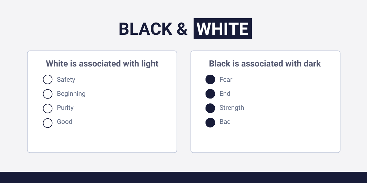
Black and white
We should meet with the color psychology of these two colors at the same time, as their meaning is the exact opposite of each other in many cases.
Positive and negative feelings
One of the most popular colors amongst businesses because of its plain, clean, and elegant look. But alongside that:
- White is associated with light – black is associated with dark
- safety – fear
- beginning – end
- purity – strength
- good – bad
Now that we successfully discovered the most important colors and their possible meanings, we should take a look at our tips, which help you to take advantage of color psychology at its finest!
Color psychology tips to improve conversions
In this part of the article, we will meet with some tips on how you can improve conversions with colors!
Tip 1: Know your target audience!
When we discovered the colors and their different meanings, we mentioned that sometimes different groups of people have different relationships with the given color.
A good example of that is the black color. An English gentleman may think that black is the color of elegance, but in a different culture, it is more likely to indicate death and suffering. Our perception of inserting meanings into colors depends on many different things:
- Cultural difference – yes, color psychology influences us from the beginning. The exact place, country, or region we grow up has different connotations than other regions. White may indicate purity in Western countries, but in some Eastern cultures, it is usually associated with grief.
- Psychological aspects – our mental state is also a differentiator factor in how we look at different colors. Just think of it: if we are sad, and disappointed we may look at red as a negative color that shows aggression and anger.
- Social influence – it means that trends, and norms can also change how we think of different colors.
- Personal experiences – the ones that businesses can’t do anything. However, it only affects one person at a time, so this won’t influence your company’s success.
However, almost everything can influence our relations with colors. Our language, age, environmental factors, etc. Your task is to discover your potential buyers, create buyer personas, and decide which color satisfies their needs the most.
But how to discover them?
Well, yes: usually it’s easier to say “Hey, you need to find out who you are selling to”, rather than actually doing it. Where to start? The thing is, there are numerous ways of getting information about your buyers, even if you have no previous data or previous concepts about the characteristics of your possible buyers. And even if you made target groups beforehand; how can you be sure that the exact group resonates with your messages the most efficiently that you wanted to target?
That’s one of the reasons why online behavioral analytics exist! These tools can discover qualitative data from your website’s visitors, just like: where they go, what they want, how long they stay, and what makes them more impulsive. If you are aware of this data, fix the mistakes, and create your site how your target audience wants, it will easily improve customer satisfaction, and after all: increase your revenue!With Capturly Analytics, you can not only discover what individual users do on the site, (although, it is also useful in different scenarios) but you can analyze your target audiences overall. That’s what heatmap is all about: showing your website’ busiest points with shades of red and blue. Capturly offers 3 different heatmaps, click, scroll, and segment heatmap.
In color psychology, scroll heatmap can be the most useful. Scroll heatmap shows how long customers scroll down on a webpage. The more satisfied they are with the content, the CTA-s, or the actual atmosphere your site creates, the more they will scroll down, and engage.
If your website’s scroll rate is low, and you filter the success of all other elements, you can be suspicious about your site’s color(s). Maybe it’s a barrier to reading the actual content (too powerful compared to the letters, or you use similar colors in both), or they just can’t resonate with it. In this case, creating an A/B test, with the old and the new color can help to decide whether this is your core problem, or you need to discover other potential problems.
But what exactly does an A/B test look like? Our second tip will walk around this topic!
Tip 2: Create an A/B test
An A/B test is a great way to test two different versions of your site. In this case, the two sites’ one and only difference will be their colors, or color combinations. Everything else remains consistent (in economy they use the term “ceteris paribus” to that)! That’s crucial because if you change something else, you won’t know which factor causes the difference in their success.
After you create the two sites, one with the old color, and the other with the new, you start to lead the audience to both. This is not computer science, you don’t have to worry: after the visitor clicks on your website, or one of your advertisements, the user randomly gets dropped to one of your sites.
In this step, it is important to connect a website analytics tool to both sites to track, and later compare their success. Capturly Analytics completely covers this problem, as it can track data from more than one site simultaneously. Unfortunately, there are no exact numbers about how long you need to do an A/B testing, and how much traffic you should make at both sites. These depend on the complexity of the test, your website’s average traffic, or the desired level of accuracy. However, under 500 visitors, you can’t get statistically efficient scores.
After you have finished your A/B testing, you can finally evaluate the results. If you find out that the new color has better results than the old one; you should use that later on.
Tip 3: Stay consistent!
Your logo is red and white, the theme color of your website is blue, and your billboard advertisement uses a combination of black and yellow. Can it work? Most of the time, no!
Staying consistent is one aspect of building trust with your potential buyers. According to Geralt Zaltman, 95% of the purchases happen subconsciously. That means in a possible buying decision buyers rather think emotionally than completely rationally.
It’s not just about the price, it’s about the brand, the values, and your business goals! Even if you are the cheapest option in town, if there is 10% that you can’t deliver the ordered product at the right time, customers may look for other options.
Of course, using the same colors won’t increase the trust around your brand just separately. You need to mix this with other options, like delivering promises, demonstrating social proof, or emphasizing your ethical standards. In this case, consistent use of colors can show professionalism and knowledge, two factors that lead to increased trust in the potential buyers’ minds.
Tip 4: Use other colors in small elements!
Some businesses think that if they find the right colors that resonate with their target audiences, they need to stick with them all the time. Actually, that’s an extremely false statement. Every human being loves something new, something they haven’t seen from you before. To demonstrate this in a deeper manner, let’s see an example!
They prefer using the combination of white and black on their website. The symbol of a clean, but strong, and independent image is a well-created color synergy for a clothes-selling business. However, as we move forward in the buying process, they use other colors to highlight the most important parts. Watch:
The words “Just in” are written in the color combination of red and orange. It can refer to excitement, or impatience (a negative connotation, still it can be used on several occasions) to motivate the potential buyer to order the chosen product, as it can easily get out of stock.
This is what color psychology is exactly! Small, almost unsensible changes, can still lead you to extremely increased conversion!
Conclusion
In this article, you got to know all the crucial information about different colors’ connotations, and the different meanings the most popular colors have. Later on, we introduced you to some tips in connection with color psychology. If you implement these tips correctly, and acknowledge the real power of colors in terms of marketing, brands, and websites, you will be one step ahead of your competitors.
And as the competition gets bigger and bigger, you can’t do anything else than use everything to improve your conversions. Even using colors correctly!