Every ecommerce business dreams of having a consistently high conversion rate. But the reality is, 7 out of every 10 visitors leave the checkout page without buying anything. This is a serious point of frustration for many store owners: how do you push more of those visitors to click that all-important “buy” button?
There are in fact several ways you can optimize the checkout experience to guarantee more conversions and more customers. And think about it: even a tiny increase of 1% in conversion rate can mean hundreds or thousands more dollars per month.
Here are our top tips.
Table of Contents
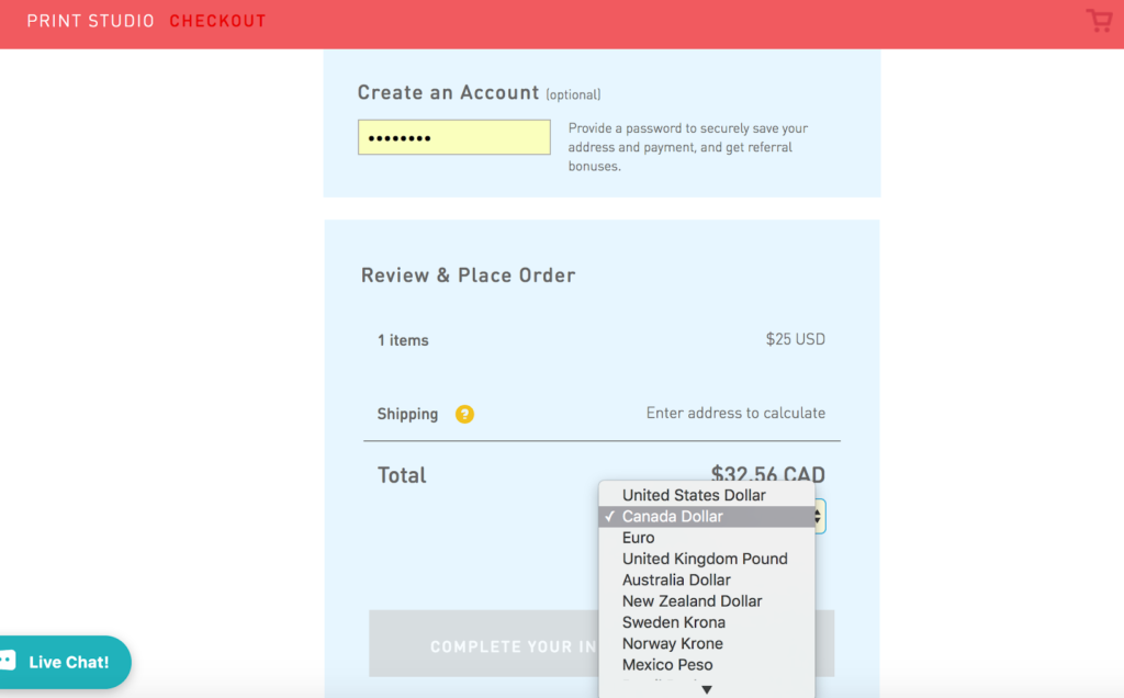
1. Offer Prices in Local Currencies
Selling online is a cross-border affair these days. Your business might be based in the US, but you might have customers from China, Australia, the Middle East, and every other corner of the world.

The thing is, people like familiarity when they’re making a purchase. They also like to know exactly how much they’re spending, and that can be tricky when prices are presented in a currency they’re not used to.
There’s a very simple fix to this. Simply provide the price in the currency of the buyer’s home country , and you’ll hopefully put them at ease enough to make a purchase.
2. Don’t Make Shoppers Register
Consumers are savvier than ever and are more hesitant to hand over their contact details. This means that online stores where registration is mandatory in order to make a purchase are often doing themselves a disservice. For one retailer, removing the mandatory requirement to sign up and log in increased their revenue by a massive $300 million. Another study found that around 30% of shoppers abandoned the checkout process when they were asked to sign up.
Instead of forcing potential customers to create an account, offer a guest checkout option which will help them whizz through the process. If you do want to grab customer email addresses, put the registration process after the checkout stage. For example, you might create a user account automatically for each customer when they buy and send their login information to their email along with their order receipt.Alternatively, you can encourage customers to sign up on the “Thank You” page, once they’ve made their purchase. At this point, they will have given you all the information you need and will just have to choose a password for their account.
This takes a huge amount of steps out of the buying process – and, the less steps there are, the less opportunity there is for a potential buyer to abandon their cart.
3. Free Shipping and Free Returns
Everybody likes free things, right? And, for online stores, free shipping brings in customers like honey does for bees. In one Forrester study, results showed that 61% of customers preferred to buy from online stores that offer free shipping.
This is a no-brainer, right? If we’ve already paid for a product, we hardly want to pay more just to get it delivered to us. But, of course, it costs to ship things, so from your end, you need to charge extra otherwise you’ll affect your bottom line.
There is a solution, though. If you can’t offer completely free shipping, consider adjusting your product prices to include shipping so that you can confidently present shipping as free.
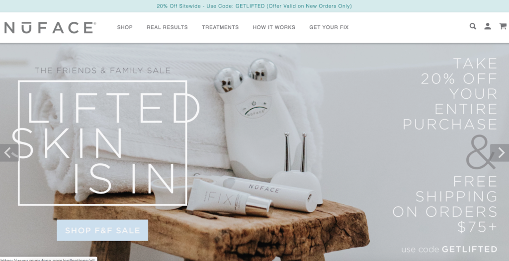
For NuFace, an online shop selling skin care products, adding a simple “free shipping on orders above $75” banner on their homepage increased orders by 90%. Not only does the prospect of free shipping entice potential buyers, but they’re also more inclined to spend more so they reach that $75 where they qualify for free shipping – it’s a win-win situation.

The same goes for returns. Buying online comes with its pitfalls, including not being able to see what a product looks like in real life. By offering free returns for customers that aren’t happy, you’re going to increase the chance of them buying in the first place.
4. Mobile-Friendly Design
More and more consumers are using their phones to make purchases. In fact, mobile is now the preferred method of shopping online for an ever-increasing number of people. This is because they can do it on the go, with many comparing prices online while actively in-store.
Focusing on this particular part of the ecommerce world should be a top priority if it isn’t already.

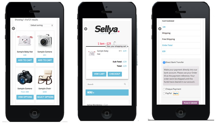
First and foremost, your store should be mobile friendly in every way. That means it should be responsive to all different kinds of mobile devices , and present information clearly and in a way that can easily be read from a small screen.
For a super mobile-friendly experience, you can also try:
- Incorporating larger, tappable buttons
- Align forms vertically so that navigation is easier
- Remove any menus that distract from the form
- Reduce the number of images to make sure the form loads as quickly as possible
Making it easy for people to buy on their mobile devices means you’re going to attract more shoppers, particularly those that only use their phone to carry out daily activities.
More Conversions Means More Customers
The bottom line is this: a smooth checkout process is a successful one .
Improving the checkout experience for your customers will make it stand out and ensure they keep coming back for more. With more purchases being made online than ever before, even optimizing the checkout process in a minor way can make a huge difference. Essentially, it can mean the difference between hundreds or even thousands more dollars a month.
Most of the optimization tweaks we’ve mentioned here are simple to carry out. They basically put the customer’s needs first and tackle any objections they might have to making a purchase from you online. From discarding registration before purchase to adapting your checkout experience for mobile devices, every little helps when it comes to increasing your online conversions.
Don't forget, sharing is caring! :)


6 Comments
Lauren Rodriguez
2023-06-15 at 14:06I have read your blog on user-friendly checkout process is important on eCommerce site.It was very interesting and helpful but I can add some extra points in your article. Here some extra points:
1.Remove distractions from your checkout page.
2.Use a progress indicator bar if you have a multi-step checkout process.
3.Make sure the design is modern and clean.
4.Offer a guest checkout as the default option.
5.Include cross-selling and upselling.
These are some extra points to add to your article. Readers if you are confused about your web and App development , you can get a free consultation at Alakmalak technologies.Visit our site for more information.
Abigail Brown
2023-06-27 at 14:08Hello, you have mentioned methods for optimizing the checkout process for eCommerce store. Good information with proper explanation. If you allow I would also like to add some of the other information that you need to take care of while designing a website, check out them below:
Simplify forms and provide clear instructions.
Offer guest checkout option.
Use progress indicators.
Optimize for mobile devices.
Provide multiple payment options.
Display trust signals for security.
Show total cost upfront.
Enable persistent cart feature.
These were some points for optimizing the checkout process for eCommerce store. I want to suggest you hire a website design company like Alakmalak Technologies if you are non-technical because they are a website design company that can help you in designing the best website according to your business.