For those of you who are too busy to read the whole article, we have made a little summary of the numbers in connection with Tep, before and after their optimization process with Capturly.
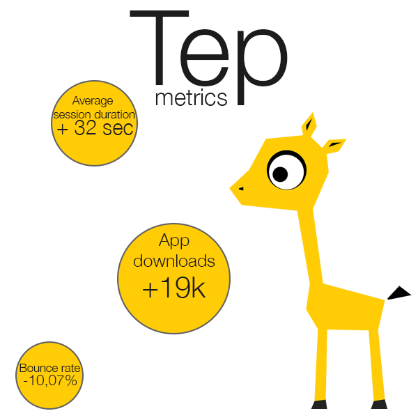
After the alternations, these are the new numbers. The session duration became 3 times longer on average (which is a huge deal, because this is not a complex webshop). The bounce rate became smaller and most importantly the downloads increased with almost 20000 in a single month.
Without Capturly, we wouldn’t have been able to implement those changes according to the needs of our users. Capturly has helped us to improve our metrics easily and effectively. We own a huge thank you for you, guys! — Akos, CEO of Tep
Page load time
Problem: The visitor recording made it clear that people were very impatient, most of them left the site before anything actually happening.
Solution: They have implemented a nice splash page until the site is fully loaded. This is a nice solution without much stuff to be developed. The simple logo with basically no background is perfect for this purpose.

Header not interesting enough
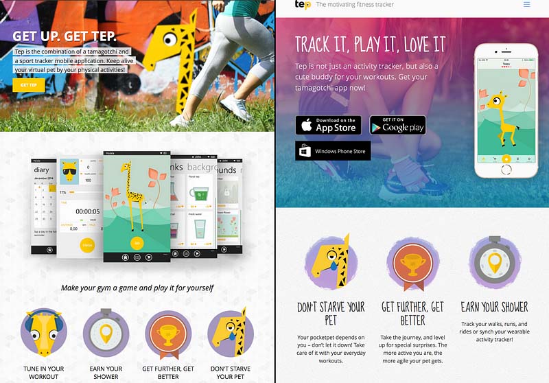
Problem: As you can see it on the left side of the the picture, the previous version was much more different from the current one.
Solution: Creating a more straightforward header with an almost completely different design, making it easier for the visitors to become users.
The current version is much more lean and easier for your eyes to scan.
The CTAs and the background have a nice contrast.
You can see the app in motion without having to do anything.
The new pitch and summary are more interpretive and playful.
CTA not clear enough
Problem: With the button simply saying ‘Get it’ didn’t turn out to be specific enough. Clicking on the button took the user to the middle section of the page, where he had to choose the given store.
Solution: Placing the 3 CTA right on the header made it easier for the visitors to download the app. They also left the older CTAs in the bottom section.

Previous version of the CTA

New version of the CTAs
Not giving enough information
Problem: On the previous website, most of the users had the screenshots of the app displayed below the fold.
Solution: Displaying the app in the header gives the users a clear picture about what to expect from the app itself. With the users being lazy and impatient, this is a good solution for their problems.
The app not being desirable enough
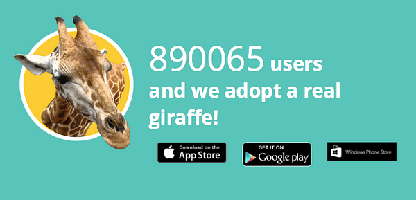
Problem: Adopting a real giraffe is a huge thing from Tep, but with this, people can get the feeling that the app is not as popular as it seems. They start calculating and speculating and this never means good.
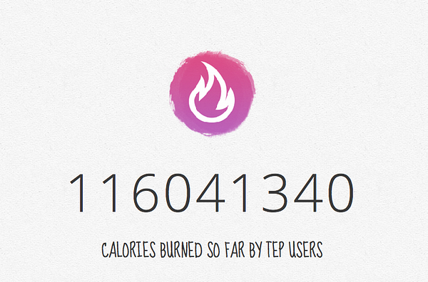
Solution: By telling the users the number of calories people have burned, they create a positive feeling. A big and positive number always creates a good feeling in people, and they want to become part of it more than before.
Providing too much information
Problem: The previous website tried to give too much information all at once. Screenshots, badges with information etc. Sometimes less is more.
Solution: Instead of giving too much information to the users at once, the new layout became less cluttered. They inserted a new video for those users who are interested enough to take a look at it.

Conclusion
Having seen the success story of Tep, we can all agree that those minor alternations lead to a huge improvement. With a traditional analytic software, they might not have realized these problems and their underlying causes.
Do you want to achieve success?
Start optimizing your website for free today.
Don't forget, sharing is caring! :)

1 Comment
materi kuliah it
2017-11-24 at 05:41Nice answer back in return of this question with firm arguments and explainin thhe whole thing regarding
that.
daftar sekolah dinas