The subject of the following case study is Rackhost Ltd., a Hungarian domain and web hosting registrar. Learn how to increase conversion rate, and how to reduce cart abandonment with a few simple modifications for a fully optimized website. Before we get into any optimization process, it’s important to know how to use CRO. How long does it take in CRO to see results?
Keep on reading to get answers to all your questions, and learn more about how Rackhost increased its conversion rate by 15%.
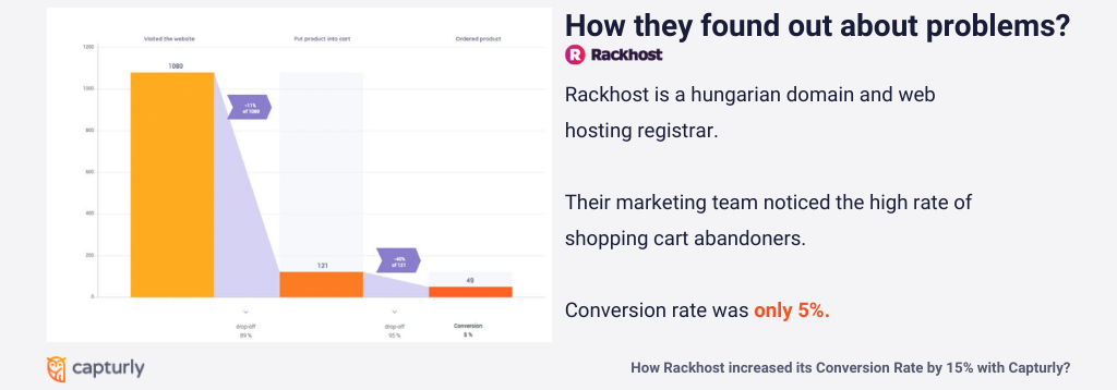
Behind the company, there is a great team of people who do the development, and a visionary marketing team with cost-effective management.
So you might ask where’s the problem?
Problem #1 – Checkout Page
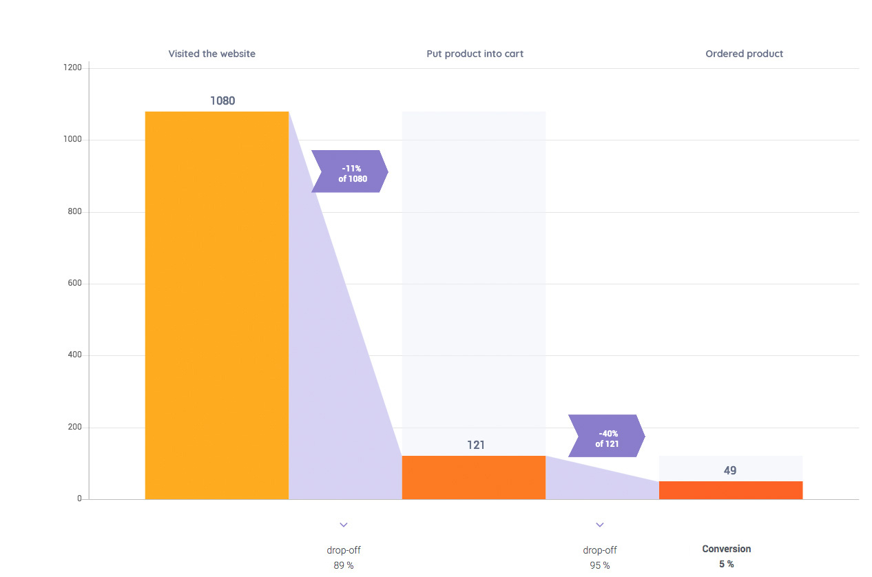
It all began when someone from the marketing team noticed significant drops on their checkout page. The high rate of shopping cart abandonment is every online business owner’s worst nightmare.
The solution
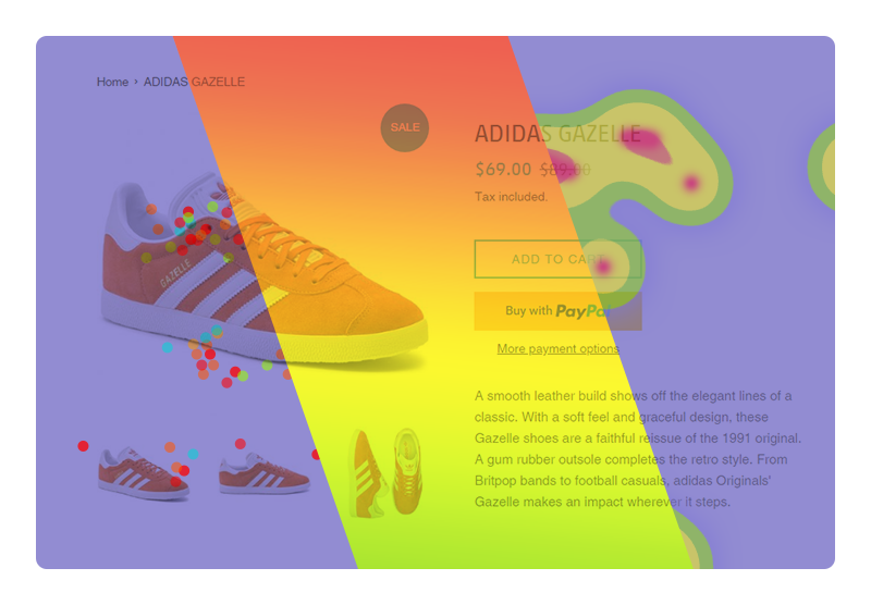
The team decided to optimize their website with Capturly’s heatmaps to get to the bottom of the problem. Heatmapping is a data visualization technique that tracks mouse movements like clicks and scrolls on the screen then highlights the most popular areas. Usually, warm-toned shades indicate higher user engagement.
During the conversion rate optimization process, they used three types of heatmaps: click heatmap, segment heatmap, and scroll heatmap.
Click heatmaps
Click heatmaps show you the exact link positions in an aggregated way. Clicking is an important action because it is a strong representation of interest.
Segment heatmaps
Segment heatmaps provide you an opportunity to filter the traffic from various sources. It is an excellent way to compare and analyze the behavior of visitors arriving from organic versus direct sources, different operating systems, and browsers, or even new versus returning visitors.
Scroll heatmaps
Scroll heatmaps show you how far your visitors scroll on your website. Using this type of heatmap is crucial in the process of determining where the most important and relevant content should be.
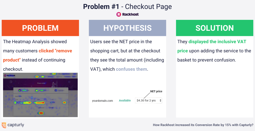
The heatmap showed that many people click the ‘delete product’ button -Ouch. The heatmap analysis also revealed that a large portion of their customers clicks on the remove product mark, instead of proceeding with the checkout process.
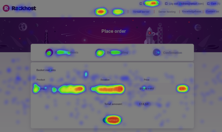
So the testing has begun. The hypothesis was that when the users put the chosen domains in the cart, they can only see the NET price. However, when they look at the basket on the checkout page, they see the actual amount (VAT included) they pay. This could be a possible reason why one would rather leave the website without converting.
The first idea was to show the full (VAT included) price when the user adds the service to the basket to avoid confusion.
![]()
Further tweaking was necessary
- Enter Data and Make Verified Button Clickable. (The heatmap appears to be clicked, but the buttons were not clickable, only the resume button can continue ordering.)
- Icon (trash or X) instead of deleting. (Maybe fewer clicks because they take up less space and less emphasis on the button.)
- Confirmation message: Are you sure you want to delete it? Are you sure you want to leave the cart? (prevent accidental cancellations)
- Remarketing for the shopping cart abandonment. (See https://www.rackhost.com/cart/index but not https://www.rackhost.com/user/todo.)
- Those who are already users send them an automatic reminder email about their unfinished purchase.
Problem #2 – Registration Process
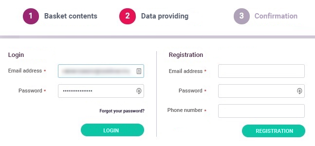
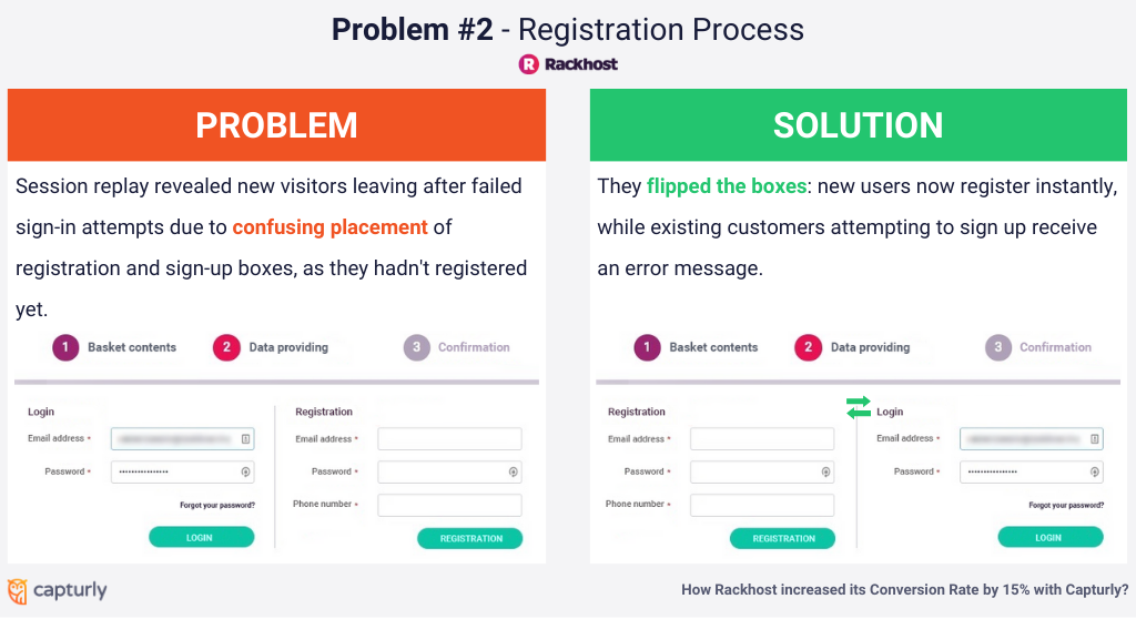
The first time they sign in, new users start typing in their email address and password, and then the system tells them that the password is incorrect, though you probably just haven’t registered and should go to the registration tab. After a few tries, they leave the page.
The solution
More emphasis should be placed on where to write. Eg Login for existing clients, Sign up for new clients. Plus you need to reverse the order of the login and registration blocks so new users would be welcomed with the registration option and those who are existing customers would be prompted with an error message that they have already registered with this email address, so there’s no need for registration.
The result
So how long does it take to see results in CRO? A week after the changes were made, here are the short-term results. Only a week later the results started to show up. The overall conversion rate has improved by 11%.
Problem #3 – Payment
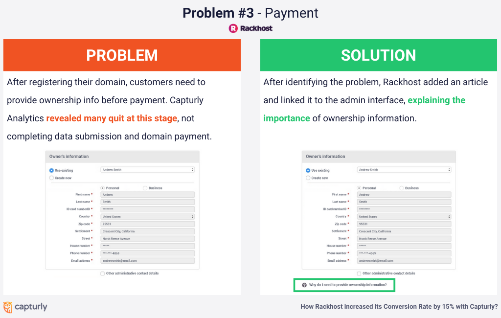
Once a user has “registered” his/her domain, he/she needs to provide the ownership information before being able to pay. Many people have stopped here and rather quit, and never provided the data nor have completed the payment process.
The solution
Why does one need to provide the owner with information? Why not write an article and link it to the admin interface. This has already been achieved, so it looks like this:
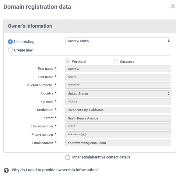
In this article, they explain that they only need the provided data for easy identification, to ensure, that no other than the owner himself has started the registration process and not someone else.
Problem #4 – Re-registration of Domain
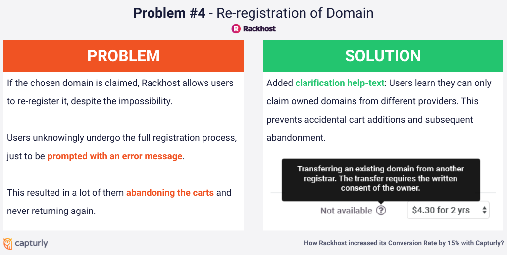
If the domain which the user has chosen is already claimed, the company lets the user re-register the domain, even though it is impossible. Therefore the user – not knowing the result – would have to go through the whole process of registering just to be prompted with an error message. Needless to say, this has resulted in a high cart abandonment rate.
The solution
Clarification help-text so the users know it’s only possible to claim the domain if they already own the domain but at a different service provider. This would prevent them from adding the product to the cart by mistake and abandoning the shopping cart because of the frustration resulting in data distortion in the conversion funnel.
Problem #5 – Domain Plans
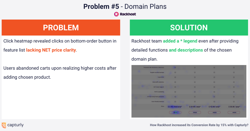
Many people click the order button at the bottom of the detailed feature list. There is no explanation here that these prices are NET only though. Once they put the chosen product in the cart, they realize they don’t need it and leave the basket. Especially since the company offered $ 3 coupons during the time, which actually sums up the full NET price of the “Mini-storage package”. The users thought that the smallest plan became free this way, realizing the mistake only later when welcomed with the VAT increased price.
The solution
Webhosting Subpage- Even after describing detailed functions, there should be a * legend
The result
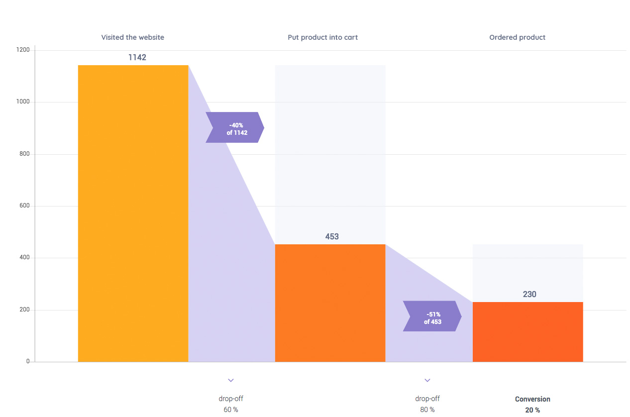
After a month the efforts started to really pay off. At this point, we were very satisfied with the results.
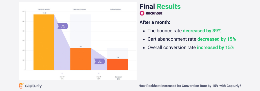
The bounce rate has decreased by a whopping 39% and what’s even better is that the shopping cart abandonment rate has decreased by 15% resulting in a 15% increase in the overall conversion rate.
How to use CRO? How to increase conversion rate? How to reduce cart abandonment? This case study showed you how a few simple modifications can lead to an optimized website.
As small these changes may have sound, the greater the impact they have on the final decision of the users. Therefore there’s no such thing as unimportant problems only ignorance.
Don't forget, sharing is caring! :)

