![How to design helpful error messages? [Guide]](https://capturly.com/blog/wp-content/uploads/2024/04/How-to-design-helpful-error-messages-Guide.png)
We might all think that creating error messages is the easiest part of creating a new website. We don’t need to care about it too much, the user just needs to find the right solution for the arising issue.
Well, you’re right, in one part. Error messages appear because of slips (the user needs to do an action, but does something unconsciously) and mistakes (when there is a mismatch between our model and the model in the user’s brain). You can say that both of them are caused by the user’s mistake! You may think: if the visitors want to move forward, they only need to think in the company’s way, understand what is wrong, and fix their mistakes.
It sounds like an easy job for customers, but do not forget something: a company relies on more of their customers, than vice versa. I guess, you have tremendous competitors waiting for your buyers to convince them about their strengths compared to yours.
What do you think: unclear error messages, or finding the wrong tone in error messages can lead to frustrated customers? Absolutely! If they believe it’s just a waste of time, and you could create a more flawless process, they won’t choose you again.
Learn: if a customer gets stuck, it’s not their responsibility. It’s your responsibility because you didn’t explain the next step to the customer properly. The creation of error messages needs time and preparation. However, in the last couple of years, UX designers figured out some core problems and suggestions on how to handle them properly.
In this article, we will share some tips on how to create helpful error messages, error messages that are concise, accurate, and efficient!
4+1 tips to create designed error messages
In this chapter, we introduce 4+1 tips to you on how to make designed error messages.
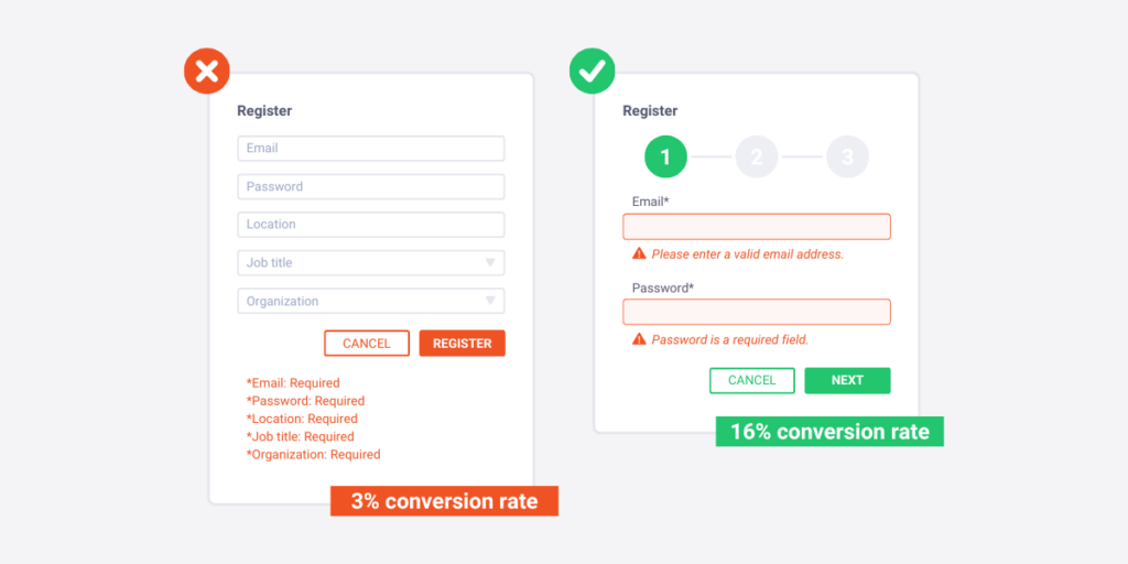
1. Be crystal clear about the problem
The following situation is quite natural: the customer – in this case it’s me – needs to fill out some boxes to end the registration process. It’s a very easy registration, I only need to write down my email address, one username, and a password. However, I quickly realize that there is a barrier.
I can’t figure out a password that accomplishes the site’s rules. You can say that “by just checking the rules first, I can avoid typing the same mistake again, right?” Well, the fact is they don’t write about any rules at all. When I made the same mistake again and again, the error messages were quite unclear: “The password is not strong enough”. I started to criticize the site after the fifth consecutive try, which was also not strong enough according to them: “What would be if you just write down the reason, and I can fix it immediately?” – At this very moment, I stated this rhetorical question.
I almost exited the whole site, but then had one more clue. What if the password needs to contain one special character, like a question mark, exclamation mark, or something? That was the problem, and after 5 minutes of continuous rage, I could finally get access to the site’s features.
This example was a good demonstration of unclear error messages. If they would simply write down this: “You are missing a special character in your password”, I would not have made the mistake again and again.
Let’s see what Netflix is doing:
They don’t have too many rules when you want to create a password there, but still, there is a minimum and a maximum number of letters that you can use. However, if you don’t succeed at these requirements on the first try, they emphasize these rules under the faulty written checkbox in a crystal clear way.
Also, they use the red color to indicate their newly generated text to notify the customer which will hide further information. They also use a red frame to highlight where you need to change based on their instructions.
2. Write the designed error message at the top of the screen
Most of the time, if there is an error message, websites display it below, or beside the problematic box. But, what if I tell you that in some situations it is not that accurate?
There are many screen resolutions, and it’s just the beginning. People can use your site via their computer, their tablet, or their mobile phone. A 2021 research concluded that 55% of online visits come from mobile users, and just only 43% come from desktop users. Yet, we still care less about mobile users!
When we place an error message next to the problematic box, mobile users may not see it at first sight. Just think about it: compared to a 1920×1080 screen resolution, they only have a 375×667 resolution. These are huge differences. Of course, you can create a responsive layout, which resizes things to be accurate on mobile devices as well, but these may not handle error messages sometimes. You need other solutions.
But what if you place the error message under the faulty written checkbox? It must fix the last-mentioned issue, right? Well, it is, but here comes another danger. Browsers offer auto-filling options to you quite often to make your life easier. This is a great opportunity, and I usually take advantage of this feature. But where is this option located in all browsers? Under the checkbox! So a situation can easily occur, when you don’t see the error message, since your auto-filling recommendations. You may not sense that there is a problem, you may think that it’s just a bug that won’t let you go to the next site.
Now let’s see Amazon’s solution:
They indicate the problem at the top of the screen. Of course, this version only works if there are no more checkboxes than just a few to connect the error message with the right field accurately. In this case, no matter what device you want to sign in, you always realize the issue.
4. Explain the problem in a few words
Who wants to hear long stories in error messages? Customers don’t need educational tales about how to improve their reading or comprehensive text-analyzing skills, instead, they want solutions! Short, but effective solutions!
I’ve got two issues with this error message:
- too long
- uses hard words
Like, it’s just one thing that customers need to read an essay about the accurate solution, but a non-English orientated person will perfectly know the meaning of “distorted” or, “access data”?
What if they would try something like this:
“Your data is not correct. Please, write an existing User ID and password, or create a new account HERE.” (when they click on the “here” CTA, the site navigates them to the signup page.)
This would be so much more accurate. But you don’t need to use sentences either. Moreover, sometimes it is more useful to divide the solution into slices and demonstrate which ones the user solved correctly, and which needs to be looked after again. Let’s see this through an example again, with Electronic Art’s solution:
Here, their requirements are noted in four different columns. They also use cross marks, and check marks to highlight those rules that you already accomplished and those that you haven’t accomplished yet. This works so much better than what we saw in the first example.
5. Try not to hide the input field
In this case, when we want to design errors, we refer to making our customers’ tasks more comfortable. It seems a good idea when the error message directly appears near the wrong input field, but there’s one thing you need to avoid at any cost: Putting the error message in front of the wrong input field!
I just politely ask you: how should the user fix the mistake, if the user can’t reach the input field again? Although, sometimes there is a possibility to dismiss the error message, and then you can write down the given solution to the input field, but then what if you forget the instructions? It is a complete mess and a disaster!
Let us mention another example here:
To reach the local university’s WIFI, you need to write down a password. However, this password is created automatically, from your birth date. Like: “if someone was born on October 1, 1970, then his/her password is 01-OCT-70.”
Some online services are built on the same simple technique: the password is generated automatically from a combination. If you don’t remember the structure of that combination, the website helps you with an error message where they mention something like the previous example.
That’s all great, but there’s a big chance that you won’t recognize the structure at first sight. So, it is better to always fully look at the error message to follow the structure well.
But, there’s some more. The previous example rarely happens nowadays, as website designers try to look at it very carefully. However, situations can happen when not just an error message pops up, but also a tooltip.
Tooltip is a common graphical user interface (GUI) element in which, when hovering over a screen element or component, a text box displays information about that element.
The thing is, even if you care about the good structure of error messages, and input fields, when a tooltip also comes to the picture the whole area can look like a mess.
In this case, you can’t see the error itself, because of the tooltip, but you can’t exit this info bar manually. You need to move your mouse forward, which sometimes really brings the user to the chain of frustrating events. Try to minimize these tooltips, and only use them when there is no other solution. Also, place exit buttons on the tooltips, so if the user reads the tip carefully can finally focus on the actual error message.
+1. Measure everything
Of course, there are obvious things, which cause no argument at all amongst your potential buyers.
We covered these in the first few tips, we think you necessarily implement those to avoid a constant negative feeling in your customers’ brains. But what if I say that there are a bunch of other elements that can depend on which target groups you try to reach?
It differs how you speak with the older generations online or younger ones. Younger generations may solve complex problems more quickly, and more easily understand correlations, as well. While older ones rather need some more instructions, and more time to figure out the “why”-s.
Use technical jargon, or not? What color do you use to indicate the problem? Do you need to indicate the problem in other ways rather than the color?
There are infinitive questions that have no rules in terms of error messages. Even if we bring some tips on how to solve these problems, and share some clues that worked in association with our site, there is some possibility that it won’t work in your case. Why? As I already said, you need to tailor your site based on your potential buyer needs, and in some cases designing efficient error messages also relies on your buyers’ comments.

But how can you get access to their thoughts?
Like, you can’t send questionnaires all the time, just to get access to some raw data. Don’t ask them for favors all the time, since they don’t want to work for you.
They just want to use your site, because your site satisfies their needs the best. If you are unable to generate a good user experience by just your own, they will end up choosing another site; a site that requires less hard work and more pleasure.
The best way in this decade to understand your buyer’s behavior online is available with online behavior analytics sites. These services analyze both qualitative and quantitative data to understand how your buyers behave, and why they behave in that exact way. Traditional website analytics contain heatmap, conversion funnel, and session recording analytics.
With the help of our tool, Capturly Analytics, I present to you the importance of data analytics in terms of designing efficient error messages.
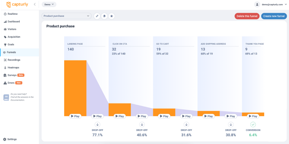
Conversion funnel analysis to track drop-off rates
With Capturly’s data analytics tool, you can detect that there is an issue with one of your subpages. To this analysis, our conversion funnel software will help you.
To make this analysis work, first, you need to define routes that your customers will go through. Usually, the last stages of these routes are the “subscribe to our newsletter”, or to “purchase these items”, where error messages more often occur.
If you set these stages, you need to track some data to then draw some conclusions from these. After a few months of continuous data collection, you can define which sub-pages have big drop-off rates. Although drop-off rates depend on many different aspects, you will easily acknowledge the strange values. Those that do not fit the whole picture, where it is rather caused by some of your non, or bad-functioning elements rather than simple human behavior.
Here, you find out the problem, and session recording software helps you to decide whether it’s because of inefficient error messages or the problem is something else. Moreover, because conversion funnel analysis is connected with the session recording tool, you can more easily connect individual sessions with the problematic element(s).
Know what your visitors want
One of the biggest advantages of data analytics tools is you get to know your visitors better. Capturly’s session recording tool is a great feature to reach that. In this analytics tool, you can capture and archive visitors’ screen updates, and you can also rewatch those to get further information.
A session recording tool is great when you are not sure about the “why”-s. In this case, you are aware of the fact that your error messages don’t work perfectly, but it is unclear to you why. If you sort out those sessions where an error message leads to page leaving, you can discover the core problems. On top of that, Capturly Analytics’s session recording is connected with our conversion funnel analysis software which also has relevance in this topic.
Conclusion
Whether you already know something about the importance of helpful error messages, or not; now you must perfectly understand how these little buttons can influence the success of a company. Badly maintained error messages can’t only make worse and worse user experiences, and many frustrated clients, but they can also lead you to fewer converted buyers, and in the end: less revenue.
But a crystal clear problem definition, a well-thought error message placement, or a shortened issue description all lead you to better-designed error messages.
Overall, try to distinguish your mistakes by online data analytics tools, and discover those that only refer to error messages. If you don’t find any of them, then you have a lucky day, with less work to do. In other cases, try to categorize your types of error message problems and solve them as we introduced and show you the numerous positive examples that we covered in this article.