It is no exaggeration to say that in November and December, there is a shopping event for nearly every week, attracting buyers to online webshops. During these events, it’s surprising to see how many webshops focus solely on the practical aspect of the trade, for example, on the technically well-functioning payment solutions, the navigation structure, and so on. However, it’s not just all about the pistons and bearings of the webshop engine. Good UX means also a fast website, intuitive user interface, brilliant brand integrity, pleasant typography, high-security solutions, smooth texts, easy messaging, harmonious colors and classy product photos.
As they often say: The bad news always precedes the good. The same theory applies to the world of User Experience.
Bad UX is much more noticeable as the good works just fine. It’s all pleasant, effective, and attractive. The excellent UX works as if it were not there.
Many merchants spend large amounts of money to advertise their webshop, while the webpage itself has such a low UX that many of its sponsored links are clicked, but the conversion rate remains low because people bouncing off the site as soon as possible.
Why should you read this article?
The goal of this article is to highlight some of the key UX features a webshop should have in order to stay in the competition during the major shopping events of the year.
|With that being said, let’s get started.
Table of Contents
Tip #1 Simplifying decisions
Offering free shipping to give a little push to the decision-making process has been around for a while now. Free shipping is cool, but ask yourself the question:
|Is it really something extra or just something standard?
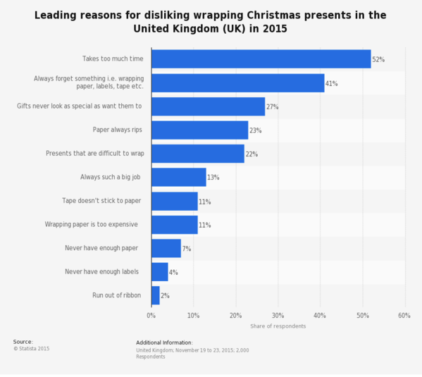
It has become mainstream over the years so the added value is not much. However, as Christmas gets closer and closer, more of your customers will want to have their items shipped “Gift-ready”. Add a gift-wrapping option so they can purchase with confidence. The gift-wrapping service is not new, it’s been around for years. All the big companies like Amazon have this feature. It’s a perfect way to catch those last-minute shoppers or those who find the whole Christmas event time-consuming.

Source: OnePol and Royal Mail
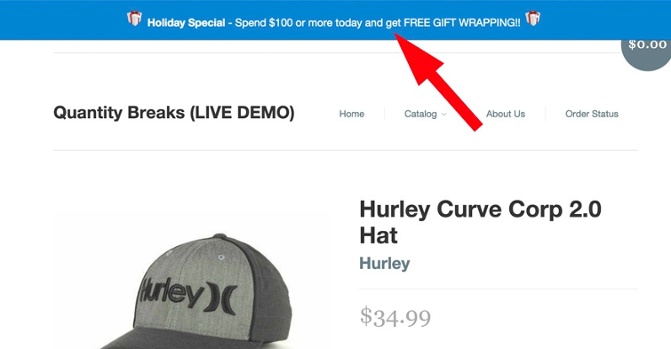
There are apps designed to warn the user when gift-wrapping or free shipping is available. For example, the Sales Motivator app for Shopify displays a custom bar in your store and encourages shoppers to spend more so they can get free shipping or gift-wrapping.

Source: Boldcommerce
Another great way to motivate shoppers is by giving ideas about who the gift is for. Those who wish to “get the job done” as quickly as possible will like this small gesture. Is your item perfect for housewives or DIY-ers? Don’t be afraid to state it in the product title and description. There are general categories like gifts for men, women, or children. However, you can create personas who would be happy to receive a certain item as a gift.
Personas are fictional characters who describe the real characteristics of your targeted individuals. Your goal here is to get as close as possible understanding their motives, fears. Once you’ve created a persona, try to draw a background.
This is a great shortcut when it comes to making decisions related to the purchase. Humans often make decisions based on emotions. Just remember how many times you’ve imagined the joy on the face of your friends and family members.
Tip #2 Holiday-friendly layout
You might be wondering if this is even worth the hassle. You have to make sure that the site won’t crash from the increased traffic, and will solve other technology related problems. But giving your webshop that extra holiday vibe actually makes a lot of sense and will make a difference since your potential customers are expecting some form of holiday promotions. This way you let them know that they are at the right place at the right time so there’s no need to go somewhere else.
|Yay! Christmas gifts!
- have hints everywhere – background, titles, product descriptions, blog, dress up your logo
- highlight your products – doesn’t matter if it’s an ebook on your blog, a course or a 24-carat gold watch, make it visible
- consider your products as gifts – the header is not just some bold text, even if you don’t consider your product a gift during the year
Tip #3 Convince the “Quitters”
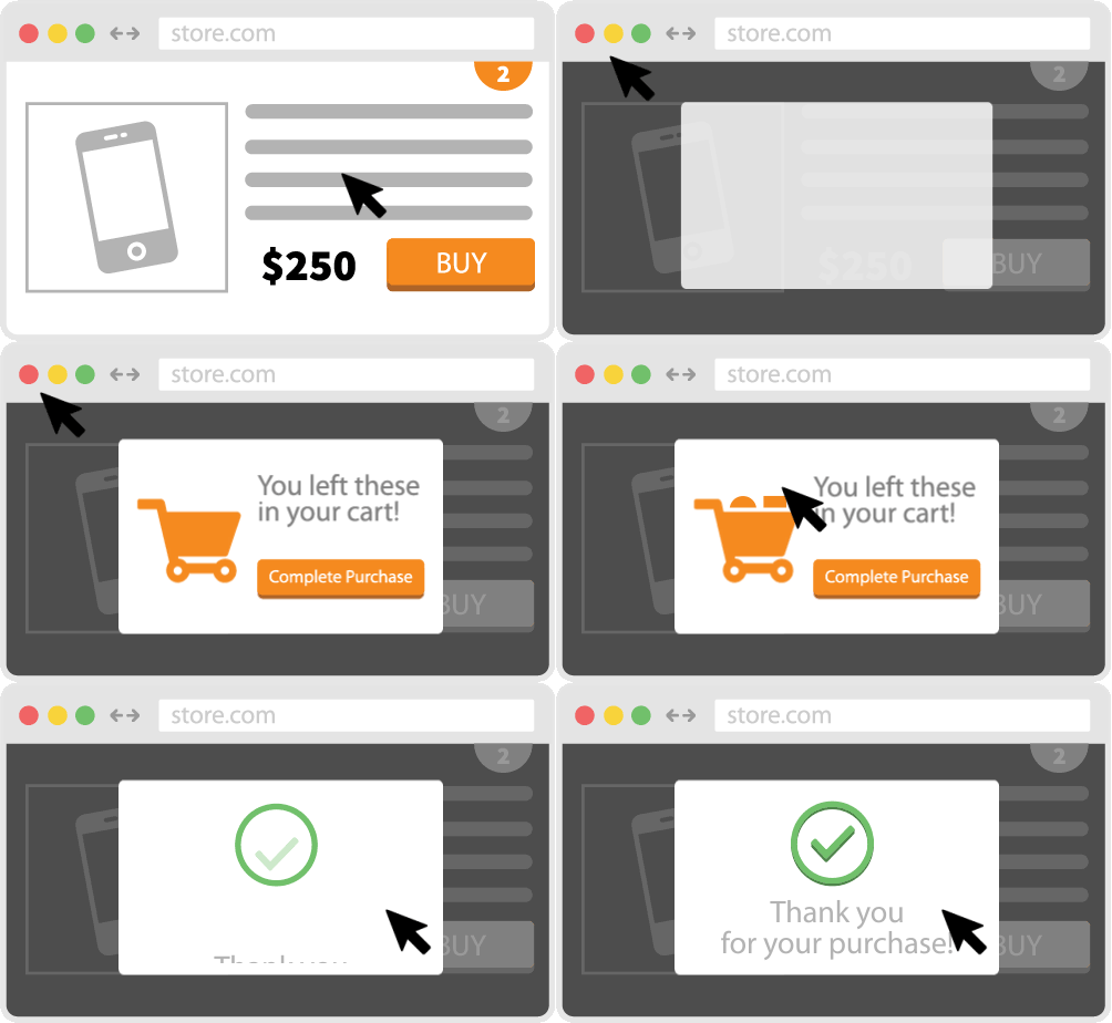
The Exit-intent pop-up is actually an intelligent pop-up window that does not interfere with browsing experience on your website and, as opposed to classic pop-ups, it doesn’t intrude upon loading the page. If the visitor does what you expect him to do – in other words, if your visitor is converting -, for example, subscribe, buy, etc., it doesn’t even show up.

Source: Optimonk
|Like it’s not even there.
However, if they want to leave your website without showing any sign of conversion, the pop-up will be activated at the very last second and will display a “must-see” offer which can be anything you want.
A couple of examples of what exit-intent pop-ups can be used on:
- downloading an eBook
- applying a coupon
- displaying a product that has a significant discount
- offering newsletter sign-u
The list of benefits goes on. Combined with web analytics tools that offer click heatmaps or mouse movement tracking, the pop-up can be timed correctly so it only activates when the cursor moves directly to the top edge of the screen, in other words, when the visitor wants to close the page. If the visitor clicks somewhere on this pop-up display, the pop-up will no longer appear. If the click doesn’t happen, it will appear once again the next time he or she revisits your page.
Tip #4 Clear Policy
Shopping for other people can be challenging, and gifting often comes with various intents. Sometimes it’s just a last-minute decision or an impulse. Humans make mistakes so even the best-intentioned gift giver can get it wrong. In today’s retail landscape, returns are inevitable — especially after December 25 when a “holiday hangover” sets in and people regret their purchases or dislike their gifts. This means that you can expect requests for refunds.
“One in three people will return a gift they’ve been given and close to $70 billion in merchandise will be returned to retailers this year.”
|Different strokes for different folks.
Policies may vary, some merchants promise everything, some have strict rules when it comes to returning gifts and refunding money. Regardless of the path you choose, keep in mind that it has to be crystal clear and easy to understand even when people are speed-shopping. Offer a more flexible, longer returning window at least for this time of the year so even the last-minute shoppers, or those who plan to shop early on can buy your goods without regrets.
|You wouldn’t want angry customers on your doorstep.
“Only 8% of people would stay silent if they saw inappropriate behavior from a brand.”
A couple of numbers to keep in mind when planning your policy:
– 55% of people are likely to say something in person
– 47% prefer electronic communication as a medium when giving voice, 42% prefer email, and 35% the phone.
– 56% of the Millennials have complained or called out brands on a social media platform, and this generation is 40% more likely to use social media to amplify their message
Tip #5 Measure, measure, measure
Many webshops do not even measure anything today, only the number of visitors and the number of people they bought. That’s it. They do not follow the movement of visitors, they do not know which side they are going to miss, where they cannot navigate and so on. There is a big difference between what you think is going on your website and what users see. “Unfortunately”, it only matters what people see, not what you think. Sophisticated web analytics tools can point to the habits of your visitors, potential buyers, and the characteristics of purchasing methods.
|UX and UI require lots of data.
Throwing some fancy template with a trendy UI on the internet and calling it a webshop is not the way things work. You can’t expect people to spend their money just because it’s that time of the year again. User Experience is a highly data-driven process so it walks hand in hand with web analytics. UX measures, tests, analyzes and works with data.
Don’t get me wrong, the UI plays an essential role in every digital interface, and it also has a key role to make consumers trust in the brand. The user interface design is actually the user’s visual control process on a product’s interface, through interactive elements, on all display sizes and platforms.

Source: Uxeria.com
|Instant feedback
It is just as important as making the website catchy for the eyes. If there is no feedback, people don’t know what is happening. We live in an information-hungry world where decisions are made – and can change – within a few seconds. So, what happens when people click all around without you giving them a proper feedback about the happenings? They stop and hesitate, or even worse, they just back off and go elsewhere.
“It must be flagged at the location where the user clicked that the processing is in progress.”

Source: Marta Serrano
UX and UI are both needed for a product or website. When a product looks good but badly used, there is a good UI design, but there is a lack of UX design. When, however, there is a good product that is terribly ugly, it’s a good UX and a bad UI. Both should, therefore, be monitored to create an optimum user experience.
Conclusion:
Good UX design is a great and permanent task. There are common best practices, but the real solution is only possible by doing your homework and making decisions based on data and user feedback. Using exit-intent pop-ups is a user-friendly way of promoting your goods and services as they can lead to better conversion rates. Web analytics tools such as click heatmaps or mouse movement tracking can help you design your promotions. If you know what your potential customers focus on and what your visitors are ignoring, then it becomes clear what and how you need to promote. If you know where and when to apply instant feedback, you will reduce the chance of hesitation during the shopping process. Good UX gives the buyer the best experience, so he or she will choose you in the future. Problems like returns and refunds should not be unexpected and need to be managed.
“Trust builds over years, but it can be lost in a few moments.”
Don't forget, sharing is caring! :)


19 Comments
Joey
2018-06-29 at 09:24Simplifying decisions is also my number 1 consideration whenever I plan for a trip. As long as everything is narrow down to a simple way, it will save both time and money.
Esha
2019-03-06 at 07:46Hello,
Thanks for sharing with us.”
It’s really a great and helpful piece of info. I am glad that you shared this helpful info with us. Please keep us informed like this.
Robert
2019-03-07 at 13:17Hi Esha, thanks for your feedback, I’m glad that you liked it and make sure to stay tuned for upcoming content! Cheers, Robert
Sandeep
2019-03-11 at 13:57Very nice article, continue great job!
Robert
2019-03-13 at 14:43Hi Sandeep, super glad you liked it! 🙂
Top UX Designers
2019-04-05 at 13:52Hi Robert, Awesome info. Please provide us great information like this. Thanks indeed.
Robert
2019-04-05 at 14:14Thanks for your comment, sounds like a deal! 😉
Banking Expert
2019-04-05 at 20:12Great article Robert, Thanks for sharing with us.
Robert
2019-04-11 at 11:30Thanks for the comment, it means a lot! 🙂
Mitchell Robinson
2019-04-10 at 14:07Thanks for amazing suggestions. I would love to implement your tips on my coupon website.
Robert
2019-04-11 at 11:29Super glad you liked it! Cheers 🙂
DigitalExamGuide
2019-04-11 at 14:38I am very thankful to you as your article has given me lots of ideas. I enjoyed a lot by reading this post. Thanks for sharing your blog.
Web Design
2019-04-15 at 11:40True! UI and UX has lot to do. It desicides whether the design / development is worth the effort.
Simplified but value added article team Caps!
radiata solution
2019-04-19 at 14:09this article is very helful for me thank you
Robert
2019-04-23 at 10:23Glad you liked it:)
Robert
2019-04-23 at 10:24Thanks for your comment! Cheers
Zorbis
2019-04-26 at 07:08It is also good for SEO as the speed and load times are positively affected.
Varun Sharma
2020-06-17 at 09:44Very informative blog. Thank you so much for sharing this amazing blog.
Suika game
2023-11-23 at 04:57Every time I visit this blog, I always find something new and unique. The articles cover a variety of topics, and the editorial team turns them into interesting and insightful articles.