Forms play a crucial role in data analytics. They help you understand your visitors better, and getting feedback from your customers is really important. I get why you might feel bad when not many people, or only a small group of your customers, fill out your forms.
Is it your fault? Can you do something to stop this from happening or boost your customers’ activity? This article will focus on this topic! But before that, let’s learn about the most common types of forms and how well they usually work.
Table of Contents
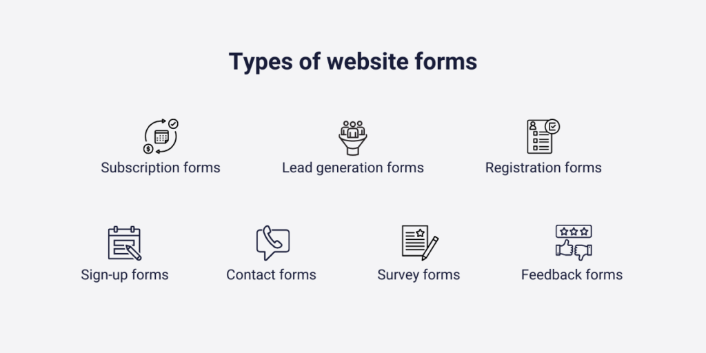
Types of website forms
There are many types of forms, but we won’t talk about them all because some, like insurance, hospitality, or healthcare type forms, only matter for a small number of people. Instead, let’s focus on the most common types of forms and what makes them special.
But wait there’s more. Each form type can have a different conversion rate depending on how they are set up. For example, asking open-ended questions may make a customer feel more uncomfortable than asking closed-ended questions. Therefore, forms with more closed questions are likely to have higher conversion rates. In this chapter, we’ll look at how certain types of forms work.
Feedback forms
These online surveys try to collect information from potential buyers about the opinions and experience of your products, services, events, or overall the whole organization. Here, you can’t add multiple answers, as you are curious about their exact opinion. That’s why here there’s a higher chance that the customers won’t fill out this form.
Registration, sign-up, and subscription forms
These forms will help your customers to apply for, sign up, subscribe, or register for a particular event, online course, or your company’s premium features. These forms require basic information, such as name, gender, and age, to identify these customers later on. The conversion rate here can be higher than usual due to its simplicity.
Survey and questionnaire forms
These types of forms are almost the same as the feedback forms. The difference between them is when you ask your questions. While feedback forms are generated after you do something to track its success, survey forms are usually generated before you make your choice. Here, you do research about your customers’ opinions, experiences, and attitudes. These types of forms’ conversion rates are equal to feedback forms’ conversion rates.
Contact forms
Contact forms exist for marketing purposes. These forms establish a way for the businesses to communicate with their potential buyers, and convince them for a later buy. Here, the visitor needs to enter their name, email address, and sometimes a very simple message. Here, you usually communicate with first-time visitors, which is why its conversion rate can be lower than the average.
Lead generation forms
This is one of my favorite bests. These forms are for catching new potential customers. In exchange for entering their email address, name, or basic information, these customers also get a reward for their humble reaction. It can be an exclusive discount, a basic gift, or brand-new content. Although, here you also want to catch first-time visitors, because of the reward, these forms’ conversion rate can be higher than contact form ones.
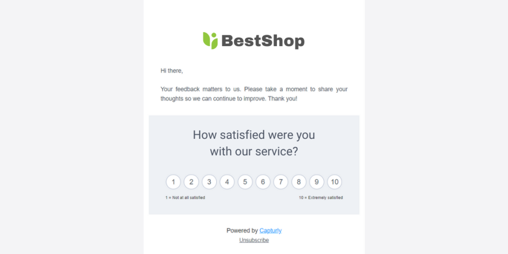
What are email surveys?
Yet, there’s another effective way to get feedback from our customers, and it’s through email surveys! Essentially, any questions you send to users via email can be considered an “email survey.” With advancing technology, we now have some very effective methods for conducting these surveys. Email surveys often get a lot of responses because they are quite engaging.
You can include:
- ratings
- scales
- welcome messages
- single-answer selections
Plus, you have the freedom to create your own graphic design in the background.If you’re interested in trying email surveys, you might want to check out Capturly. Capturly Analytics offers data analytics tools, including heatmap tools, session recording software, and in-email forms. Our in-email form feature isn’t just for sending questions to your customers; you can also track your statistics and check your success. If you’d rather not subscribe to two different tools for these activities, we highly recommend giving our tool a try!
Form conversion rates by industry
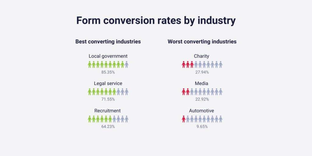
Now that we’ve learned about variations in conversion rates for different types of forms, let’s explore whether these rates can differ based on industries. Are there significant differences between the conversion rates of forms on an online charity webpage and those in financial services? The answer is yes, they can vary. Fortunately, we have more efficient data on conversion rates within different industries.
Based on Zuko’s research, the three biggest overall conversion rates in terms of the industries are:
- Local government (85.35%)
- Legal service (71.55%)
- Recruitment (64.23%)
And the three lowest are:
- Automotive (9.65%)
- Media (22.92%)
- Charity (27.94%)
Now let’s see the 4 most common reasons why customers don’t fill out your forms!
4 reasons why your customers don’t fill out your form
Firstly, congratulations! If you’re concerned about the success of your forms, it means you’re attracting a good amount of traffic and have a high number of visitors. This initial stage is crucial for creating forms that many people will fill out. It’s the first and last challenge that my tips can’t help you with.
However, you’ll find that seemingly critical issues related to forms can be easily resolved. So, pay close attention as we discuss a few common mistakes about why your customers might not be filling out your forms. The upcoming solutions might just solve your problems in no time. Let’s delve into it!
1. Your form is too long
Humans are impatient creatures. We can always explore that when we are waiting in hospitals to get our wound examined, or when a company’s telephone customer service makes us wait for 4 hours straight. These activities end up generating anger in us, and there’s not enough reward to heal our “pain”. Bad forms can enhance this anger in the visitor’s mind. Just think about it: most of the time the customer does us a favor by filling out the forms.
Put your hand on your heart: the majority of the forms are not a win-win situation. You win, that’s obvious, but your visitors (we will deal with this issue a little later)? If you expect that most of your visitors fill out your forms for free, spending some of their free time on you, you at least make it simple and easier.
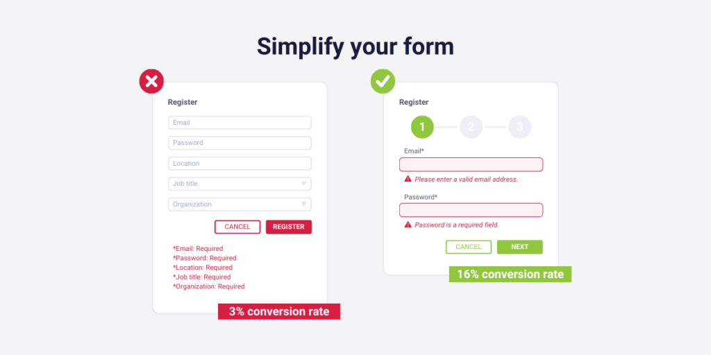
Solution: Simplify your form
Mobilespoon has done research about the ideal number of fields a form must get. They found out very interesting things throughout their research. The one that I mention now is when they analyzed the ideal number of field forms for better conversion rates.
According to their research, 3 fields per form generate 25% conversion rates on average, on the other hand, 5 fields per form only generate 15% conversion rates on average.
One other effective piece of advice can be if you use the progressive disclosure technique here. This technique means in this case that you only face the visitor with more questions if the visitor already answered a bunch of questions. If he sees all the questions the first time, he may end up closing your form, but with this option, those questions stay hidden until the visitor does not want to go further.
2. Not comprehensive mobile layout
Did you know that 53% of the total web traffic came from mobile users in 2019? Although it depends on the actual industry you work in, every second potential buyer sees your website on its mobile screen. Luckily, many website creator tools ensure a mobile-friendly design, but that’s not always true with online forms.
You may not think of bugs that make these forms unable to be filled with a mobile device. Fortunately, these mistakes rarely occur. However, back-and-forth page swapping, frustrating zoom-in-s, and zoom-out-s can quickly cause unturnable anger.
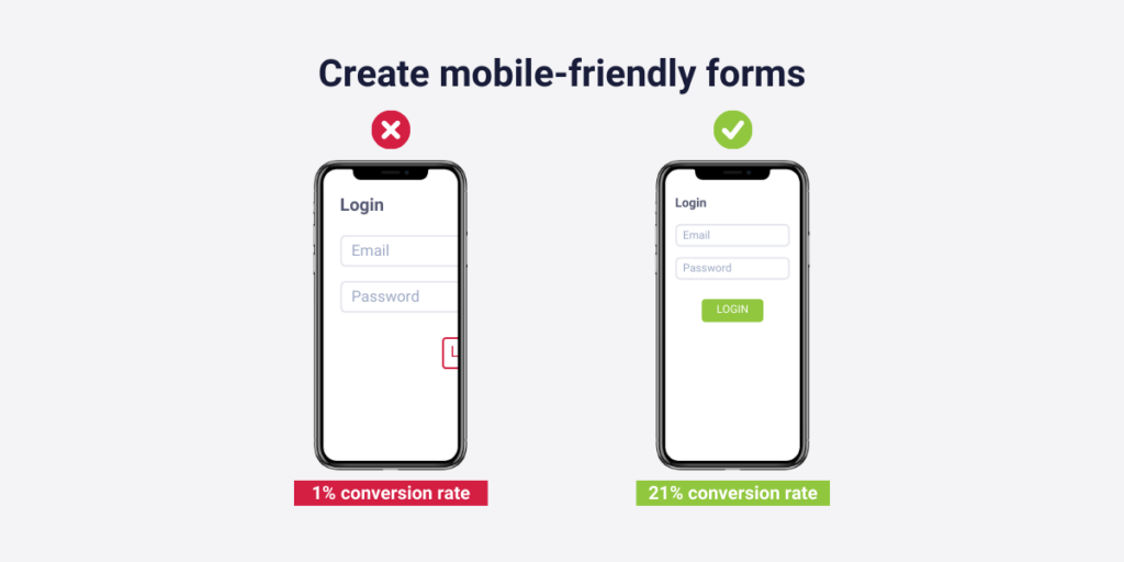
Solution: think of your mobile user customers
As you can see mobile customers exist! So make sure to take care of them.
There are a couple of ways you can increase the number of satisfied mobile customers when they fill out your form:
- Increase the size of the form fields, so that miss-taping can not be an option
- Break down the form into smaller sections as scrolling is way more problematic on mobile phones than on computers
- Be sure that your design adapts to different screen sizes
- Figure out a place for crystal-clear error handling (sometimes it really differs from the ones you determine for computer users)
And of course, test as much as you can. That’s the most efficient solution, as you can figure out other bugs and mistakes that are only connected to your specific form (but that’s a little bit later).
3. Your customers are uninterested in filling the form out
This is the most trivial one among all, but it’s better to answer this question than neglect it.
- Are your customers really interested in filling out your form?
- Why, or why not?
- What will be their reward for their kindness and great act?
- Do you even find something to motivate them?
These are the typical questions you need to ask yourself.
But if you find yourself in a situation like this, so no other solutions work out, you need to do something. You need to convince your buyers, luckily there are some ways you can do that.
Solution: Offer incentives, and emphasize why they need to fill it out
There are two different routes on how you can convince these uninterested buyers.
1. Highlight rewards and incentives
It is the easier option, but it can end up being tremendously expensive. If the form results can not offer anything valuable for your potential buyers, so if it’s only you who wins something from it, you better use this method. In this case, you have to offer something valuable in exchange for their kindness.
However it is quite hard to determine products or services that are valuable enough to convince your buyers, but not so expensive that your cost will be much higher, than your revenue, advantages, or opportunities about your form results.
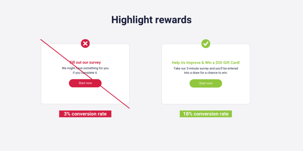
If you sell a service with a monthly subscription fee, you are in the best situation. You just need to offer some subscriptions to some of your potential clients who fill your form out. They want it, otherwise, they don’t visit your webshop day by day. It’s harder when you are selling products or services but at high, one-time payment prices. But I would also advise the same: offer your own products or services as a reward for the winner of the giveaway.
But if you don’t want to make a giveaway, as you want to try other methods when all of your customers who fill the form out win something, you have some other options. Discounts, extra contents that only they get access to. In some cases, these can be more stimulating, since your customers are certain that they will get an advantage, and they get it immediately.
2. Communicate about the value of the form
Another method can work when you are certain that your form’s result will have a positive impact on your visitors, and you are 100% sure that you can communicate it convincingly.
What can it be? For example, if the results will lead to a better user experience, and your customers can buy products from you more easily. If you communicate it right, your potential buyers may rather fill out the form, as they have some critics about your site that they want you to fix, or change. This time, they fill out your form to make their life easier later.
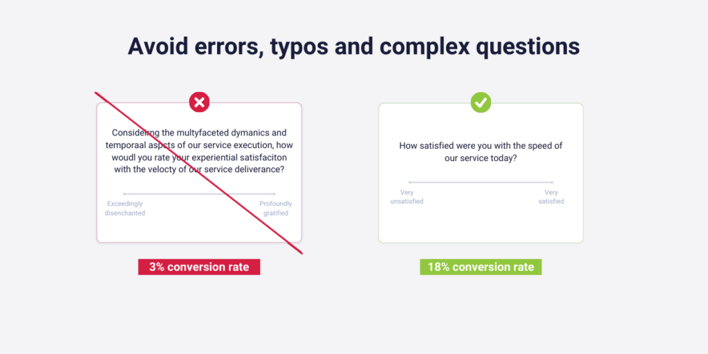
4. Bugs, typos, or too complicated questions
There can be several other issues, why no one or just a few of your customers fill out your forms. But to tell the truth, mostly these are very small but critical mistakes.
- A bug that your customers can not go forward on your form
- Typos that make the form outrageous, insignificant, or unmeaningful
- Complicated questions that your customers don’t understand
And there are many others, the number of possible mistakes is infinite. What can you do to avoid them? Well, first concentrate during the creation of the form, as you can save a lot of time later on. However, mistakes always happen. You can’t filter all of them. Then how can you solve it?
Solution: Test, test, and more test
I already recommended this activity in this article once, but I must highlight its strength a little more.
Testing has at least three separate steps:
1. Test slightly after you created the form
Here you test the form on your own, with your coworkers, or with a few very curious customers. This time you need to fix the typos, too long, or meaningless sentences. Moreover, you need to be sure that your customers will reach this form at your site, and get access to fill it, no matter where they found it.
2. Test meanwhile your form is on
It’s also crucial to track user behavior meanwhile your customers fill your form out. Maybe just a few of them actually fill it out, but from their data, you can get access to different information which explains why the majority don’t fill it out. Many data analytics companies, including Capturly Analytics, provide this service to their subscribers.
Analyze the results after the form went off
Testing does not end when the action is over. If this is the only thing you learn from this article, it is already worth writing it. You need to analyze your form’s conversion rates, compare it to industrial and form-type averages, and designate what you need to change in your next forms.
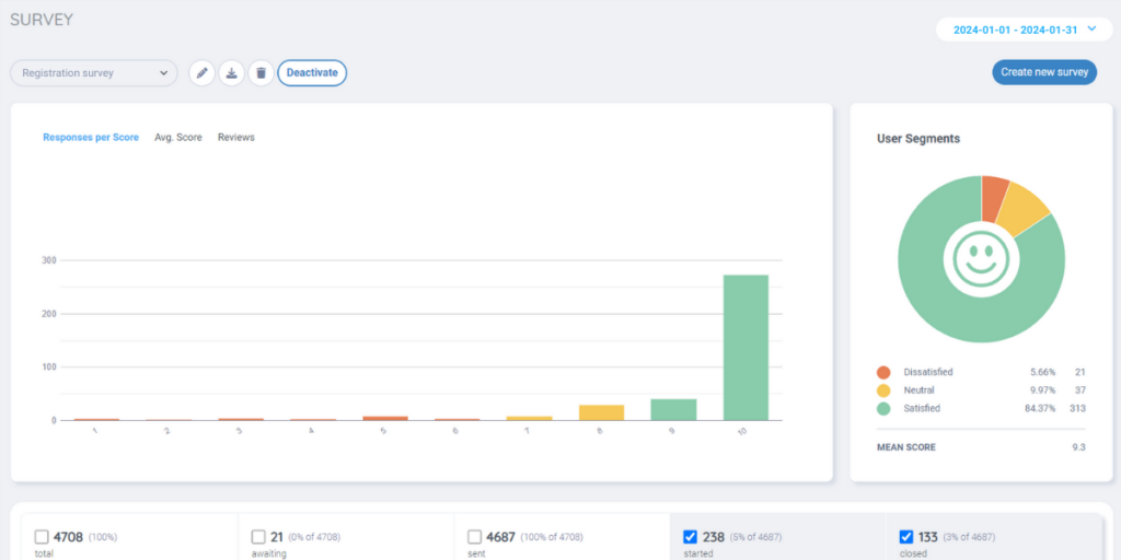
And what makes testing more effective? If you can check and compare your form’s results. That’s what Capturly Analytics can also provide you. Our tool has an analytics display, where you can analyze how your email surveys are going. On top of that, this is connected to our session recordings software, so you can optimize your surveys by just watching these clips.
These will all help you avoid that situation when none of your customers fill out your form. Even if it is unavoidable since it’s too late, accurate testing will help you avoid making these crucial mistakes again.
Conclusion
In this article, we met with the most usual types of forms and their conversion rates based on the type and which industry it will be introduced. This not only gives you a good perspective of what you can expect from these, but also helps you analyze whether your customers really don’t fill out your form because of your own mistake(s), or if an external issue is the source of the problem.
Then we introduced you to four different internal mistakes why your customers don’t fill out your form, and we recommended some solutions on how you can solve these issues, and convince your customers in some way. Do not forget when you are creating forms for your website to understand what your visitors want in exchange for filling out your form, because these win-win situations will generate long-term positive connections with your buyers, which will bring you better selling rate numbers, more revenue, and more profit.
Don't forget, sharing is caring! :)

