The secret behind running a successful business and keeping things afloat has good conversation rates. Without optimizing conversion rates, you cannot reach your sales and revenue goals and thus may struggle to keep your business going. Hence, Conversion Rate Optimization (CRO) is usually one of the top priorities for most businesses.
But, what does User Experience (UX) have to do with CRO? The fact is that UX and CRO are intrinsically linked and go hand in hand. Focusing on CRO solely may yield you good results; however, improving the UX of your website will work wonders in improving your conversion rates even further.
This is because UX is all about enhancing customer satisfaction by improving your website’s usability and interactive experiences. Making UX improvements ensures that every step along the customer journey is enhanced to ensure higher engagements and fewer exits.
Therefore, we can safely say that improving the UX of your website has the ability to bring about drastic changes to the CRO of your website. In this extensive guide, let’s have a look at various UX improvement strategies that you can follow to skyrocket your CRO in 2021.
Table of Contents
1. Use Crisp, Benefit-Driven Copy
When we talk about website UX, one of the first things you must focus on is the copy of your website. This includes homepage copy, landing page copy, sign-up form copy, etc. This is because copywriting has a major influence on how users perceive your brand and your products.
UX is all about offering satisfactory experiences to your customers with the ultimate goal of converting them. So, you have to offer your users exactly what they are looking for and urge them to convert. And how do you convince them of that? Through copywriting.
Here are a few tips of how you can create crisp, benefit-driven copy for website visitors in order to improve conversions:
- Before you create copy for your website visitors, try to have a deep understanding of them. Understanding their demographics, likes, dislikes, pain points, goals, aspirations, etc., will help you fuel your copy and make it more persuasive.
- Make sure to replace feature-driven copy with a benefit-driven copy. Your users are not interested in the features that you offer. They are rather interested in how these features can benefit them. When they are able to visualize these benefits, they are more likely to convert. For example, instead of talking about your fool-proof eCommerce fulfillment, you can talk about how you can offer quick deliveries.
- Keep your copy crisp and concise. Always assume that the user doesn’t have much time to go through walls of text. So, state how you can benefit them in the most persuasive way through the least amount of words.
2. Do not Use Your Homepage as the Landing Page
Are you using your homepage as your landing page and wondering why your conversion rates are low? Well, you’re not alone! Statistics show that almost 77% of top landing pages were home pages.
If you’re doing this now, then this can be the biggest reason that is affecting your conversion rates. Here’s why you shouldn’t use your homepage as a landing page:
- A landing page should be devoid of any kind of distractions. Your entire landing page UI and copy should lead the user towards one single goal—the Call-To-Action (CTA.) Compare that to a homepage that is full of distractions—navigation bar, social media links, footer links, and more. So, the user can get easily distracted by all these links and deviate from clicking on the CTA.
- Another reason that directly links to UX is that when you use your homepage as your landing page, you are directing visitors from all your traffic sources to the same page. Ideally, your business may have different target personas with different pain points and aspirations. Hence, having different landing pages for each of these personas will help significantly increase your conversion rate.
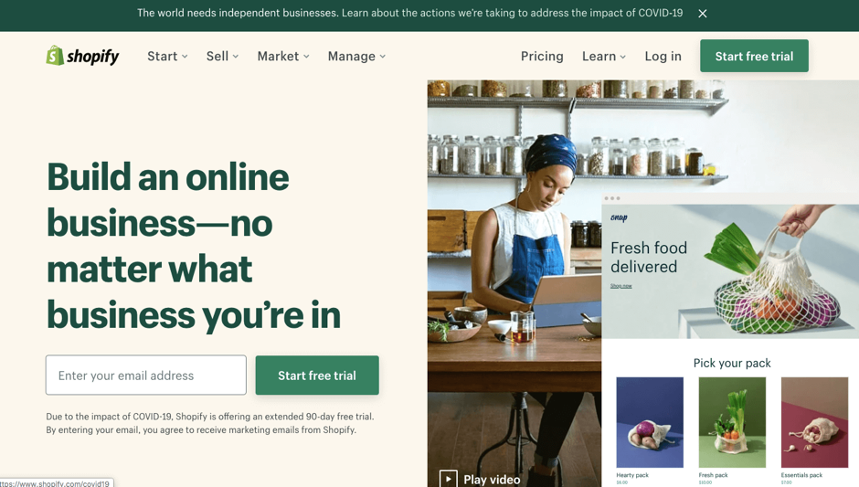
A great example of this would be Shopify’s homepage and landing page:

3. Provide Easily Accessible Contact Information
As discussed in the previous point, not every visitor who lands on your landing page will be the same. Some users may directly convert from your landing page or product pages.
However, some may want to learn more about your products, services, or brand before converting. Not having easily accessible contact information may be a hindrance for such visitors, leading to lowered conversions.
To make sure this doesn’t happen, it is essential that you make your contact information clearly visible and accessible. The user shouldn’t have to spend time looking for contact details such as email ids, addresses, phone numbers, and other information.
Add access to contact information in the navigation bar as well as the footer area to make things easier for your visitors. Also, make sure that the contact information you provide is accurate and consistent everywhere.
4. Use Abundant Social Proof
At the end of the day, CRO heavily relies on human psychology and interaction. This is probably why there are no fixed set of rules or formulae that can give you a sure-shot improvement in conversion rates. The best you can do is to try your best to persuade your customers by offering them a good experience.
One such important factor that affects the psychology of your website visitors is social proof. Social conformity helps users value and trust your brand more. Hence, the more social proof you add, the better will be the UX that you offer, and this will help you with CRO.
There are various forms of social proof that you can add to your website:
- Customer reviews and ratings
- Customer testimonials
- Trust badges
- Brands that you have collaborated with
- Customer success stories in the form of text or videos
- Social media following
Make sure to use abundant social proof throughout your website wherever it is relevant, and you’ll most likely start seeing better conversion rates.
5. Create Urgency and Scarcity
FOMO or Fear OF Missing Out is a term coined by millennials for a phenomenon that holds true across all ages. We, humans, are social beings and hence want to be a part of interesting things happening around us. You can use this fact to your advantage to convince your audience to convert.
Many times it so happens that users may be interested in your offering. However, they may decide to rethink it and revisit your website at a later time. Most of the time, users will forget about your offering. To tackle this, you can use urgency as a tool. When you convey a now-or-never kind of offer to your users, they are more likely to take action right now.
Scarcity is another powerful tool that works on similar lines. When you say that your offering is limited and scarce, the user will take action now instead of deciding to come back later. You can use urgency and scarcity at the places where you talk about your offering and add a CTA button.
6. Keep your CTA and Form Above the Fold
“Above the fold” refers to all the elements that you add to your website that are visible on the device screen without scrolling vertically. Now, why are we talking about above the fold?
According to a study by Neilson Norman group, what you place above the fold matters a lot. Here’s what the study has to say “What appears at the top of the page vs. what’s hidden will always influence the user experience — regardless of screen size. The average difference in how users treat info above vs. below the fold is 84%.”
This means that if you bury your sign-up form and CTA down below the webpage somewhere, users are less likely to scroll down and convert. So, to improve the UX that you offer and work towards CRO, it is vital that you place important elements such as lead generation form and CTA above the fold.
7. Remove Distracting Elements
As discussed in one of the previous points, everything on your website landing page should direct the user towards one goal—the CTA that you want the user to click and convert.
However, many websites make the mistake of adding distracting elements that deviate the users from the intended action. This way, the user would not give undivided attention to the intended CTA, and your conversions will automatically dip.
Here are a few measures you can take to avoid this:
- Refrain from using different types of CTA on one page. For instance, you do not want to add two types of CTAs—”Sign up for ABC” and “Sign up for XYZ” on the same page. The chances are that the users will get distracted and click on neither. So, always stick to one CTA for each landing page.
- Remove any unnecessary pop-ups, ads, etc., from the landing pages.
- Do not add navigation bars, search buttons, and footer links to your landing pages.
- Remove any unnecessary internal and external links from your landing pages.
8. A/B Test Your Landing Pages
As mentioned before, there is no magic formula using which you can guarantee better conversion rates for your website. However, testing can get closest to this. How? Testing strategies such as A/B or split testing can help you run tests on two different versions of your landing pages.
Through these tests, you will know the version of the landing page that works better for CRO. On similar lines, you can conduct A/B tests on different elements of your landing pages and consistently improve your landing conversions.
You can test various different elements of your landing pages one at a time—colors, design, copy, CTA copy, CTA design, form placement, form fields, fonts, social proof, and the list goes on.
You can use session recording and heatmaps to understand how users navigate through your site. This way, you’ll have a better idea about the landing page elements that you should tweak for A/B testing.
9. Leverage Videos to Improve Conversions
As a consumer, you’d know that videos offer a whole new experience than other forms of media. Videos are way more attractive, compelling, interactive, and effective at conveying your message than texts or images.
This is why adding videos to any website’s homepage and landing pages can be a great UX improvement tip that will lead to higher conversions. You can add animation videos related to your offering, customer success stories, etc., to your web pages.
You can also use a digital adoption platform to add quick demo or walkthrough videos to offer the user a brief gist about your product. If you run an eCommerce store, you should consider adding product videos to your product pages to increase conversions.
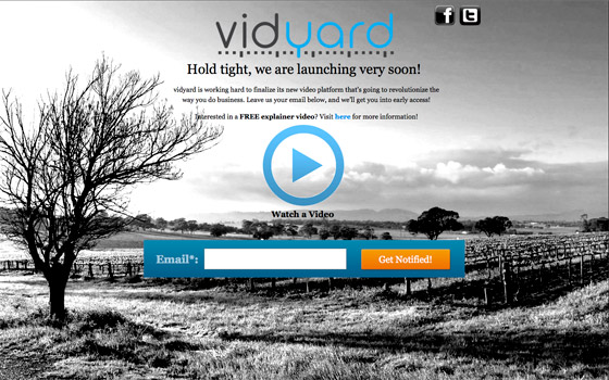
For example, consider the case study of Vidyard. They used videos to lift their landing page conversion rate by 100%, which is massive!
10. Optimize CTA Color
Psychologically, colors have a profound effect on human behavior. The right colors can influence your website visitors to take favorable action, while the wrong color can make them ignore the CTA altogether.
You can use brand identity, contrast, audience demographics, and other similar factors to determine the colors that will work best for your CTA buttons. A/B testing different CTA colors can help you land on the color that works best for CRO.
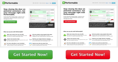
A great example of this would be the case study by HubSpot where they ran A/B tests for determining the best CTA button color—red or green. Results revealed that the red button outperformed the green button by 21%.
11. Improve the Readability of Your Site
Readability is probably one of the most basic concepts of good UX. However, you’ll find it appalling to see the number of business websites still scoring poor on readability.
Readability acts as a repelling factor that drives visitors away from your website. Because let’s face it—most consumers today are impatient skimmers who do not have the time and effort to go through difficult-to-read web pages.
Therefore, improving the readability of your website is very important for good UX. It can also bring about considerable improvements to your conversion rates. To ensure readability, make sure you work on the UI of your website by seeking help from experts.
Use the right fonts, colors, and media for your web pages. Avoid adding walls of text; instead, space out the text content well. A/B testing can, again, come to your help here.
12. Improve Website Load Speed
Consumers today are impatient and do not have the time to wait for your website to load. If your website takes time to load, the visitors will probably bounce and move on to your competitors. In fact, studies show that the probability of bounce increases 32% as page load time goes from 1 second to 3 seconds.
Hence, to offer a good user experience and help with CRO, it is essential that you work on your website load speed. Here are a few ways you can ensure good website performance and speed:
- Pick your hosting provider wisely as your website load speed largely depends on the performance of your hosting provider.
- Work on technical strategies like JS and CSS minification, browser caching, using Content Delivery Network (CDN), lazy loading, image optimization, etc., to bring about significant improvements in your website speed. You can hire technical support to work on these strategies if need be.
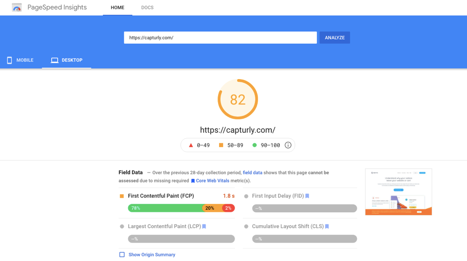
- Use tools such as Google PageSpeed Insights to check the speed of the desktop and mobile versions of your website. Make sure you consistently work on improving the same.
13. Ensure Web Accessibility Compliance
According to the CDC, 25% of Americans have some type of disability. These may be physical, mental, and emotional disabilities. Such users may not be able to access your website as others can if you haven’t worked on website accessibility compliance.
Website accessibility compliance ensures that your website is accessible to all types of people, irrespective of any disabilities they suffer from. You can ensure website accessibility by seeking manual help from experts to work on the UI and design of your website. Or, you can also use AI-based website accessibility tools to ensure compliance.
Ensuring website accessibility brings drastic improvements to your website UX. You’ll find more visitors interacting with your website. This will ultimately lead to higher conversion rates. Website accessibility also helps you build trust with your users and improve brand awareness.
14. Ensure that the Landing Pages are Mobile Friendly
Did you know that 54.8% or more than half of global website traffic comes from mobile devices? This means that more than half of your visitors will land on the mobile version of your web pages—be it the homepage or landing pages.
So, it does make sense that you give utmost importance to the mobile-friendliness of your landing pages to work towards CRO by offering good UX. You should ensure the mobile-friendliness of your website right from the start by picking the right CMS solution and theme that comes with mobile-friendly features out-of-the-box.
Next, you should also conduct extensive tests on the mobile version of your web pages to make sure that every UX/UX aspect is working as expected. You should also work on speed optimization of the mobile version of your website.
15. Keep Your Forms Simple
Don’t you hate it when you are really interested in signing up for an offer, but the form asks you to fill up lots of unnecessary, irrelevant questions? The same goes for your website visitors.
When users fill up forms on your website, they are essentially giving away their private information to you. This takes a lot of trust. And, you should respect this by keeping your forms simple and minimalistic.
Keep your form fields bare minimum. You can ask for other details later on as the customer progresses through the different buyer journey stages. For example, if you are asking for contact information, try to stick to the first name and email address instead of asking for a contact number and other information that may not be entirely necessary.
Key Takeaways
UX and CRO are highly interdependent and go hand in hand. When you work towards improving the UX offered by your website, you automatically prep your website for higher conversions. Hence, as a prerequisite to CRO, you should consider working towards a better UX for your website.
You can take the help of the strategies offered in this guide to work on your website UX and subsequently bring about significant improvements to your website conversion rates.
2 Comments
API Travel
2023-05-03 at 13:10thanks for the tips! keep posting.
Travel agency software
2023-05-23 at 07:13this article is so good by the way. keep sharing!