The restaurant industry is currently undergoing a technology-driven disruption, much like it’s retail and hospitality counterparts.
The largest two disruptors? Online ordering/food delivery and the injection of new restaurant POS systems and other SaaS tools to help restaurants manage, monitor, and market their business.
In fact, online ordering is growing 300% faster than dine-in experiences, and businesses that offer online ordering see a 30% increase in delivery revenue than those who don’t offer an online option.
But having a system to order from a restaurant online isn’t the only problem restaurants are facing. Many current ordering systems are outdated or have a terrible user experience and interface.
That’s why we’ve put together tips for restaurateurs on how to build and optimize an online ordering system that converts.
Table of Contents
10 Tips for Creating a Great Online Ordering Experience
The following ten tips help provide a roadmap to how best to build an intuitive online ordering workflow system that converts visitors into customers.
1. Wireframe the Ordering Experience
Many restauranteurs may be asking “what is a wireframe?” That’s fair, as it’s a user experience (UX) designer term.
Wireframing is the act of sketching out the skeleton of a workflow or system. A wireframe is an early representation of a website/app at its very basic foundation. A wireframe acts as a visual representation of a website or app before the application is live, which helps uncover trouble spots in a design or workflow.

Restaurants should work with a UX/UI designer or consultant to help wireframe and mockup its online ordering system before they began to create it, as it will help identify future problems before they happen. Restaurants can go old school and wireframe out their ordering experience on a whiteboard or can leverage one of the many free wireframing tools available online.
2. Clean and Consistent Design
A busy or cluttered design can kill your online ordering conversions, and not only for design professionals. A clean and consistent design will help navigate your users to specific areas of the site, working as a guide.

Having too much going happening on a menu, or having design elements that serve no purpose, will distract users and lead to more abandoned shopping carts and a loss of revenue.
3. Easy to Find Online Ordering Menu
A simple tip that many restaurants venturing online tend to strike out on. Make it obvious how to order from your online system with a clear CTA.
First, create an asset in your restaurant’s branded style and then make it stand out to a point of annoyance. You can always go back and optimize this later on, but the point is you want to make it very clear to those browsing your site how they order online, or you’re risking losing out on business.
In the same vein, make sure to keep an eye out and monitor your website and online ordering system for bugs and page breaks. Many restaurants are built on old WordPress or Wix foundations and are outdated, leading to 404s and broken links.
Insider tip: Consider including branded merchandise in the orders you deliver so customers will remember to visit your website first the next time they’re hungry.

4. Categories
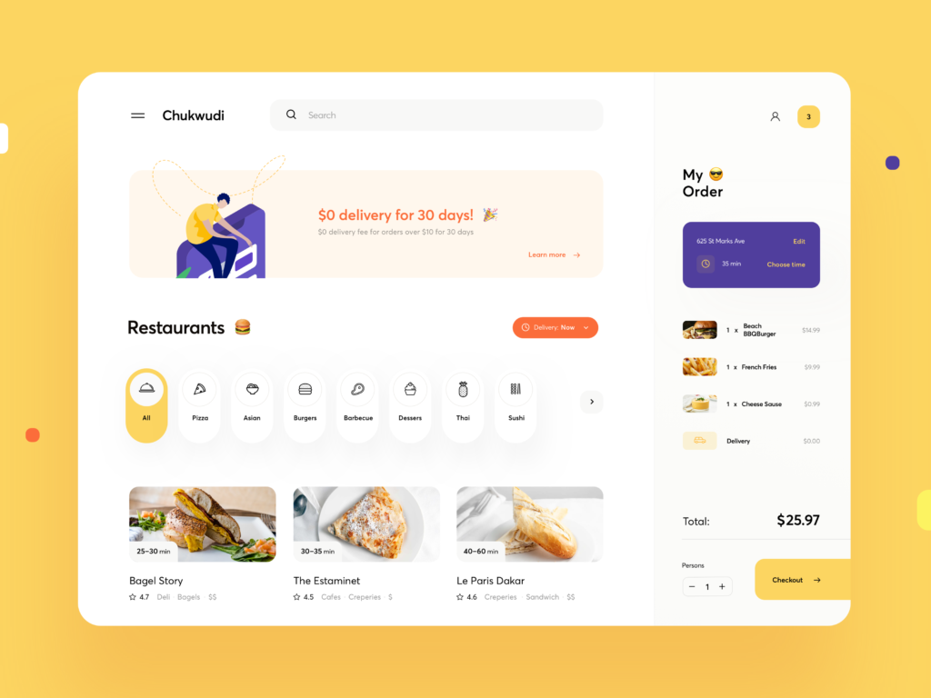
Categories help to create an easy-to-understand user experience by grouping similar items together. This allows users to quickly understand the UX of your ordering system and find exactly what they want to order without trouble.
Look at what your restaurant offers and then build out 4-6 core themes. These can be types of food such as pizza, sandwiches, salads, or courses such as breakfast, appetizers, and dessert.
For a pizza parlor, examples of categories to include are “Appetizers, Pizza, Wings, Salads, Dessert”
 (Source)
5. Clear and Concise Descriptions
Descriptions are the restaurant’s chance to sell an item, not a placeholder for listing out every ingredient one-by-one.
Use clear, concise, and descriptive wording. No one is moved to order a “14 IN Cheese Pizza with Pepperonis”, but “Delicious 14IN Three-Cheese Pizza with Fresh Pepperonis and Handmade Sauce” is a different story.
6. Pictures
Maybe the most obvious on this list is to simply include pictures along with items. Pictures help indecisive people make decisions – helping to convert more online orders.
Don’t cut corners here. Hire a professional photographer to take stunning images. No one will want to buy the item with a poorly cropped and badly lit hamburger.

PRO TIP: It doesn’t have to be every item, but restaurants can be crafty and include HD images of their best and most expensive dishes. This helps restaurants to drive more revenue with customers spending more per order.
7. Specials and Combos
For those looking at entire meals, add a section including lunch/dinner combos and weekly specials. These upsell skills give customers a sense that they’re receiving a deal and rationalize a final decision on their online order.
Combos and specials are also a great strategy for upselling customers and driving more revenue to your restaurant, as well as offloading items that have seen poor sales.
8. Suggested Add-Ons
At the end of the order, be sure to suggest add-ons that are commonly ordered with what a customer has in their cart.
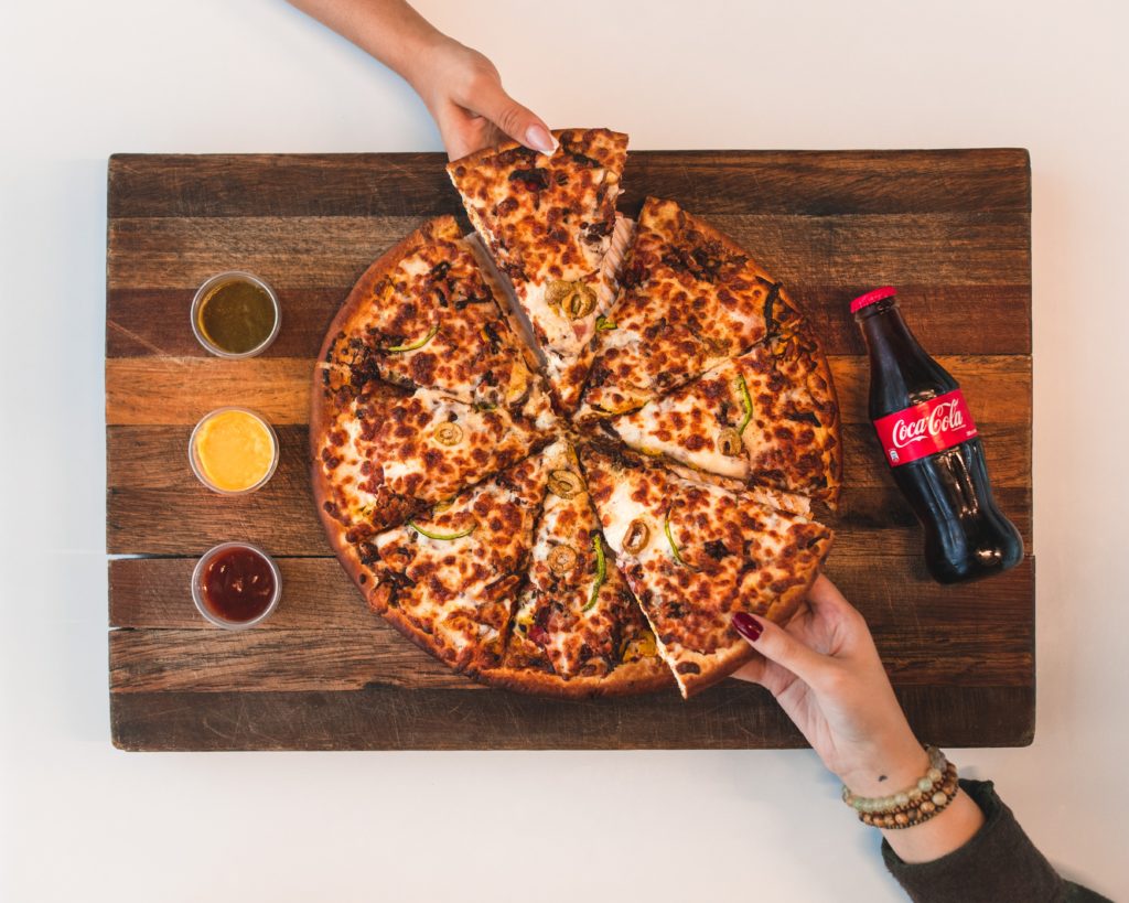
Ordering a pizza? Make sure to throw a CTA to not forget breadsticks and sauce. Or a 2-liter for just a few dollars more.

It’s a stellar upsell strategy that is another step in navigating users to the finish line.
9. Multiple Sign-In Options for Return Customers
Many online orders are abandoned due to complications with sign-ins.
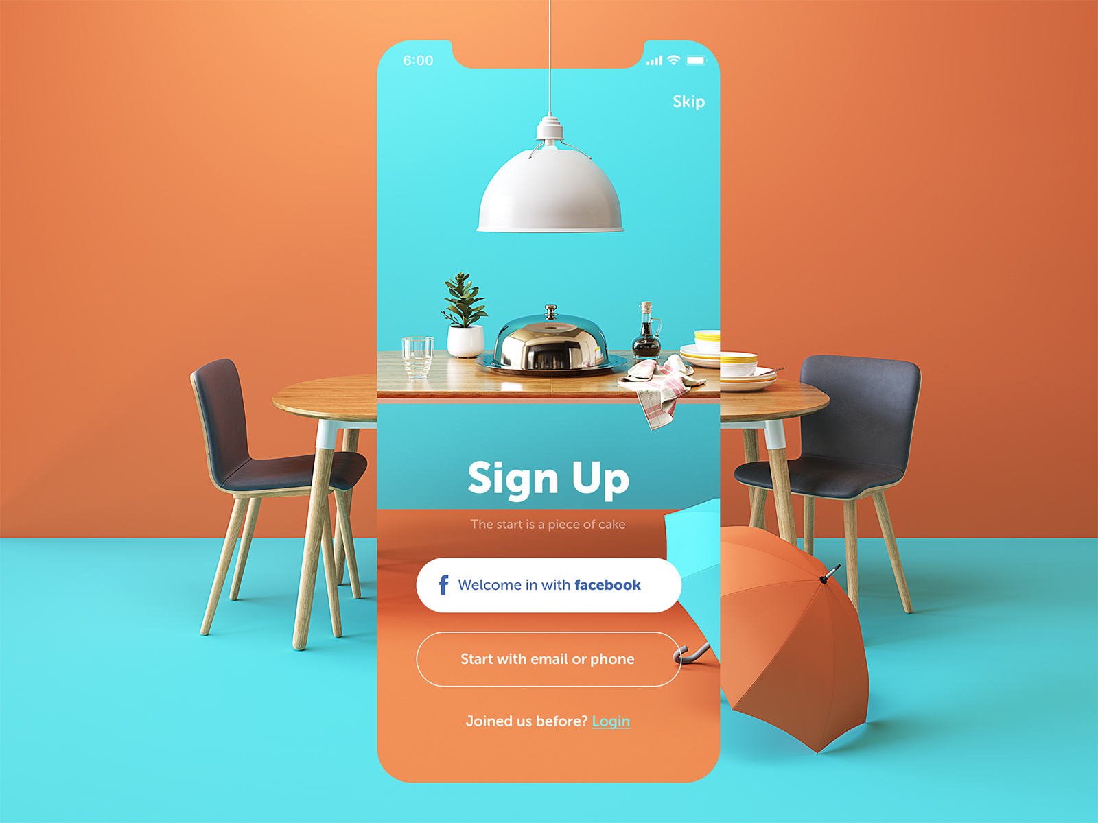
Be sure to offer multiple options for signing in: guest checkout, Google or Facebook checkout, and creating an account with your restaurant.
This helps users navigate around friction points. They can’t remember their password for their account? No worries, they can simply use Facebook’s SSO to login with their Facebook account. Not on a device registered to them? No worries, they can choose to complete their transaction with a guest account.
 (Source)
Offering sign-in options through a custom account, or with a third-party such as Facebook, allows restaurants to capture user information on their customers. This allows restaurants to promote new deals and specials to drive return users through follow-up emails, gather demographic data on their audience, and offer a restaurant loyalty rewards program.
10. User Testing
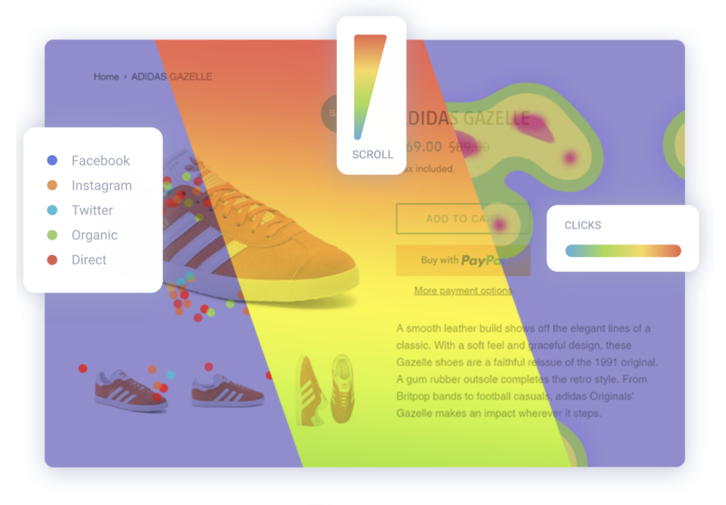
Finally, also test your ordering system. Before it launches, use user testing services and software to uncover how customers are interacting with your system.
This will help to uncover points of rage clicking, cart abandonment, and general confusion.

Don’t stop at launch either, continue to test your workflow, and always be on the lookout for how to optimize your online ordering system to ensure your restaurant isn’t losing out on orders.
Always Be Testing Your Ordering Experience
As mentioned previously, restaurants should never stop testing their online ordering systems. New restaurant-focused software such as restaurant cart abandonment and restaurant referral programs continue to present new problems and innovates for restaurants – and so will the continued adoption of online ordering and food delivery.
By staying the course and following the tips outlined in this article, your restaurant should be well on its way to being one of the best online ordering systems.
—
Levi Olmstead | Levi is the Director of Marketing at 2ndKitchen. 2ndKitchen helps partner bars, breweries, hotels, and other businesses without a kitchen partner with neighborhood restaurants to create custom, branded dining experience. Levi also blogs on content marketing and link building at LeviOlmstead.com and can be followed on Twitter at @levi_olmstead
Don't forget, sharing is caring! :)


2 Comments
Sarthak
2023-03-30 at 07:59I appreciate you sharing this knowledge
The Foody Gram
2023-10-25 at 18:57Great tips! Optimizing online ordering for restaurants is crucial for success. These tips will surely help businesses improve efficiency, attract more customers, and boost their online presence. Well done!