
User Experience Design Principles
Are you up to build a new website for your business or anything else? Well, no matter how much technical knowledge of HTML, CSS, or PHP you have, you still need to take care of many factors that developers usually ignore and end up with reduced active responses towards the website and business. These majorly include the much-neglected UX design principles.
Technical things first, then we will switch to Web Design factors. Your website should be properly functional, free from broken links, free from distraction creating images, etc. It must have a utility too. So, here are a few things you need to keep in mind to build an effective UX.
How to Build an Effective UX
1. Make Arrangements For Faster Loading
All your visitor expects your website to be as fast as possible. The pages one surfs on the website should be designed such that they load with the best of speeds. On average, it leads to the disappointment of users when it takes more than 3 to 4 seconds for a page to load.
53% of mobile site visitors leave a page that takes longer than three seconds to load.
This triggers a huge no when it comes to UX and might reduce the conversion rates. Professional web design services always consider loading speeds as one of the most important pillars when designing the UX of a website.

2. Make Navigation Easy
The next UX mistake you wish to avoid is complex navigation. Guide your visitors through the website with the help of your UX design elements. A simple flow can boost your conversion rates significantly. It is the keywords and social media links that take the users to the website. Once they reach it, it’s now your responsibility to make them navigate comfortably on the website. One can use a sitemap for your website. The terms you use for navigation should be standard and easily understandable. Things must not be complex. The website should be easy to use.
Moreover, if the signup processes are complex, you should provide a guide to them for easy signups.
Bad navigation can cause a number of negative effects on your website. It can be low conversion rates, high exit rate or bounce rate, etc.
But how do you know if there’s a problem with navigation on your website?
That would be quite a difficult question to answer without qualitative web analytics tools. Session replays let you have an insight into what your visitors experience and see on your website. Every detail and mouse movement like clicks and scrolls are tracked to give you real user data. With session replays, you are able to discover if your visitors encounter any problem on your website.
3. Create a Mobile-friendly User Experience

Source: rawpixel.com
In today’s busy world, people might not have time to switch to laptops or a desktop computer to open your website and check your product. The desktop environment generates more revenue, but most of the website surfing sessions come from mobiles and tablets. Optimize your conversion rates by making user interaction and navigation on your website easy on mobile phones and tablets so that you achieve a greater number of users.
Bad mobile optimization annoys 48% of users.
Now, coming to a much important part, that is Design. One needs to keep a lot of things in mind while designing an attractive and effective website with a pleasant UX design.
4. Color Scheme
It might seem creepy to you to consider ‘color’ over all the other things while designing your website. But this is an important thing. One needs to keep a mixture and a smart combination of colors on his website. Colors, that attract the attention of users, but don’t stand in the way of pleasant UX. Colors, that energize them like Bright Red, Orange colors, and colors, that relax their mind like Blue, Green. Smart Colours like black also need to be used in specific places. A perfect combination of these will make the website visually appealing. Colors generate an emotional response towards your website and effect it reaches and uses.
5. Choose Font Wisely
Make your font choices such that you can have effective messaging. The more effective and attractive the font is, the more your users will absorb the message. Things like the style of font, its size, spacing, and the usage of underlines according to the expected age of readers should be kept in mind. The font shouldn’t be too small or too large, otherwise, it will distract the attention of the visitors and most likely ruin your conversion rates through the impact it has on the user experience. So in a nutshell, using too small or large fonts are fatal user experience design mistakes. The color of the font should be chosen such that it is properly visible when displayed with a colored background.
6. Aim for a Professional Website Design

Source: Fancycrace
A layout includes all the essential components of your website that deal with vision. These include the photos, illustrations, copy, etc, and their organization to make a proper page with a simple but standard design.
A study found that 75% of people judge a website’s credibility by its aesthetics.
Your copy should be to the point and easily understandable. Presentation and product photography should be very nice and represent the invested time. The photos should be placed according to the content where they make the most sense. These images should be descriptive.
The layout takes all the components of your content: photos, illustrations, copy, etc, and organizes them in a meaningful way. The flow should be sensible and users must be properly guided by the flow about the next steps they take. A well-designed flow means great UX and lots of happy users.
7. Qualitative Web Analytics- Heatmaps
How do you know what your visitors like or dislike? Well, website heatmaps are there to answer that.
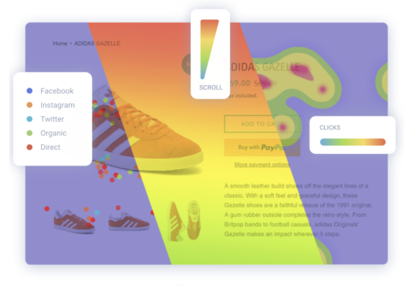
Scroll heatmaps show you how far your visitors scroll down on a certain page. If they stay above the fold it is a warning sign that the content does not encourage them to scroll further. In this case, you should always place the most important message and CTA above the fold and try to give users a visual cue or avoid scroll hijacking.
Click heatmaps are your tool to find the most popular areas on your website. This type of heatmap shows the exact click positions, so you will get accurate data regardless of the page layout. Also, these maps are great advisors on which content should be clickable and which shouldn’t.
Segment heatmaps are a little different. These allow you to filter data in a convenient way to see if any of the segments are behaving differently.
Wrapping up
The sole aim of your website building should be such that it eliminates all confusion and complexity. It should be visually comfortable to the users and understandable to the readers. They should find it easy to surf the website and get the desired information easily. Implementing these UX design principles will make you website ‘Effective’.
3 Comments
Whois es
2018-09-26 at 11:51Awesome post, thanks for it.
Congratulations for the wonderful work you are doing in this site.
Robert
2018-10-08 at 16:22Thank you, glad you liked it!
ellen
2021-05-10 at 15:27This is very nice post. It is easy to understand and useful for me. Thank you so much for sharing this.