Why do you eat at McDonalds? Because it’s the cheapest option in town? Then, why don’t you buy something at the local bakery? Maybe, do you want to eat something warm? Then why don’t you go to a low-budget canteen, which seems even healthier than what Mcdonald’s offers? No hate, I don’t have any personal problems with McDonald’s, in fact, I also go to this fast food restaurant once a week.
The point is that humans usually don’t think rationally. In the 20th century, a bunch of economists believed that humans are homo economicus, who are consistently rational, and always want to maximize utility.
Well, Kahneman and Tversky (two very well-known economists, who examined the psychological acts behind decision-making) stated that this statement is false, and defined heuristics and biases, which all affect our brain emotionally.
Do you really know why people die in airplane crashes so often? The fact is the opposite; people rarely die because of airplane accidents, but since these are all generating media coverage, we are always notified about these catastrophes.
Emotional website design also takes advantage of our brains. But be aware, your task is not equal to manipulating your visitors’ brain with fake, or misleading information. Instead, you need to create an experience that resonates with your target audience. In this article, we will show you the power of emotional website design, the way it can enhance your user experience and the factors that can be the catalyst of a better emotional website.
Table of Contents
Psychological act behind emotional website design
There is a book published in 2004 by Don Norman that was an actual bestseller. It’s called “Emotional design: why we love (or hate) everyday things”. In this book, the author writes examples when humans like attractive things even more than less attractive ones, even though the two products are the same in terms of their functionality.
Don Norman distinguishes three different types of processing in our brain:
- visceral level – automatic layer
- behavioral level – that part contains the everyday behavior
- reflective level – contemplative part
If a lizard detects danger he runs elsewhere. That’s an automatic layer, the detection of danger automatically activates a feeling in the lizard’s brain that he needs to run. However, some animals can’t do more than a visceral level of sensing.
Then imagine that your dog sits down when you bring the food to her. She knows that because you didn’t give her her meal without sitting on the ground in the past. Maybe you needed to do this activity 100 times to successfully teach your dog to this. Well, that’s the behavioral level, and most mammals are actually able to learn, analyze situations, and behave correctly.
But only humans have a reflective level, thus we are able to learn new concepts and generalizations about the world. Norman’s example of reflective level human behavior is very understandable: on a visceral level roller coasters are dangerous.
We don’t want to go fast and at a high distance, because we don’t want to die, and our brain tells us: this can be harmful to you, don’t do that. But reflectively, we kinda like when most of the people refuse to take a ride, and we believe they are too scared. However, we want to show that we are the bravest human in terms of them, turn off our brain’s visceral level, and take the ride to then feel appreciation.
Before we do actions or sense something, our brain always runs through these three levels and decides whether it is a good or bad choice.
What is emotional design?
In terms of visual design, what do these three levels mean to us?
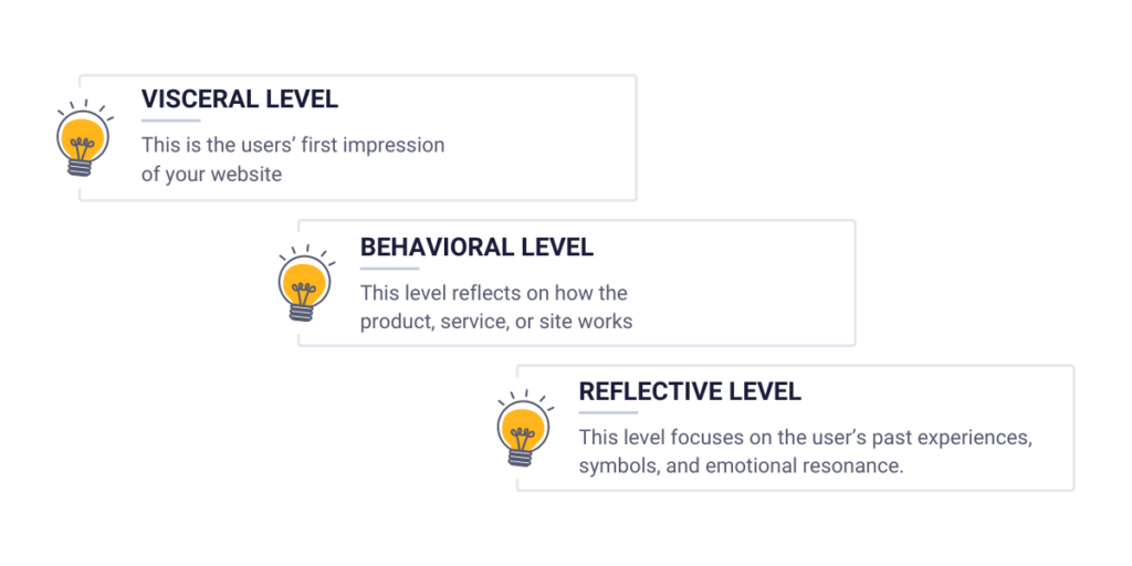
1. Visceral level
The appearance of the site. This is the users’ first impression of the site.
That’s why the site needs to be appealing. It means you need to grab the user’s attention to stimulate the user to take action as soon as possible.
2. Behavioral level
This reflects how the product, service, or site works. What we experienced during our multiple uses. Usability, functionality, and overall user experience; these are what all matter here. A website design must work smoothly, and it is desired to satisfy the user’s functional needs. Your site needs to be effective because of the behavioral level of human sensing. The users need to find what they are looking for, without bugs and badly maintained elements.
3. Reflective level
This level focuses on the user’s past experiences, symbols, and emotional resonance. This is the only level that not only focuses on immediate reactions, instead it wants to create lasting impressions in the humans’ brain. The reflective level is connected to our memory. So, in terms of emotional design, a website also needs to be memorable, but in a positive way. One of your main tasks is to create a relationship between the user and your brand.
In conclusion, we can finally understand what emotional website design is exactly: emotional website design is evoking positive short-term, and/or long-term feelings in users to create a better user experience, and to convince the visitors to buy from you now, or in later stages.
How to choose the right emotion?
Now that you know the basics of these three levels, and how these are connected to emotional website design, we need to take one last factor into this equation. Basically that will decide how to play with these three levels of human sensing to make out the maximum from your site.
And this “factor” is what your whole brand depends on. The potential buyers! There is a very plain rule in marketing: no company is desirable by anyone. Also, there is no product and service that everybody likes, and wants to buy. But brands have no intention to advertise their product to everybody. They establish some target audiences, which they prefer to reach with their messages, and try to convince only those groups of people.
In terms of emotional website design what does this mean? You need to tailor your site’s emotions based on your brand’s target audiences.
Example of emotional design
Let’s analyze an example to understand this on a whole new level.
You’re running an online film and series subscription site, but you have only horror-themed shows in your offer. Horror is not for everybody, thus not every person in the world will be interested in your brand. You need to define first who will be your potential buyers.
- Horror enthusiasts – they are fearless and adventurous, and like to explore the dark side of human nature. Potentially they are between the ages of 18 and 50, watch multiple horror movies in a week, love dark stories, and books, and seek brutal, frightening videos on social media.
If you are a marketer, you can even make human personas based on these characteristics to be clear who you are looking for.
Elena, the horror-seeker
Age: 28
Occupation: tattoo artist
Characteristics:
- horror fan since childhood
- likes to attend horror festivals, and other horror-typed programs
- she likes classic, and indie horrors as well
- she has limits in terms of brutality
A marketer would create 2 to 4 more types of potential buyers and personas, and start to advertise based on this information. However, you can not only use this information in advertising but you need to also create a more-optimized website design for these potential buyers.
In the next chapter, we will meet with different emotions, and their combinations. Believe it or not: this has a crucial role in emotional website design.
Possible emotions to choose from
There are pleasant and unpleasant emotions. Pleasant are excitement, happiness, or love, while unpleasant are fear, anger and sorrow, for example.
However, since we not only have a visceral sense, we can sense things differently. Think of the old example: a lizard always tries to escape when he senses danger, but some humans love roller coasters because of both the reflective and the behavioral levels. We not only want to sense pride, and uniqueness, but we are also sure that the roller coaster is safe, and we won’t be dead by the end of the round.
Know your visitor’s characteristics
The actual emotions you need to use in your website always depend on your visitors’ characteristics. So, negative emotions do not specifically mean negative things in every sub-group and every website. And there is one more thing here: some products and services even want to create a negative feeling inside humans, and people are glad to buy these things. Why? Do we really like to suffer? Well, in some cases, yes: we rather get up early just to go to work, rather than sleeping more, but getting fired. That’s why we buy alarm clocks!
These examples are referring to how hard it is to pick the best emotions for your customers.
Choose the main emotions to trigger
Website designers usually pick some of these emotions, when they establish a user-optimized site based on their needs:
- Joy – happiness, contentment, and pleasure.
- Surprise – wonder, excitement, astonishment.
- Fear – unease, excitement.
- Sadness – melancholy, empathy.
- Anticipation – excitement, curiosity, eagerness.
- Anger – frustration, passion.
- Love – affection, warmth, connection.
- Empathy – understanding, support
- Curiosity – interest, exploration
Of course brands usually use these in a combination.
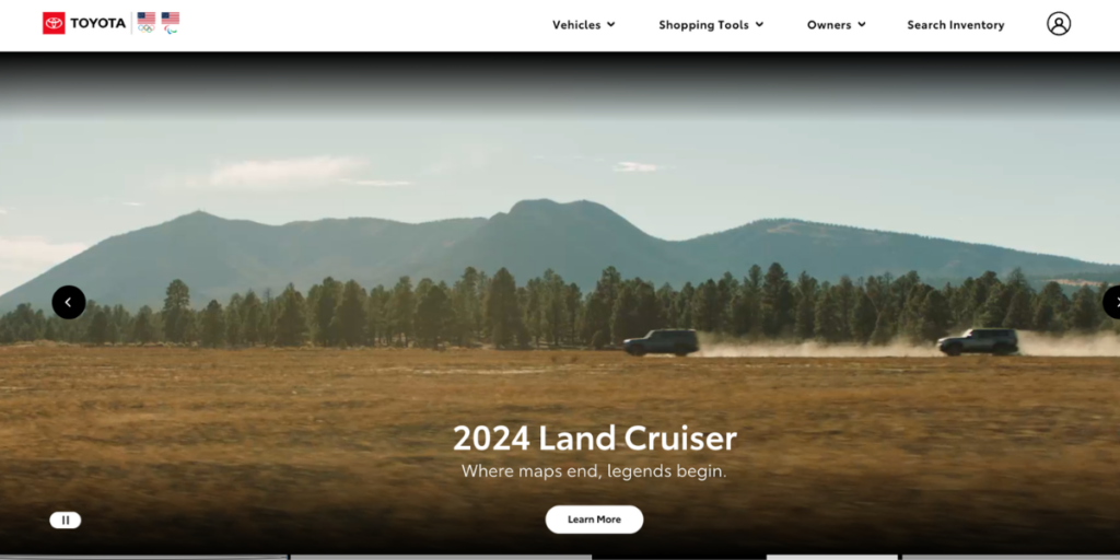
How does Toyota use emotional website design?
Take a look at Toyota’s landing page, and one frame of their displayed video. What does this emotionally mean to some of us? Curiosity, fear, and joy in a combination. Now that we have already given you a slice of how other companies use emotional website design in their site, it’s your turn to learn these tricks in a minute!
What can influence the emotions of your audience on your site?
On a website there are plenty of ways of generating emotions to your customers. In this chapter, we explore the most immersive ones!
The psychological effect of colors
As we already discovered symbols have a huge importance in our brain. These help us connect things with each other, and help us acknowledge complex correlations, and stories.
What if I tell you that different colors have different meanings, which designers usually take advantage of? Well, humans do not typically recognize these symbols intentionally, and usually they are not aware of these effects.
How does Screambox use colors?
However, allow me to bring back the horror-themed example. Screambox is a horror-themed subscription site that I talked about earlier. What color illustrates horror the best? White, pink, or black? I think most of you picked the option “black”. Why? Because humans connect black with mystery, evil, and death.
Meaning of colors in marketing psychology
As you can see, it’s black. Now let’s see what we associate with other colors:
White – purity, cleanliness, and virtue
Brands that have easy solutions to a problem try to demonstrate it with a white background.
Red – fire, violence, warfare, love, and passion
Websites that sell gifts to lovers and friends usually use this color.
Orange – change, movement, often associated with health and creativity
Brands that want to emphasize continuous movement (for example travel agencies) use this color.
Yellow – happiness, hope
Brands that want to establish a deeper connection between the brand and their visitors use this color quite often.
Green – growth, envy, jealousy, stability, harmonization, nature
Nowadays brands use this color to highlight their positive feelings about sustainability.
Blue – calmness, responsibility, peace, safety
Companies use this color to ensure their users that their platform, product, or service is safe.
Purple – wealth, royalty, expense
Brands use which want to highlight their premium status quo.
Of course, there are some other colors and shades, and other meanings. The real project here is to connect your product/service, and your target audiences, and find the perfect color which resonates with their feelings when going up to your site.
Yet, the power of colors is not only usable in backgrounds, but in fonts as well. Also, you can also use more colors if you want to emphasize the combination of these emotions but try not to fall off the other side of the horse.
The power of images
What do you think, which luxury brand’s landing page contains this photo? This demonstrates a skinny lady with a tight dress inside a luxurious building.
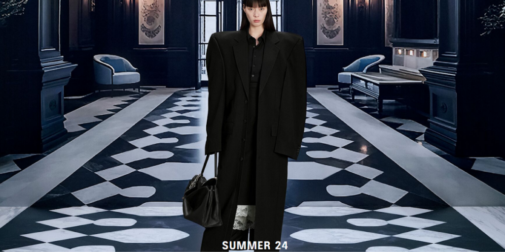
Well, this is Balenciaga’s image, but why did most of you predict that? Because Balenciaga’s vision is to create unique, but strange dresses to convince buyers to reconsider what they previously knew about fashion. If we want to determine Balenciaga with the combinations of emotions we would choose surprise and curiosity. This picture demonstrates both of them.
The fact is, images are even better elements in emotional website design than colors. Images can direct emotions more powerfully. For example, you may not know at first sight that Unicef’s blue color refers to peace, and safety.
Increase willingness to buy with videos
However, sometimes companies not only use images, rather than short videos to demonstrate emotions. Take a look at Toyota’s, Ford’s, or Ferrari’s webpage. All of them use videos, which start automatically when the user arrives at the site.
Why? Because it’s part of the storytelling process. These are all expensive products, and they need to emphasize why they are unique, and better than the others. And storytelling affects the user emotionally.
An autoplaying video from Ferrari highlights the speed and the excitement. The camera can’t even follow the car, which basically disappears from the screen within a second. In Ford’s video, they emphasize that the car can go on every dirt and that they really care about sustainability. On top of that they are fast as well. As you can see they want to convince others than Ferrari tries.
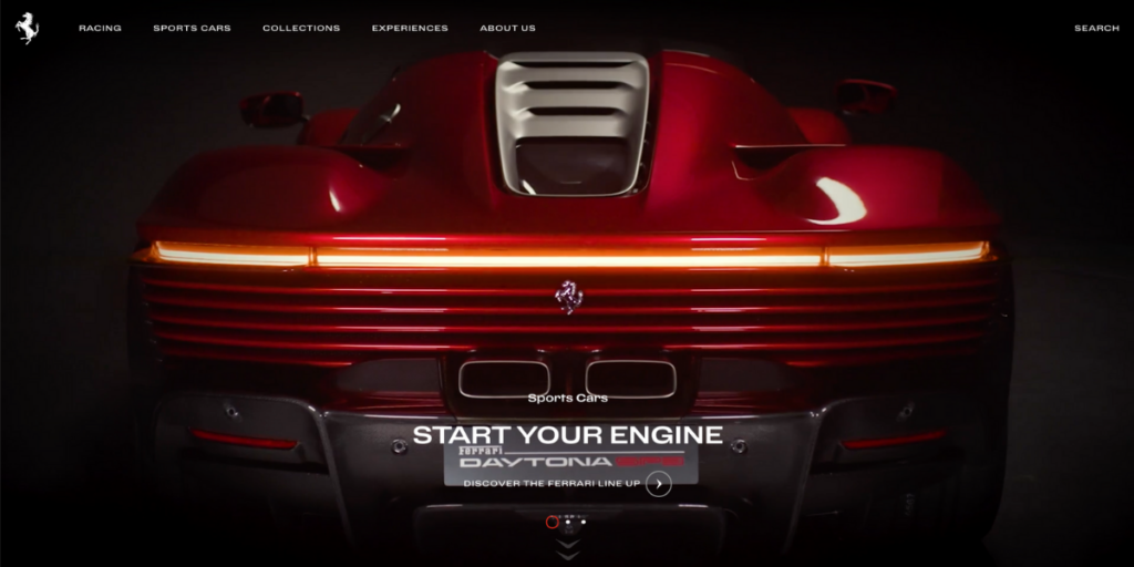
The guy who only cares about speed, and has the resources will choose Ferrari. The one who has more empathy will rather choose one of Ford’s cars.
Emotions are really easy to display with videos, however, your visitors won’t watch hundreds of videos. Their time is way more precious than this. That’s why you need to maximize the number of videos, in fact, one is more than enough.
Also, it can distract the visitor’s attention. Videos are great when the visitors need to think more about buying the product/service, because it’s expensive. However, I would not recommend using them when you sell cheap products!
How to measure success?
There’s only one thing left. Let’s say that you introduced emotional website designs four months ago, and you are curious whether it is successful for your brand, or not.
The fact is, you are a little bit late, and you won’t get clear data about your success. Why? Because at least you need to track your numbers from the start of this introduction. But it’s even better, if you have data from your previous website designs to compare the changes. However, the second is manageable.
Data analytics tools can help you with that! They are able to track your visitors’ individual sessions, clicks, scrolls, or frictions which are all crucial to determine success. It’s very easy to connect these tools with your site, and after you are done with this, you can finally analyze your users.
Use A/B tests
Do you remember what I said earlier? It is manageable if you don’t have previous data. That’s because, with some data analytics tools, you can create A/B testing.
A/B testing means your users can either go to the “A” version, or the “B” version of your site. In this case, the “A” version is the one with an emotional website design, and “B” is the original. From a few weeks of continuous tracking, you can determine whether your emotional website design success was better, and that you would implement that format.
Also, you have loads of other options to measure success with data analytics tools, just as:
- Website heatmaps – with scroll heatmaps, you get to know how long your visitors scroll down, and with click heatmaps you can realize where most of them click to.
- Session recordings – with session recordings you can analyze single sessions to track individual problems with your newly implemented emotional website design. Also, if something is not functioning really well based on some information, here you can check the “why”-s.
- Conversion funnel analysis – here you can track your customer’s journey, where are the main friction points, and the percentage of your converted users.
I have good news for you: these are all available at our data analytics tool, Capturly Analytics, which provides you with a free entry to these tools.
Conclusion
As you can see, emotional website design is a huge topic, with many interesting psychological researches, and new and new areas that are waiting for researchers to discover.
In this article, we looked into the human brain itself, and understand why we don’t think rationally most of the time. As emotional website design is built based on these examinations, we needed to discover the three levels of sensing, and their differences.
After that, we defined what emotional website design is exactly, and how finding the right emotions can be good for our company. In the end, we discussed three areas where designers can use emotional website design in their everyday lives. We hope that the brought examples made the understanding of this article even more easier.
1 Comment
FNAF
2024-05-23 at 04:40This level focuses on the user’s past experiences, symbols, and emotional resonance. This is the only level that does not just focus on immediate reactions but wants to create lasting impressions in the human brain.