Ever wonder how websites get you to trust them? That’s where digital nudging comes in. It’s like a friendly guide nudging you in the right direction online. In this guide, we’ll explore what digital nudging is, its different types, some neat tricks, and how tools like Capturly can make it even better. It’s all about understanding the secrets behind gaining trust on the internet. Ready to learn?
Let’s get started!
Table of Contents
What is Digital Nudging?
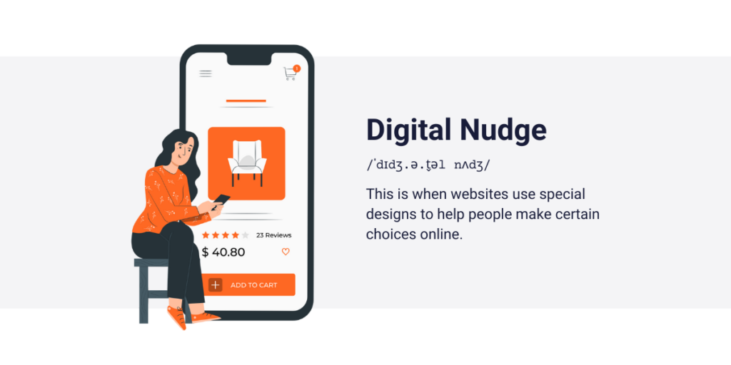
Imagine you’re surfing the web, doing your usual thing. Suddenly, you notice something guiding you—a digital nudge. So, what’s this nudging all about?
Nudging is like a quiet helper on websites. It’s not in your face; it’s more like a friend giving you a nod in the right direction. Picture this: you’re on a site, and instead of overwhelming you with choices, a digital nudge gently suggests what might be a good pick.
In the digital realm, nudging is your silent buddy, making your online experience smoother. It’s not about telling you what to do; it’s about making your choices easier without the internet noise. It’s like a soft guide saying, “Hey, check this out—it might be what you’re looking for.”
Now, why does this matter? Imagine you’re on a shopping site, and instead of feeling lost, you see recommendations that fit your taste. That’s nudging at work—making your choices more tailored to you. It’s the difference between scrolling endlessly and finding what you need without the fuss.

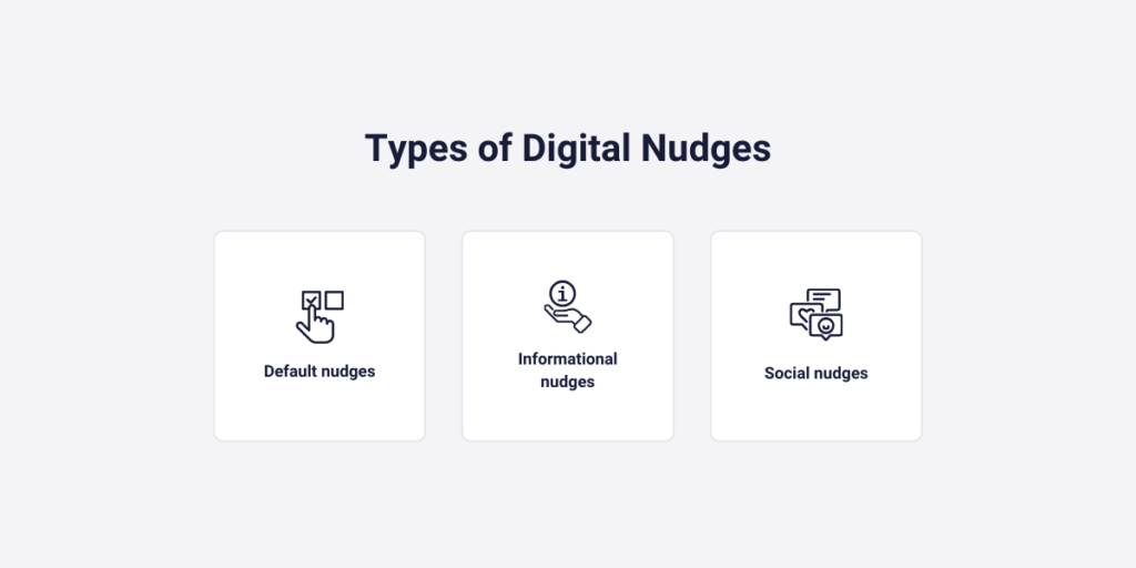
Digital Nudge Types
Understanding these nudges is like having a map for your online adventures. It allows you to see how websites guide you and why. Knowing the different types lets you recognize when a website is using these friendly nudges to enhance your experience. It’s about being aware of the invisible hand that’s there to make your online travels more enjoyable.
All right, let’s take a deeper dive into the fascinating world of nudges and explore the various types that shape your online experience. Think of these nudges as the tools in a digital toolbox—each serving a distinct purpose to make your journey on the web more intuitive.
Informational nudges
Picture this: you’re browsing a website, and a little pop-up appears, sharing important info. That’s an informational nudge. It’s like a friendly guide giving you a heads-up without you having to search high and low. Whether it’s updates, announcements, or key details, informational nudges ensure you stay in the loop effortlessly.
Social nudges
Ever wondered what others are up to on a website? Reviews, popular choices, or trending items—those are examples of social nudges. It’s like peeking into the virtual world of others similar to you. Social nudges make your online experience more relatable by showing what people in your shoes like and choosing.
Default nudges
Have you ever noticed that some options are already selected when you’re filling out a form or making a decision on a website? That’s a default nudge at play. It’s the website subtly suggesting, “Hey, most people go with this option. Maybe it’s a good fit for you too.” Default nudges make choices a bit easier by providing a gentle nudge in a particular direction.

Now, these digital nudges might sound complex, but they’re pretty straightforward. They act like signposts in the vast online world, guiding you through the digital landscape. Informational nudges share crucial details, social nudges connect you with what’s popular, and default nudges gently steer you toward options. It’s all about simplifying your digital journey, making it smoother and less confusing.
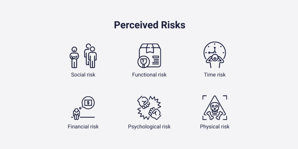
Perceived Risks
In the vast digital landscape, where every click carries potential risks, digital nudges can serve as guiding lights, helping users navigate through functional, social, time, financial, physical, and psychological concerns. By combining the power of digital nudging with an understanding of perceived risks, websites can create experiences that prioritize user safety and confidence.
Let’s explore how digital nudges can address each dimension of perceived risks:
1. Functional risk
Digital nudges can provide clear guidance and support to users, ensuring they understand how to use products or services effectively. By offering tooltips, step-by-step instructions, or interactive tutorials, websites can reduce functional risk, helping users feel more confident in their interactions.
2. Social risk
Nudges can encourage positive social interactions and foster a sense of community within online platforms. By highlighting user reviews, testimonials, or community forums, websites can alleviate social risk, reassuring users that their interactions are valued and respected by others.
3. Time risk
Digital nudges can streamline the user journey, helping users find what they need quickly and efficiently. By offering personalized recommendations, search filters, or time-saving shortcuts, websites can mitigate time risk, ensuring users’ time is spent productively and meaningfully.
4. Financial risk
Nudges can instill trust and confidence in online transactions by providing transparent information and security assurances. By displaying trust badges, secure payment icons, or real-time transaction updates, websites can reduce financial risk, reassuring users that their financial information is safe and protected.
5. Physical risk
Digital nudges can guide users towards reputable and trustworthy products or services, minimizing the risk of physical harm or safety concerns. By highlighting quality assurances, product certifications, or customer satisfaction ratings, websites can mitigate physical risk, ensuring users’ well-being is prioritized.
6. Psychological risk
Nudges can promote positive online experiences and protect users from harmful or distressing content. By implementing content warnings, user feedback mechanisms, or content filters, websites can address psychological risk, creating a safe and supportive environment for users to engage in.

By leveraging digital nudges to address each dimension of perceived risks, websites can empower users to navigate the digital landscape with confidence and trust. Whether it’s providing clear guidance, fostering social connections, or ensuring transactional security, digital nudges play a crucial role in creating online experiences that prioritize user well-being and safety. Let’s embrace the potential of digital nudges to create digital spaces that inspire trust, confidence, and positivity for all users.
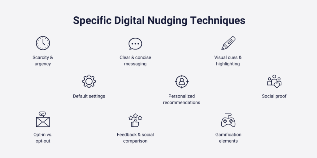
Specific Digital Nudging Techniques
Think of these as the secret moves websites use to make your digital interaction a breeze. Buckle up— we’ll explore these techniques with real-life examples from brands that know how to nudge with finesse.
1. Clear and concise messaging
Ever visited a website where the messages just make sense? That’s the brilliance of clear and concise messaging. Take Dollar Shave Club, for instance—they use straightforward language to guide you through their subscription process.
Their site ensures you know what you’re getting, and they even throw in a bit of humor to make the journey enjoyable. Dollar Shave Club’s witty and straightforward messaging simplifies the subscription process, making it easy for you to understand the value and humor in its offerings.
2. Default settings
One prevalent nudge technique is setting default options that encourage users to take a specific action without actively choosing it. An excellent example of this is found in subscription-based services like Spotify or Netflix, where the default option for continuing the subscription is often highlighted, nudging users towards automatic renewal unless they opt out.
3. Social proof
Social proof nudges leverage the power of social influence by showcasing how others have interacted with a product or service. TripAdvisor’s use of user-generated ratings and reviews is a prime example of this, where positive reviews and high ratings nudge prospective travelers towards booking accommodations or experiences based on the experiences of others.
4. Scarcity and urgency
Nudges that create a sense of scarcity or urgency prompt users to act quickly by highlighting limited availability or time-bound offers. E-commerce platforms like Amazon utilize this technique effectively by displaying messages such as “Only 3 items left in stock” or “Limited-time offer: Ends in 24 hours,” nudging users towards purchasing missing out.
5. Personalized recommendations
Tailoring recommendations based on users’ past behaviors and preferences is another powerful nudge technique. Amazon’s “Customers who bought this item also bought” feature suggests complementary products based on previous purchases, guiding users toward discovering additional items of interest and increasing their overall shopping experience.

6. Visual cues and highlighting
Using visual cues such as arrows, icons, or contrasting colors to draw attention to specific elements on a website nudges users towards focusing on particular content or actions. LinkedIn’s subtle highlighting of profile completeness progress nudges users towards completing their profiles by indicating areas that need attention, encouraging a more comprehensive and engaging user experience.
7. Gamification elements
Incorporating gamification elements such as progress bars, badges, or rewards systems motivates users to engage with a website’s features or content. Duolingo’s use of streak counters and achievement badges nudges language learners to maintain consistency in their daily practice sessions, fostering a sense of accomplishment and progression.
8. Feedback and social comparison
Providing feedback on users’ actions or progress and facilitating social comparison encourages desired behaviors by leveraging the principles of accountability and competition. Fitness tracking apps like Strava use leaderboards and performance comparisons among peers to nudge users towards achieving personal fitness goals through friendly competition and social validation
9. Opt-in vs. opt-out
Finally, the strategic placement of opt-out and opt-in choices influences users’ decision-making processes. Donation platforms like Patreon use an opt-out model, where users are prompted to choose a donation amount and frequency but can easily adjust or cancel their contribution, nudging them towards supporting content creators while maintaining control over their financial commitments.

By understanding and implementing these diverse nudge techniques, websites can effectively guide users toward desired actions, enhance user engagement, and optimize the overall user experience.
Capturly in Action
Getting started with Capturly is a breeze. Simply integrate it into your website, and it quietly works in the background, collecting valuable data. You can then log in, explore the visual insights, and make informed decisions to enhance your nudging game.
Capturly is like having a backstage pass to see how well these nudges are performing and where they can be fine-tuned. Let’s explore how Capturly empowers businesses and website owners to check the effectiveness of their nudges in a way that’s both insightful and user-friendly.
Imagine having the ability to see exactly how visitors interact with your website. Capturly provides a visual playground, capturing user sessions to give you a front-row seat. It’s like watching a movie of your users navigating your site, showing you where they linger, what catches their eye, and where they might need a little extra guidance.
💡 Example: Let’s say you have a limited-time offer digital nudge on your homepage. Capturly can reveal how many visitors notice it, engage with it, and ultimately convert. It’s like having a report card for each nudge.
Heatmaps for insight
Ever wished you had a heatmap of your website, highlighting the hottest spots where users focus their attention? Capturly makes it happen. Heatmaps visualize the areas of your site that receive the most clicks or attention, guiding you to optimize those sections for maximum impact.
💡 Example: If you’re using clear and concise messaging as a digital nudge, Capturly’s heatmap might show you which words or phrases attract the most attention, helping you fine-tune your messaging strategy.
Conversion analytics
Now, let’s talk numbers. Capturly doesn’t just show you where users click; it also breaks down the nitty-gritty details of conversions. It’s like having a personal analyst providing insights into how many users take action after encountering a nudge.
💡 Example: If you’re running a personalized recommendation nudge, Capturly can reveal the conversion rates, telling you how effective it is in turning browsers into buyers.
Capturly acts like a magnifying glass for your website, zooming in on user behavior and the impact of your nudges. It’s not about complicated graphs and numbers; it’s about straightforward visuals that empower you to understand and improve your online strategies.
Conclusion
In our journey through the world of digital nudging, we’ve covered the basics, explored digital nudge types, and unveiled specific techniques with real-life examples. We even delved into potential risks in the online realm.
The core takeaway? Digital nudging strategically builds trust online. Whether it’s through clear messaging, personalized experiences, or limited-time offers, digital nudging enhances the user journey.
To gauge the effectiveness of your nudges, we introduced Capturly—a digital detective that monitors engagement, analyzes conversion rates, and supports continuous refinement.
Armed with this knowledge, you’re ready to create an online experience that not only attracts but also fosters trust. So, keep those nudges thoughtful, messaging clear, and the online journey seamless. Your digital adventure awaits—happy nudging!

Don't forget, sharing is caring! :)

![How to Build Trust With Digital Nudging? [Beginner Guide]](https://capturly.com/blog/wp-content/uploads/2024/03/How-to-Build-Trust-With-Digital-Nudging-Beginner-Guide.png)