“Dear Website Owner!
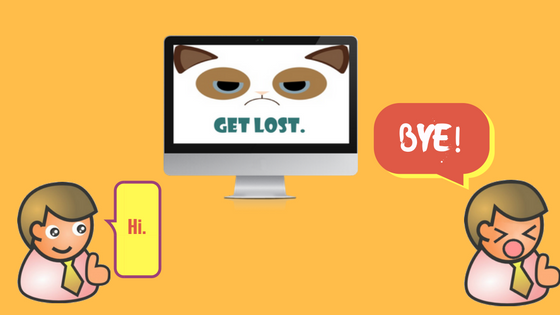
Hi! I’m your customer! Or I would have been if your website hadn’t driven me away. So out of the goodness of my heart I decided to notify you about the mistakes you made.
First of all: what’s up with this terrible design? The backdrop is a simple shade of mild purple, but it’s so crowded with images, buzzwords marketing blurb I could barely navigate through it! I got confused right on the spot!
To make things worse, the menu buttons blended into the background color so I had a hard time deciding which part registers as “clickable”!
And when I wanted to use a link, it was broken and directed me to a long-deleted page!
I also found some typos! How unprofessional, you should definitely check these out.
Also, no terms of condition or privacy policy? Are you trying to hide something from me?
When I finally found the item I was looking for, all I saw was some badly-cropped image from the Internet and I was unable to enlarge it! I want detailed images and full description about my product!
When I looked up your contact menu I had to realize that you lack both live chat and a proper phone number, not to mention you don’t specify whether you operate 24/7 customer support. If you don’t tell me how long I should wait for an email reply, I’m out!
On a side note: I checked out your mobile website and it was a letdown. Poorly optimized, I could hardly navigate through it! Pro tip: make it touchscreen-friendly.
As for your social media presence, I only found your Facebook site, but it had no content from you, just some shared posts and motivational pictures. I didn’t feel engaged, as if you gave up on the idea to reach me at all!
And the checkout process, don’t let me start! First you bombarded me with those irritating popups to sign up, and then you condemned me to fill out an overly long form before checking out. I don’t want to waste my time with formalities, provide me a mean to pay in an easy manner.
And to add insult to injury, the system demanded email notification to complete the purchase!
Well, that was the part when I gave up on the idea of ordering from you. I bid you farewell and I hope once we can do some business together, but only if you find a remedy for these aching problems.
Sincerely,
Your Ex-Customer”
The Causes of Shopping Cart Abandonment
As you can see from this fictional complaint letter, the reasons for shopping cart abandonment can be various. Poor customer support, missing description, amateurish spelling errors, high prices, overly long checkout process instantly dismiss a potential customer. To be frank, our friend was from the persistent kind, as most customers are turned down instantly upon seeing an unintuitive, boring or messy design.
If you want to understand how fast customers can make up their mind on whether they like a webpage design or not, you should read this great article from the guys at ConversionXL.
According to official case studies, visitors only need around 50 milliseconds to form an opinion about your site. This is barely enough to glance through your homepage, yet it turns down a significant amount of people. Grabbing their attention and motivating them to explore your offers are the keys to raise conversion rates. A good website design must be clear, apprehensible and most importantly user-friendly. Easier said than done, right?

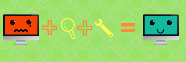
Finding The Pain Points
Slowly refining your website takes lots of effort, and without the proper tools, the optimization turns into a guessing game, and changing the site for the worse will scare away even more customers. That’s when nifty little visitor analytics tools such as Capturly come into play. Such tools provide a good opportunity to identify and deal with customer pain points. For example, by checking the visitor engagement heat maps of your page, you’ll see the hot spots of your website, aka the parts people interact with the most. This helps to identify the breaking points during the checkout process, as the problem is around the “cold” areas.
For a more analytical approach, you can utilize session replays, which are basically recorded footage of your visitor’s mouse movement. Following their actions can help you understand user behavior and see how they got from A to B and why they dropped off at C. This plays a vital role in optimizing customer journey as it highlights the poorly-placed links people pass by and displays the actual time someone needs to reach the end of the order.
Session replay also provides clues for small, but meaningful improvements. A lot of people try to click on an image that is only for decoration. This conveys that: “we are interested in this image, let us enlarge it”! Last but not least, website analytic tools can help you identify the biggest reason for cart abandonment: high prices. In case a significant amount of people select a specific offer than it’s a sign that they are copying it to Google to search for a better alternative. This clearly indicates that you need to change the price tag.
Refining The Results
Finding the problematic areas on your website is only the first half of your job. After making the changes, you still need to monitor customer behavior to see whether the new stuff that you implemented works or not. Visitor analytics tools work like a charm for these scenarios as well. Use session replay to investigate how effectively your main page attracts attention. You can find examples of how visual appeal can play a huge role in your website’s success in this blog post from Usabilla.
Also, you may wish to experiment by adding some bold Call To Action words (or CTA in short). These are your verbal soldiers that prompt users to immediately follow their lead and perform an action. CTAs should be brief, simple but explicit. By means of them, you can help visitors to explore your site more deeply and convince them to sign up, subscribe or check out a coupon deal.
Try to Avoid Mistakes With CTA
Just like with anything else, it’s easy to slip with CTAs. Common mistakes include poorly placed or colored buttons that are indistinguishable from each other; too many CTAs piled upon each other; overly long, boring lines full of technicalities and hollow marketing lines that have no emotional appeal. It goes without saying, that heatmaps are your biggest friends when testing the effective placement of a CTA.
For some inspiration, check out HubSpot’s awesome collection of irresistible CTAs.
In summary, there are plenty of things that can go wrong on an e-commerce site, driving your customers away. From untasteful design to broken links, problems pop up in the least expected places.
As the above examples clearly show, in order to maximize your online revenue it is essential to constantly monitor your website, analyze and understand your visitors’ needs and pain points and optimize the customer journey.
Just as the old saying goes: a website owner’s job is never done! Okay, okay I have just made that up 🙂 but it is still something to live by!
2 Comments
cs2 commend bot
2024-01-09 at 02:03nice post keep it up!