
Increasing revenue is a goal sought by many in the e-commerce field. Webshop owners invest a lot in sales, advertising hoping for the best, however increasing conversion rate on your webshop is not as difficult as one may think. Even after reading this article, you will be able to do a lot in order to turn your visitors into customers. But have no fear, as we collected 9 useful tips that you can apply right away!
1. Safety is number one
When we talk about money transactions we mean safety. Every client wants his or her finances to be secured and it is the task of a webshop owner to provide it. At first, set reliable payment methods. PayPal is good, but if you add an extra step it will raise your credibility. Just check and test everything beforehand.
Still, considering the payment methods is not enough. It is also vital to prevent theft of your clients’ data. The best way to assure it is to use a Security Socket Layer certificate that will encrypt all the data exchange between the server and the browser. Apart from security, SSL may also increase your search engine rank a bit, so keep that in mind.
It is necessary to think about the type of SSL certificate before you decide to buy it. There are multiple SSL types starting from a single domain to wildcard SSL. You can find even SSL providers including certified authorities who offer it at a low price. For example, Comodo SSL certificate, GlobalSign, Sectigo are few reputed authorities that you can keep in mind.
2. Simplicity and UX design
Make your webshop simple and “edible”. In the times of minimalism, no one will examine hundreds of extra functions, banners, or fields your webshop has. Help your visitor to find their product and remove all the bulky elements. Consider what your customers think about your product and use it. Call-to-Action is a must.
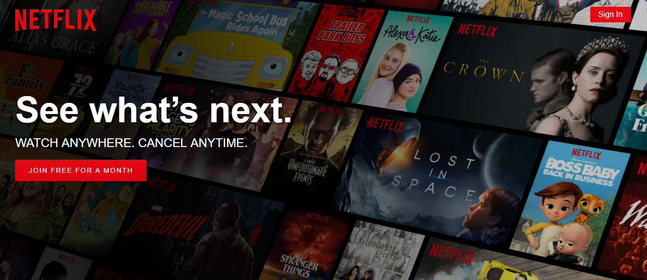
A good example here is Netflix. The first thing the users think of is how to end the subscription if they don’t like it. They’re afraid it may be complicated. Netflix intercepted the problem delicately – they added the phrase “Cancel anytime” right on the Homepage right above the Call-to-Action. What is the best way to reassure clients? Moreover, the buttons “Sign in”, “Join free for a month” and the very logo of Netflix are made of the same color. So, Netflix determined the possible problems and prevented them in advance. One of the best examples of great UX design.
Other practices:
- Highlight the “Add to Cart” button – to focus attention. It’s even better if this button follows the user when he/she scrolls through the page.
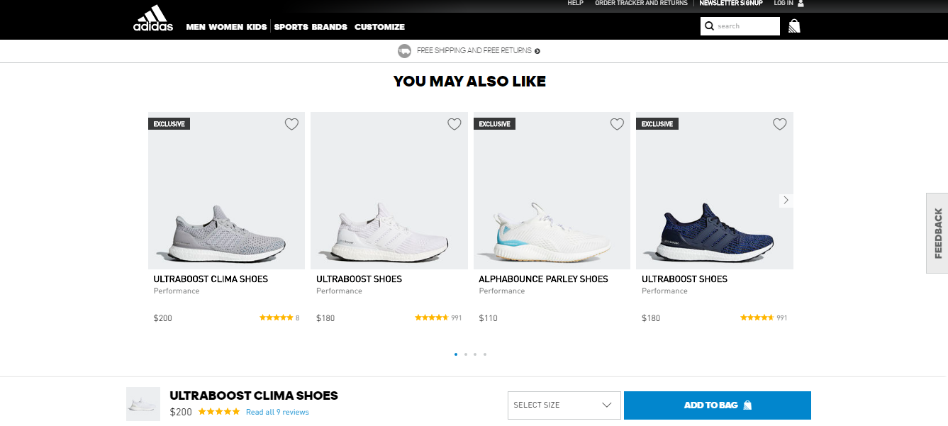
- Show similar products – if your customer is not sure about what to buy, this field will help him to make a decision. Consider the Adidas website. Once you scroll down you see the field “You may also like” and there is still the “Add to bag” button in case you want to buy not only these runners.
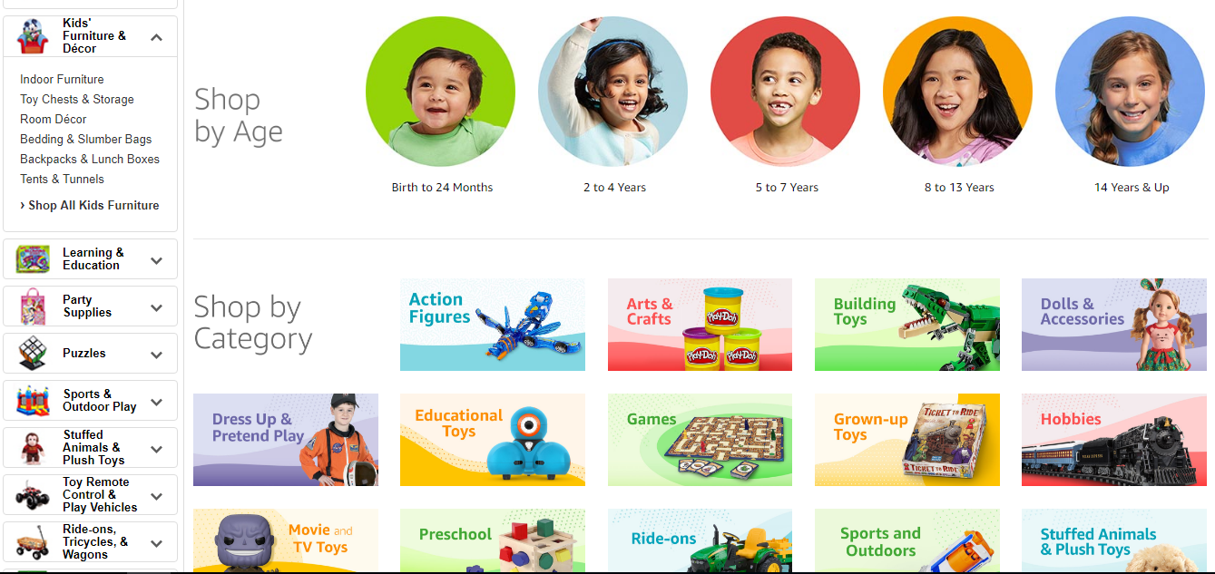
- Specify – the visitor should have a possibility to find everything he/she wants while spending as little effort as possible. Product segregation will help your users to find what they really want without browsing dozens of items.
Amazon is a good illustration of this technique. Imagine that you want to buy a toy. Having a great amount of them, Amazon offers you the option to specify your request using different category filters.
The segregation will not only help your visitors to find what they want. It will also target your products to specific customers according to their:
- financial status
- commitment to a specific brand
- the purpose of their purchase, etc.
3. Manipulate attention using patterns
Users do not read website content the way they read simple texts. Actually, they do not read it at all they scan the given information until they find something that draws their attention. So, it would be beneficial to learn how users do that to use it for your purposes. Luckily, the researchers found the patterns most people follow in this process.
The two most popular patterns are:
The F-pattern
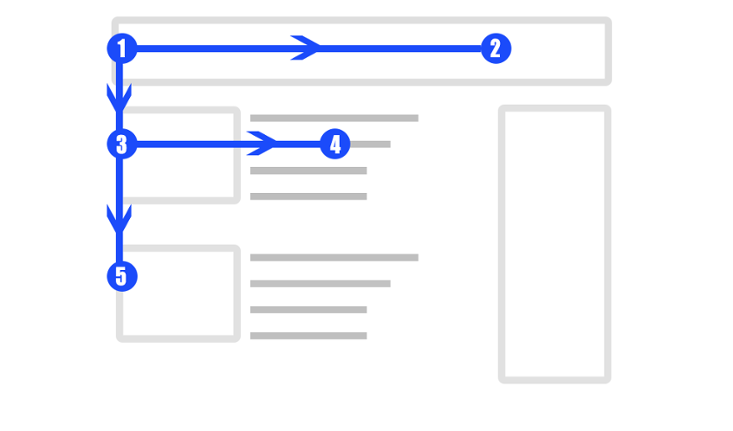
One of the most desired cases of scanning is the F-pattern. It is called so because the way the eyes move reminds the letter “F”. This pattern comes especially handy when the pages are rich in text content. Instead of reading every letter, users just scan through the text like this:
- Then they move down on the left side of the screen
- And yet again go down using the left side
- Repeat the process all over again constantly going down the page
If you can achieve this pattern it will help you to create a good visual hierarchy of your content. In return, it gives your UX more control over the users’ attention, and increase your conversion rates. So, how to use this pattern properly?
- Prioritize everything. The most catching content must be on the top and on the sides. The sides are the best place for CTAs and tag clouds.
- Use keywords at the beginning of every paragraph.
- Give more weight to your text with visual tools such as different colors, italic, bold, and underlined type, etc.
- One idea per paragraph is enough. Don’t overload your users’ perception by masses of thoughts.
The Z-pattern
When your page is made in a minimalistic style and contains little text, then the Z-pattern takes the stage. This layout, as the name suggests, resembles the letter “Z”. Users follow this pattern when they don’t need to “read” much and must focus on some blocks of information.
It works the following way:
- Like in the F-pattern, users follow the horizontal line on the top
- Then they diagonally go down to the next visually weighty block to the left
- Another horizontal line
- Repeat the previous two steps
A reminder: his pattern works best with pages less text-oriented. Considering this, you must understand, what content your visitor should see on these pages and what should he/she do here.
How to use it? All is simple – just follow the “Z”. Set all the most important information along the horizontal lines. Fill the diagonal with “eye candy” content, like a hero image, that also separates one information line from another. Congratulations, now you can manipulate attention!
4. Server accessibility
Another important thing is a stable server. Work only with highly secure and stable connection as even 2 minutes of server break down will cause terrible effects. Imagine, if one randomly closes the doors of Walmart or Asda for a while. It will lead to great losses. The situation with webshops is no different.
5. Consider the representation of your product
It is of little use to think about design, conversion rate, accessibility, and other things when the product is not represented in the best way. Show your goods from all angles and talk about the “profits” the customer will get.
Invest in high-quality photos. Good photos not only delight to the eye of a potential customer but also show what will he/she get. Offer your users multiple views in the UI.
Remember that description is no less important than images. A small text presentation of a product will let your customer see the details you wanted to highlight. Enumerate a number of issues your product solves. Or at least add characteristics. Even the smallest goods need it.
6. Do not ignore client interaction
Answering all the questions will make your visitors more likely to buy something. Constant availability via live chat, chatbot or phone will give you more credibility.
Also, do not forget about watching your chat. As obvious as it sounds, a lot of businesses tend to forget about it. If you answer 30 minutes after a question then it will leave a negative mark on your UX.
No one likes to wait.
7. Profits of Social Media
Another important factor is social media. Users like to boast the new purchase and the best way to do it is to make a post on social networks. Simply adding Facebook or Instagram interaction will definitely increase your conversion rates. Moreover, if you search and connect with users on social networks, like answering their comments about your shop and track the reviews, it will also serve you well.
Social media work both sides. If you keep your customers informed about discounts or upcoming special events in your webshop, it will influence your Conversion rate like crazy. Photos of your office life and activities will also come across very well. For this purpose, you may use different Magento extensions such as Instagram Pro, Twitter, and Facebook that are specially designed to integrate into Magento shops. Still, do not forget to regularly post something on social networks.
8. Define your Return Policies
Clear Return Policies show that you work fairly and do not afraid of refunds in case of something goes wrong. It is how you stand behind your goods. Moreover, refunds will tell you what you should take notice of and if your supplier is still reliable.
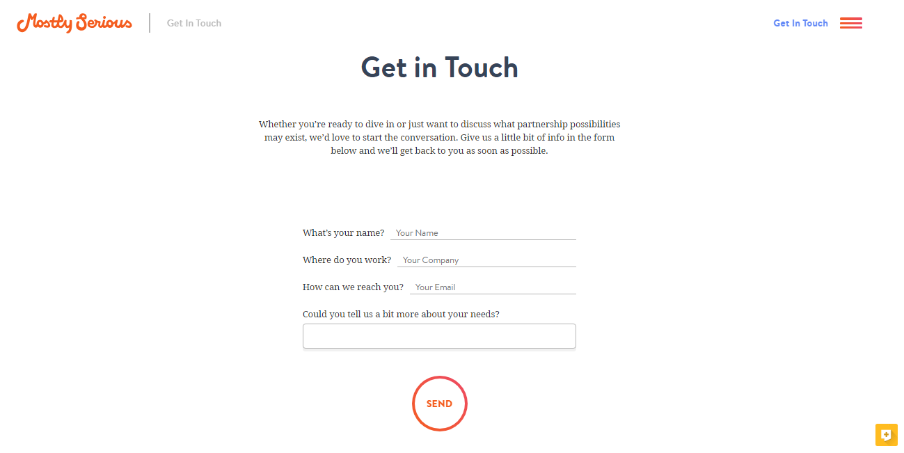
9. Make it easier to contact you
One may ask a question about why do you need a contact form if you have a chat. The thing is that they serve different purposes: while chats are created for answering the spontaneous questions and solve up-to-the-minute tasks, a contact form deals with large applications and suggestions. It is easier to ask for full information concerning the topic, leave your email, and then read the detailed reply later.
Conclusion
All in all, eCommerce is a fast developing sphere and one must work hard to remain at the top. The features we have covered will definitely improve your Conversion Rate and increase your sales. Just remember the more time and efforts you spend in your shop – the more profit it will make.