What makes a good logo? Depending on who you ask, you’ll get different responses. Marketers also have tried out different methods over the years in order to create a stunning logo design that can catch their audience’s eye.
However, one untapped aspect to consider when creating your logo is UX design. While UX is mainly used when designing websites or mobile apps, the core principles should still be applicable to designing a good logo. After all, UX design and logo design has the same goal in mind — to create an end product that is meaningful and relevant to a user.
With that being said, let’s discuss various UX design principles, and see how we can apply them to logo design.
What are UX Design Principles?
Before we dive in further, let’s first define what UX design is. According to Interaction Design Foundation, UX design is defined as:
The process design teams use to create products that provide meaningful and relevant experiences to users. UX design involves the design of the entire process of acquiring and integrating the product, including aspects of branding, design, usability, and function.
From that, UX design principles are essentially guidelines and considerations that can help you create fun and seamless UX for your users. These principles focus on usability, learnability, and accessibility, all of which will lead to creating a product that is enjoyable and relevant to a user.
Great UX can also lead to great revenue down the line, as studies show that for every $1 spent on UX, it will result in a return of $100.
UX Principles and How To Incorporate Them in Logo Design
With different UX principles available, let’s take a look at some of them and see which one we can learn from and incorporate when it comes to logo design.
User-Centric
According to the Interaction Design Foundation:
A User-Centered Design (UCD) is an iterative design process in which designers focus on the users and their needs in each phase of the design process. In UCD, design teams involve users throughout the design process via a variety of research and design techniques, to create highly usable and accessible products for them.
To put it in simpler terms, user-centricity means that your focus is on the user and you make design decisions based on what you know about them. You’ll identify their needs, behaviors, and expectations, in order to create a product that is tailored made for them.
User-Centered Design usually follows this process:
- Research the user
- Understand the user
- Identify their requirements
- Design solutions to their problems
- Evaluate the design and iterate
By following this, a designer can create a product that a user will like and find value in.
How to apply user-centricity when it comes to logo design?
An ideal logo design is not only aesthetically pleasing but is something that matches your target audience. Just like in UCD, your logo should accurately reflect the needs, wants, personality, and preferences of your audience.
Why is this important for logo design? It’s because, in branding and marketing, an emotional connection with your audience is crucial. Your audience prefers brands that they find relatable and they can “see” themselves in. If your logo design reflects their personality, it makes sense that they would be interested in your brand or prefer your brand over the others.
Your logo is also the first thing that your audience sees of you, and is usually your greatest chance at catching your audience’s attention. Even if you have a product that is perfectly tailored to your audience, if your logo doesn’t reflect that, your audience might not even get to try your product.
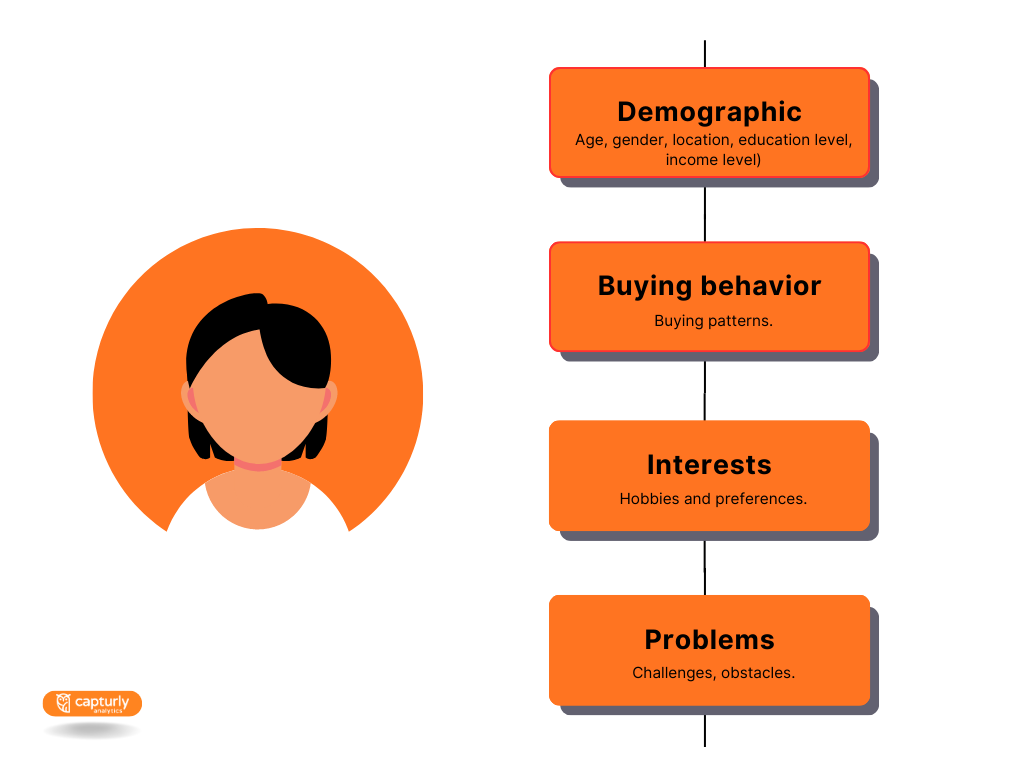
This is why before creating your logo design, it’s important to create your buyer persona. It’s a profile meant to represent your ideal audience and is done through market research and analyzing data from your audience.
To create a buyer persona, you should identify your audience’s:
Just like in UCD, by putting your audience first, you’ll be able to create a design that is perfectly fit for them and one that they will like.
Consistency
Consistency in UX design can mean two things.
First, it means your design is consistent across all your platforms, pages, or screens. Your design should have a similar look, layout, pattern, and function. It also means that all your products under the same brand have a similar look or feel to each other, to make it easier for your user to identify that those products are under the same family.
Second, it means being consistent with the user’s expectations of how things should look or work.
As per Jakob’s Law
Users spend most of their time on other sites. This means that users prefer your site to work the same way as all the other sites they already know.
Basically, this means that your product needs to follow some standard commonalities or rules to meet your user’s expectations. For example, clicking the magnifying glass icon means searching, your social media links are located on your website’s footer, clicking the logo on your site will take you back to the homepage, etc.
This level of consistency is important in UX since it makes your products intuitive and user-friendly. It also reduces the learning curve needed for your products and makes things less confusing for your user.
Having a consistent look across your products also helps build familiarity and trust with your user. If you have a great UX and are consistent with using that UX in your products, it signals to your user’s minds that they can expect a good experience with your products each time they use them.
How to apply consistency when it comes to logo design:
When it comes to branding, consistency means presenting your brand’s message and identity in a uniform way to your audience. This means using the same color scheme in your marketing materials, placing your logo on all your platforms, using the same language style and tone in your written communications, etc.
Brand consistency is an important factor in improving your brand recognition and recall. By using the same elements in your products, it’s easier for your audience to identify that this product is a part of your brand.
Brand consistency can also increase revenue by 33%, according to studies.
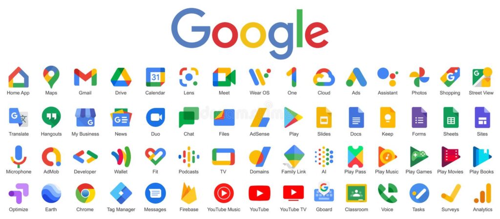
One example of this is Google. They use their iconic red, blue, yellow, and green color pattern on the logo design of their suite of products. So just by looking at the logo of Google Meet, Google Calendar, Google Drive, or Google Play, you’ll instantly recognize those products to be under the Google Brand.
And just like in UX design, consistency also breeds familiarity and trust with your audience. If they have a good experience with your brand, it’s more likely that they’ll purchase your product again. They’ll prefer your brand since they know they can rely on you for a great experience.
Principles and Psychology of brand consistency
Now, how about the second type of consistency? Believe it or not, branding also follows certain rules or standards just like in UX design. Brands follow marketing psychology and principles in order to meet their audience’s expectations as well.
Notice how the majority of fast-food chains have a red and yellow color scheme in their logos? Since red is known to incite hunger and is commonly associated with fast food, new food chains tend to use the same color scheme to fit with the industry standard.
Other examples are luxury brands such as Cartier, Chopard, and Balenciaga. Luxury brands tend to use wordmark logos, meaning they only spell out their brand name without using any symbols or icons. They also use either an elegant script font or a clean modern font. So if you want your brand to fit in with other luxury brands, you’ll want to use a simple and clean wordmark logo instead of a vibrantly colored mascot.
This is all done to meet your audience’s expectations and to instantly associate your brand with certain industries or products.
Responsive and Adaptive Design
Responsive design is when a web design interface adapts to the device’s size, in order to facilitate usability and navigation. Developers code the page to ensure that the site can automatically reformat and adjust its layout to fit different screen sizes and orientations.
Adaptive design, on the other hand, is when designers create different layouts for different screen sizes. This means, they have a layout specifically meant for size 320px, a different layout for size 1600px, and so on.
Responsive and adaptive designs are an important part of UX, as both provide a smooth and seamless experience when accessing your web design on different devices. Especially with the rise of mobile devices and mobile search, providing a great UX on mobile is now a priority in order to keep your users happy and engaged.
How to apply responsive and adaptive design when it comes to logo design?
With different platforms, advertising channels, and marketing mediums, logos are also not just “one-size-fits-all”. You’ll need to create different variations of your logo design to fit different platforms and different contexts.
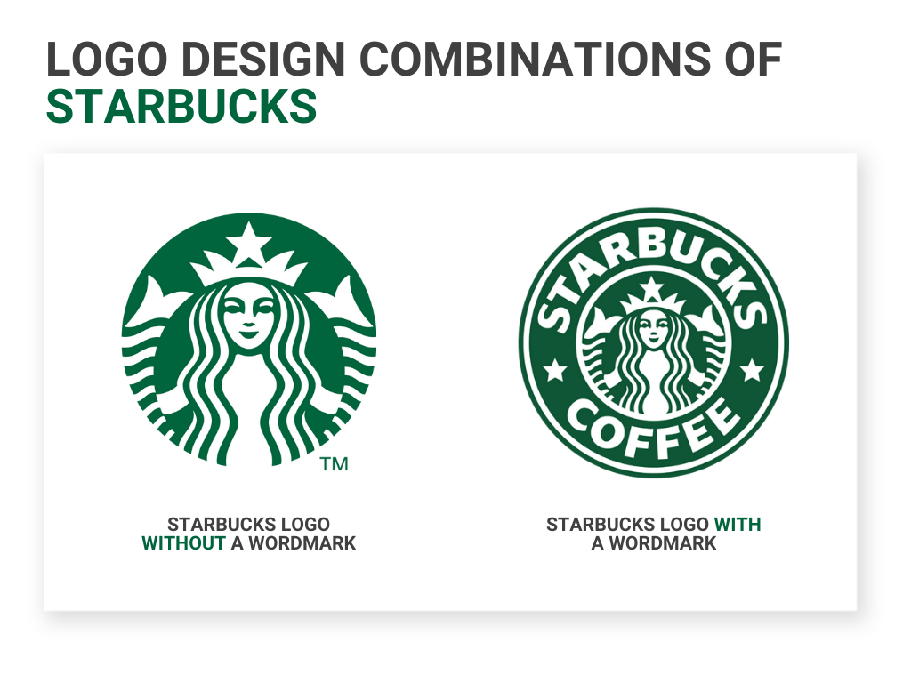
An example is the Starbucks logo. Their main logo consists of their iconic siren mascot. However, they also have a logo version that consists of a wordmark that spells out their brand name, and a combination logo that has both their mascot and wordmark.
This ensures that they have a logo that can fit different platforms, whether they need a logo for their mobile app, tumbler, stickers, card, website, email newsletter, poster, and many more.
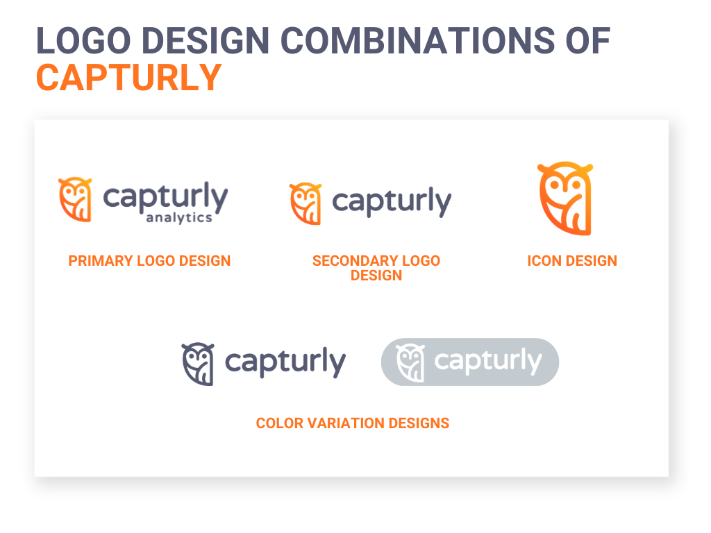
You should also apply this method to your logo design. Some logo variations that you’ll need are:
Primary logo design
This is the main logo that you’ll use primarily for your branding. This usually has all your design elements, whether it’s an icon, wordmark, tagline, date, etc.
Secondary logo design
This is the alternate and more compact version of your primary logo design. For example, if you have a horizontal primary logo, your secondary logo is a vertical version or a stacked version. This can also be a version with fewer design elements. This is to ensure that you’ll have a logo that can fit spaces your primary logo can’t fit in.
Icon design
It consists of just your icon and is best fit for smaller spaces. If you don’t have an icon in your primary logo design, you can just use your business name’s initials and that as your icon. This design can be used in your favicon, mobile app, social media profile photo, stamps, or product packaging.
Wordmark design
It consists of just your business name. This design can be used in larger spaces such as your labels, tarpaulins, signages, or storefronts.
Color variation design
Your logo should have a full-color, black, and white version. This ensures that no matter what background color you’ll place your logo in, your logo will still be visible.
Seasonal design
Some brands also adapt their logo to different seasons or events. It’s usually done by slightly modifying your primary logo to celebrate a particular event like Christmas or Halloween, without completely changing your whole brand image.
Versatility and adaptability are important elements of logo design, and having logo variations ensures that you have a logo that can fit different platforms. It also maintains brand consistency and reinforces your brand identity, even when your audience sees your brand in different contexts.
Visual Hierarchy
According to NN Group, “A clear visual hierarchy guides the eye to the most important elements on the page. It can be created through variations in color and contrast, scale, and grouping.”
This means that by manipulating design elements and characteristics, you can draw a user’s attention to an important part of your design.
For example, if you want to emphasize a particular text on your website, using a large bold font and vibrant color will draw the user’s eye to it. If you want a user to click a button, using a bright red color for the button and leaving the background white will create contrast and will make it easier for a user to see the button.
Visual hierarchy can be created through the following methods:
- Size and scale
- Color and contrast
- Typography
- Alignment
- Negative space
- Grouping or proximity
- Spacing and distance
- Texture
- Repetition
Visual hierarchy is important in UX design because it helps lessen confusion for your user. Navigation will also be easier and more intuitive since your visual cues will serve as the guide for your user.
How to apply visual hierarchy when it comes to logo design?
Your logo is your way of communicating your brand’s message with your audience. Since it’s visual and non-verbal, you’ll also need to rely on visual hierarchy and visual principles to say your message when it comes to your logo design.
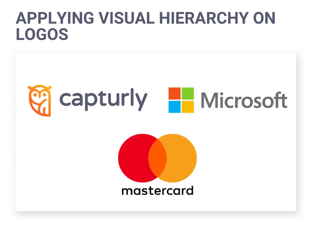
Creating a visual hierarchy by using colors
For example, if you want a specific part of your logo to stand out, you can keep some parts of it black and use a brighter color on the important part of your logo. If you’re using a combination of an icon and a wordmark, you can keep your wordmark colored black and use more vibrant colors on your icon to draw attention to it. These can be seen in the logos of Mastercard, Microsoft, and Capturly.
Color can also be used to signify a particular image for a brand. For example, brands oriented at kids such as ToysRUs have a more colorful color scheme for their logo, while eco-friendly products such as Garnier use the color green.
In terms of contrast, you can take a look at the logos of HP and Ray-Ban. They both use a vibrant color for their background (blue for HP, red for Ray-Ban) and a white color for the text inside. This creates a great contrast and makes it easier for their audience to spot their logo.
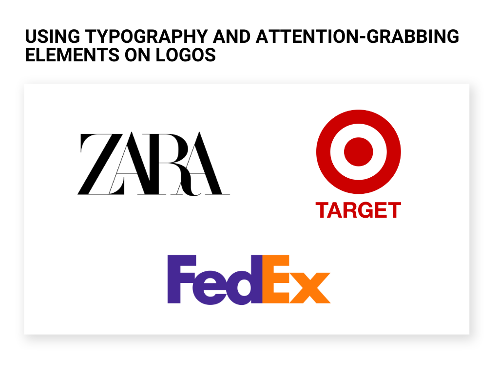
Creating visual hierarchy by using typography
For typography, the fashion brand Zara is a great example of it. They kept their logo monochromatic and relied on their classy, script lettering instead. The logo is also in all caps, with the letters slightly overlapping with each other to create a distinct font and look. Because of all of these typographic elements, their logo commands attention.
An example of alignment is Target’s logo. It’s composed of a bullseye icon, with their wordmark below it. The bullseye instantly draws attention as it is placed on the center, and has a great contrast with its red and white color scheme.
A great example of making use of negative space is FedEx’s logo. If you look at it closely, there is very little space between the letters, especially between the letters E and X. This negative space produces an arrow shape, which is associated with motion and progress, which are qualities that FedEx wants to be associated with.
All of these visual principles will lead to the creation of an aesthetically pleasing and visually memorable logo design. Aside from that, these visual elements can also help you clearly convey the message that you want to communicate to your audience.
Summary
UX design principles are guidelines that can help create a better experience and product for your user. While these are mainly used in web design, these principles can also serve as a foundation for creating better logo designs. Check out our 7 steps to create your own design! With more and more brands competing for their audience’s attention, making use of UX design principles can just be the boost that your brand needs to get an edge over its competitors.