In the past few years, UX has changed. A lot. Not only the techniques but also the user’s expectation. This has an effect on UI design as well. The constantly developing background technologies made animation finally viable. It’s not considered a curse sent upon users by some witches of Salem, something that holds back people.
In fact, it has become a real cornerstone of User Experience since if something moves, it appears to be more alive and responsive. But this is just the tip of the iceberg since animation has many other benefits.
As I mentioned, there were times when animations slowed down devices turning out to be a terrible idea for UX. Since those days are gone, now you have the opportunity to pimp up your site/app with fancy animations and effects.
Wrong.
UX isn’t about making a website or app that feels like a movie directed by Micheal Bay.
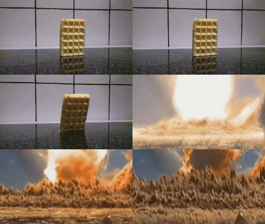
Always keep in mind that a coin has two sides and sometimes less is more! With these pieces of information, let’s get into the process itself.
Be responsive! – The ultimate UX tip
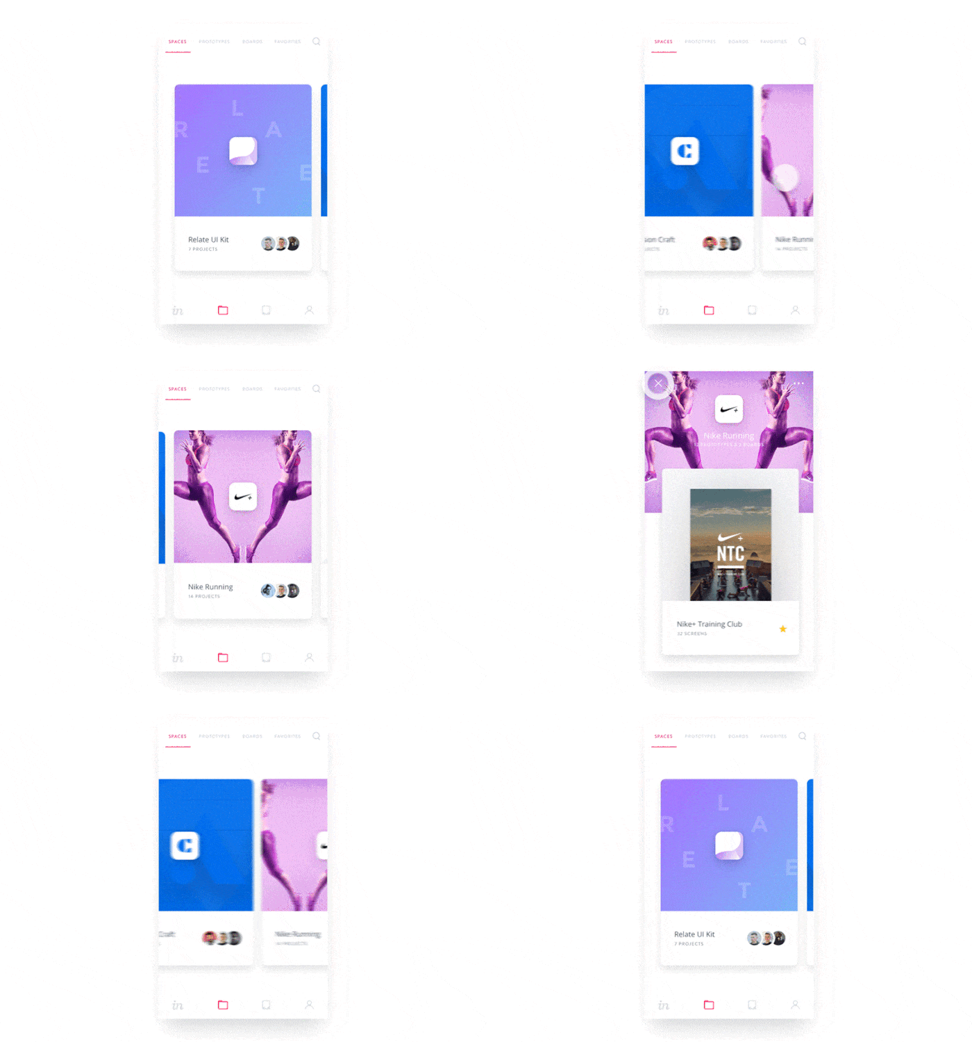
Google’s search app on iOS uses several animations to make the interface appear more responsive during the loading process.
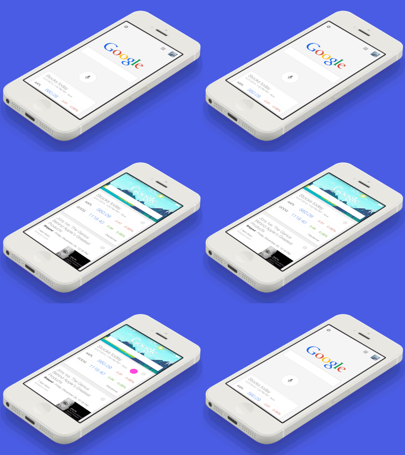
Due to the immediacy of these transitions, you get the sense that the app is reacting to your input despite the fact that nothing has actually loaded yet.
„It’s the interface’s responsibility to mediate an information exchange which makes it so important. The challenge for designers is to determine when their design gets in the way of this central UI tenet.” Sophie Paxton
You have to answer two simple questions:
1. When should you discuss the animations with your developer?
As a UX designer, you have to determine where your work connects to the development. I’m going to talk about the waterfall and the agile style. With agile, the designer has the opportunity to work on the project in parallel with the developers. To answer the question: simply as soon as possible; for example during and within an early sprint cycle, regardless of the type of sprint you are doing. If you wish to know more about agile, lean, and design sprints I suggest you read this article.
2. What is the purpose of the animation in my situation?
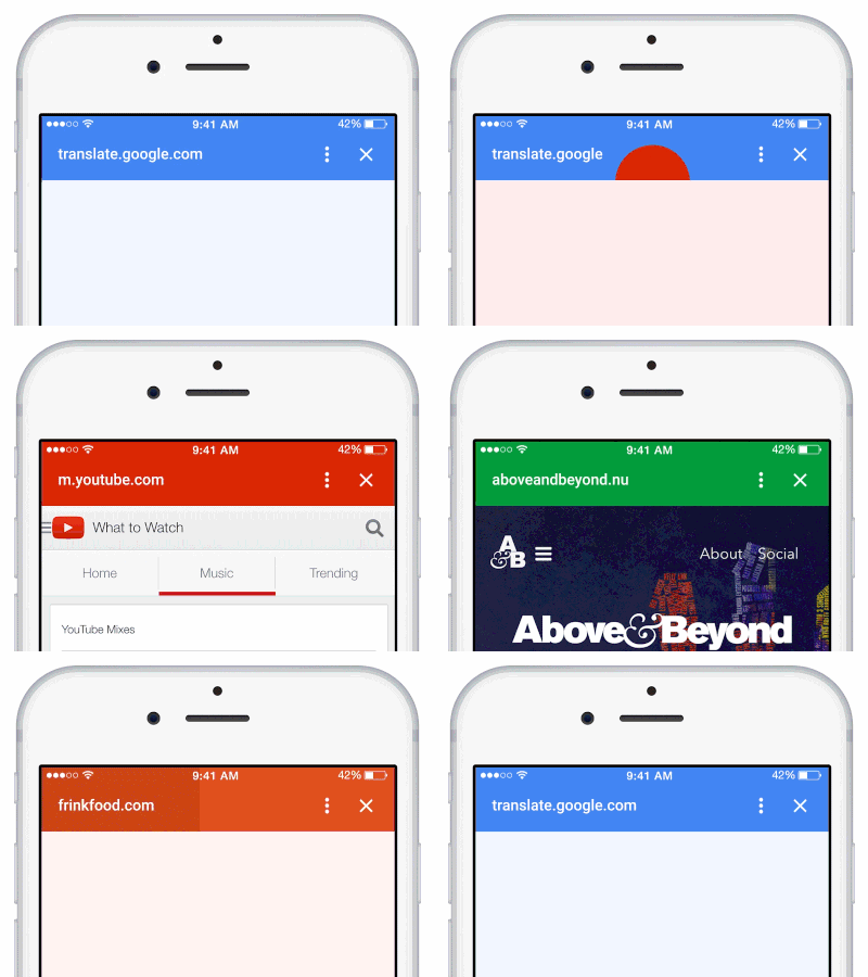
Sometimes users don’t wish to read your text-based how-to, no matter how easy to understand it. With just-in-time animations, you can provide help in the time of need. Use the interface elements to show where the user has the opportunity to take action with gestures and as they progress, reduce the intensity of these ’tutorials’. If you are willing to highlight something on your website by animating it, don’t forget that animations work as main headings on your website. They draw attention.
You can animate things for all kinds of reasons, for example:
- to create something attractive
- to look alive
- to increase responsiveness
- to unstuck the user from frustrating situations
- to slow down user interaction
- to build up a hierarchy
The list goes on.
Now that you have an idea of when and what you should animate, you can start thinking about how.
Like any other design process, it starts with a sketch. Now you don’t have to animate every single frame manually on paper. There are tons of ways of sketching; for instance, you can use a whiteboard or an app such as Sketchbook Pro and Photoshop.
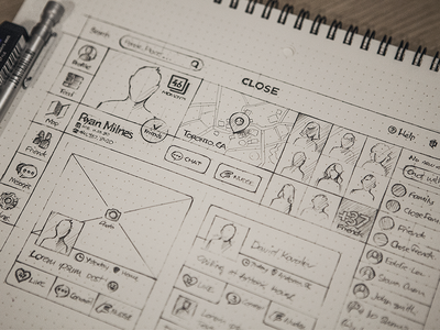
After you have all the requirements, you can start prototyping. Prototyping is a key element of UX and it gives you something to present. It reflects progress and motivates users to give feedback which is very important in reaching your goal as a designer.
An animation is awesome, but how can you start creating and prototyping actual animations?
There are plenty of applications for creating and testing applications; it only depends on you what tool you use.
Let’s go through a few apps that are available out there. Some are free and some need investment — it really depends on you.
UX tools for creating animations
Adobe Photoshop
Yes, Photoshop is a great tool if you want to get into animation. It doesn’t require that much skill to get started; in fact, once you’ve mastered the basics you’re pretty much good to go. In case you get stuck in one point, well, the good news is You can find tons of guides out there including YouTube videos, books, forums, etc. Moreover, there is a good chance that you’ll get an inspiration for your project during one of these learning processes.
For a detailed description of animating in Photoshop check out this guide.
Adobe Animate CC
This is a real treat for animators. You might be wondering: why not After Effects? While they are very look alike, Animate CC is a better choice for the web or graphic designers. The things you can do with it are simply fantastic. The limit is basically your imagination and expertise. Again, you have plenty of resources to learn from like this review from SoftwareHow.
CodePen
If you don’t fear the mystical world of coding, there’s good news for you. This app gives you high flexibility, with also a ton of resources that can give you plenty of ideas to choose from. Who knows you might find just what you need on a silver plate. With a bit of practice you can create neat little forms like this:
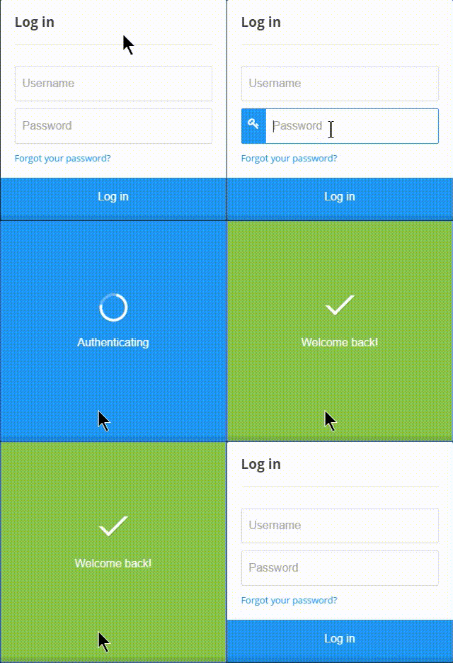
One thing is for sure,
„Some say buy a whole arsenal of equipment, while others say grab a piece of paper and pen. Tools are just tools. You are the designer, don’t forget that!”
Don't forget, sharing is caring! :)

1 Comment
Doodly
2021-07-12 at 13:15Really appreciate this post. It’s hard to sort the good from the bad sometimes, but I think you’ve nailed it!