The holiday season is here, and with it, the usual yearly increase of traffic on websites, especially on e-commerce sites. To make the most out of the holiday season, there are some things that you should do and some things that you shouldn’t do to increase your traffic. In this article, we will focus on the things that you SHOULDN’T do.
Some implementations in your design can hurt your business significantly. Have you ever encountered a good site with some great products of services, only to be put off by the bad UX design and complicated use? If you have, then this article will be familiar to you. We have taken some examples of bad UX design implementations so that you don’t follow them.

This is even more important during the holiday season. During this time, many people will be scrolling through online retail websites or other sites. These bad practices can hurt your business, as visitors will leave your site due to these practices. To help you avoid that, take a look at some examples of bad UX design so that you don’t make the same mistakes.
Table of Contents
Complicated Registration Forms
There is nothing more frustrating than having to register at a site before you make your purchase. That practice alone can be infuriating and time-consuming for many people and might turn off people. But to make things worse, the registration process takes ages before you can finally get on with your purchase due to the complicated registration forms.
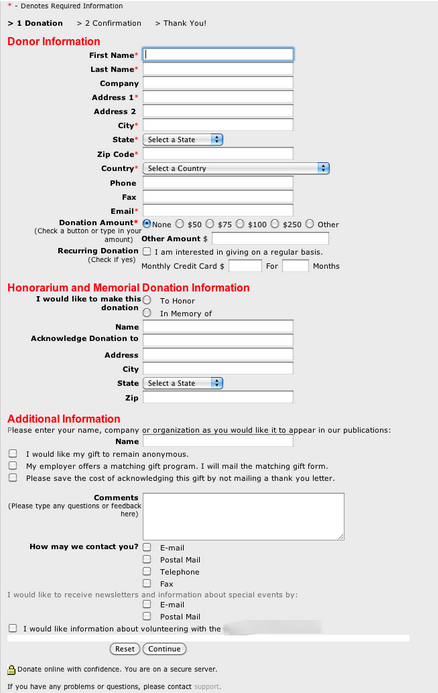
Let’s say you are looking to buy a small thing at an e-commerce site. For example, a pair of socks. You think that you will get the socks quickly, but you have to register prior to buying them. Ok, this will be a breeze. But then you see the long registration form and you start to get frustrated. I don’t want to get through this; surely, there are some other sites where you don’t have to go through this?

Long forms are a major turn off. We understand that you need some information about the buyer, but try to sprinkle these tasks over several smaller steps.
Maybe you want to spread out the registration form, or you just collect the vital information first like the e-mail and ask the user to enter the rest later.
To make matters worse, you can see that this form in the example has a reset button next to the continue button; this can be a dangerous method, as someone might click on the reset button instead of on continue. Imagine the rage that it can induce.
Overly Complex Password Requirements
This one goes hand in hand with the previous bad practice. When you register on a site, you are required to enter some sort of password. It has to be unique to prevent potential crime practices, but some companies go way too strong on the security aspect.
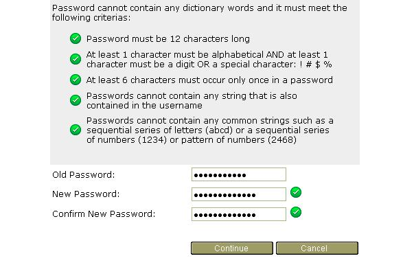
Nobody wants to do this; It can turn off your customers, and you might lose traffic due to this simple step. Thinking of long passwords and then remembering them can be hard, but the inconvenience of password requirements makes it even harder. An average person has to remember at least 10 passwords for various things, and then to have to fit it into certain requirements? Impossible.

Passwords can still be secure, even if they are not long or consisted of various numbers, signs, and uppercase or lowercase letters. Just ask users for a couple of requirements instead of a ton of rules that makes the process a chore.
Keeping it simple but still effective for security requirements is the way to go.
The time that is spent by the users setting their password could be spent browsing on your site.
The Norman Door Mistake
The Norman door is a concept that represents badly designed doors where you don’t know whether to push or pull. This can happen on your site – the Norman door effect – which means that some of the aspects of your site are unclear in their purpose and are not intuitive to the users.

This does not only apply to your site, but also to your products or services. Leaving the customers in the dark and clueless as to what to do, it can turn off the customers massively. If you are looking to implement a new feature to your site, make sure that it’s there for a purpose, and that it is clear what the purpose of the feature is.

Likewise, with your products – don’t leave your customers in the dark, provide them with some instructions and tips as to how to use your products, and your customers will be happier.
Having a clear and intuitive system means a lot, and contributes massively to the satisfactory user experience.
You can find out the possible bad features of your site using tools such as heatmaps, which show you which buttons are not used as much or are subject to frustration clicks. It might indicate that a change is needed.
Tutorial Overlays
This one is understandable but sometimes misused. You want to educate your users on how to use your site or app, and there is nothing wrong with that. The problem is with the execution and how it is done. Having to go through tutorial overlays before you can use a site or a product can be frustrating and very unnecessary.
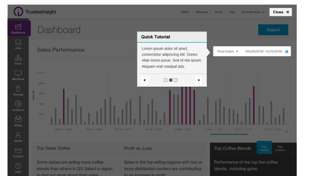
This is especially applicable to mobile apps but is quite often seen on websites and web apps, as well. Having these overlays can be a frustrating thing for users, as they will want to use your site or app as quickly as possible. It might not seem like a big thing, but it can frustrate users and create unnecessary tension.
A better thing to do would be to present your features at the very beginning and then have a subpage for tutorials or help on how to use your site instead of having these overlays. These are just not effective, as many users will just skip it and it will come to nothing in the end; it might be a waste of your time, but also a waste of visitors’ time.

Avoiding these overlays might be good practice and focus on bringing an intuitive system that will not require a lot of learning instead.
Bad Checkout System
One of the biggest issues an e-commerce site can have during the holiday season is a bad checkout system. Under this term, we have many issues that can occur. The worst would be a site, or a checkout system, with slow loading times. Other issues that a checkout system can have are the necessity to create an account, overly long checkout forms, and not displaying your fees at all times.

A complicated checkout system such as the one above is one of the worst things that users can face. Everything is messed up; you don’t know what to do with it. There is a ton of information all condensed on one page, and just generally a bad design practice for checkouts. Try to keep it as simple as possible for intuitive use.
Also, another issue can be the fact that your checkout is slow. Nobody wants to see their funds at risk of being lost due to a bad connection. The first step to improving your checkout system is improving its speed.
Be transparent with your fees and show them at all times.
This can go a long way for users having more respect for you, and it makes it easier for them to decide. Also, try to keep the form as short as possible, or split it into small pieces and show the progress of the checkout. Nobody wants to spend forever on the checkout page.
Another issue is that users sometimes have to sign up to the site prior to buying. Instead, allow them to checkout as guests and save them those precious minutes that they could be spending on your site.
Conclusion
So these are the worst UX examples that can happen during the holiday season. You can improve the UX by not following these flawed designs. But remember that improving your UX is an ongoing process; it involves a lot of research, time and testing.
A good way to build a good UX is knowing what practices are good; a better way is understanding and knowing bad practices and then avoiding them as much as possible. We can all learn from these bad designs and, hopefully, improve the UX at least slightly. During the holiday season, it is especially important that your site works in a satisfactory way for the users; these flaws can seriously hurt your business during the holidays.
Your UX should constantly be evolving and changing, and it is an ongoing process. Understanding the importance of these bad designs can be essential for helping you build the best UX possible for your users to enjoy.
3 Comments
Bhabna Ray
2021-10-25 at 17:00Ha ha. The title of the topic is really interesting. The admin has gone totally out of the box. The post is deserving an applaud. Yes, I also do not wish to face a complicated registration process and the password to mention three four times and that too according to the website’s choice format. The web design must be simple and responsive in order to win.
yash
2022-04-16 at 03:49knowledgeable content
Website Development Company Bangalore
2023-03-22 at 11:27I love this post. The thing I like in your posts is that everything is in a detailed and learning manner.