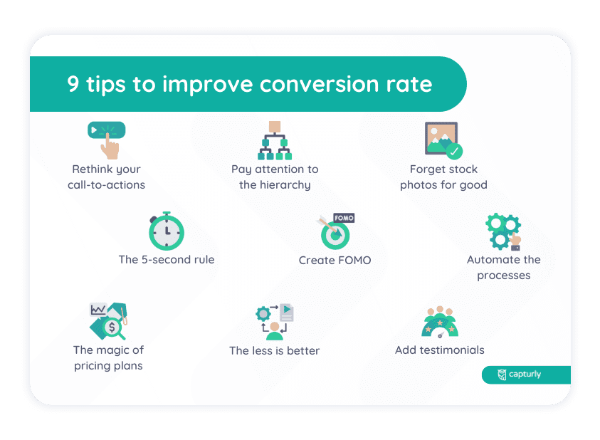
Lots of research has been conducted in favor of revealing the best practices of conversion rate optimization. Marketing psychology has proved underlying principles that can be applied on websites to boost conversion rates even from zero to hero!
#1 Rethink your call-to-actions!
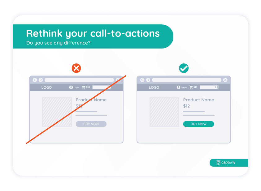
These are the buttons that instruct your customers to take action as fast as they can. If those can’t be seen or are hardly visible, you’ll lose a lot of opportunities. People do need to be told what to do to act. If there’s no clear instruction, there’s no completion, either.
Also, why not display CTAs more than once? The marketing rule of seven concludes that people need to see your ads 7 times to remember you for a long time! The same goes for CTAs! Robert Zajonc, an American psychologist of Polish origins, has shown that the more people are exposed to a certain effect, the more comfortable they feel towards that specific stimulus because of the mere-exposure effect. Just think about it! Would you buy a product from a marketer that you’re not familiar with at all? Probably not, so you have to build trust first by displaying your messages to your customers.
We don’t want you to push it, though. Don’t be scammy! Find the golden mean and display those colorful buttons within bounds and at different times! Furthermore, forget about boring CTAs and try something different that resonates with your offer.
Here’s an example: you provide online marketing consultancy to your clients and instead of using ‘See more’, you should go with ‘I want useful tips’. You have to put yourself in their shoes. They don’t want to read for eternity, they want useful marketing consultancy that solves their problems as soon as possible.
Also, add visual depth to your CTAs and make sure they change color when a visitor scrolls down your page. These tiny changes don’t seem to make an impact, yet together they can do a lot for you! Hedwig von Restorff, a German psychiatrist back in the 20th century, has proved that we tend to recall things that are unusual. In other words, it’s easier, for example, to remember a certain word with noticeably more vivid background colors, different font types, sizes, etc. You must’ve been studying for an exam in your life, so you need no further explanation.
And the last tip in connection with CTAs is that you should definitely place at least one, but preferably two of them above the fold! This way, your customers will immediately know what to do when visiting your site.
#2 Add testimonials!
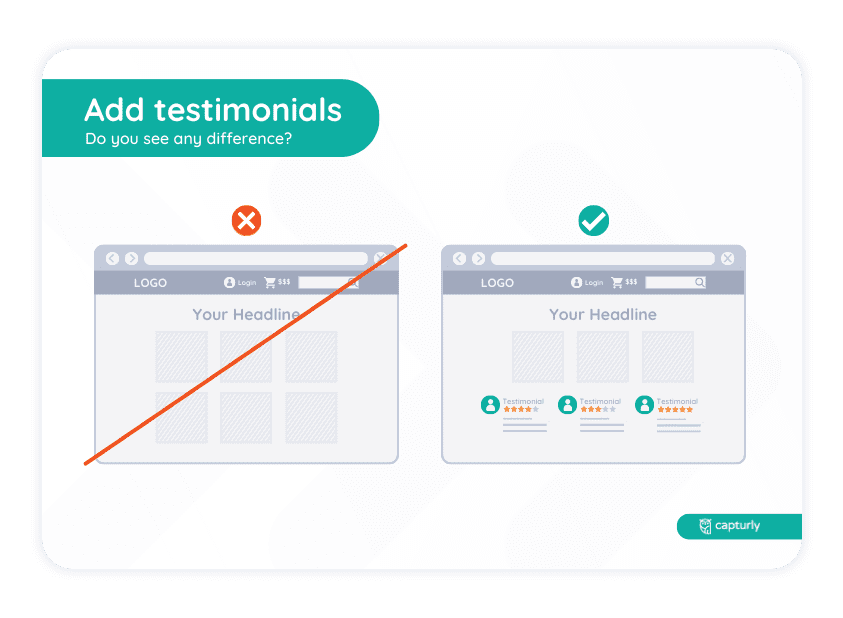
Did you know that over 80% of people would more likely buy a product after a friend of theirs recommends it? Why miss this chance? On top of that, if you spend as much time as possible on customer loyalty, your top consumers will do the marketing for you. So don’t be lazy to reward your most loyal customers. Considering that they can be your brand ambassadors in exchange for a little more attention!
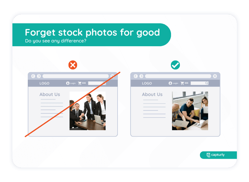
And when you add testimonials, keep it real! Forget about stock photos and fake names! When you want to display your most loyal customers on your site, pay attention to every little detail. If they agreed to this, show their faces and their full names to the public and describe their occupation. If they have social media accounts, those might be useful since visitors can track down if they’re real or not.
Adding real testimonials will improve the power of your social proof which is basically the concept of people acting faster when they see others have already experienced that given event. Just like one of the pedestrians making sure that no vehicle is nearby and therefore can cross the road, even when the traffic light is red. What usually happens next is that person is going to be followed by others.
So just keep in mind that social proof could be your cost-effective weapon to optimize conversion rates!
According to research, 93% of people said that reviews play a role in their shopping decisions. That being said, testimonials on a website have a real impact!
#3 The 5-second rule
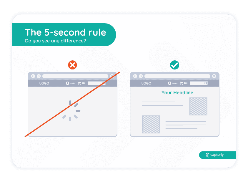
You’ll only have a few moments to grab your visitors’ attention. When your homepage loads, the customer will decide within 5 seconds if they read along or not. In the midst of competition, which is greater than ever, consumers can find another solution in a split-second. So you should be very cautious about what you’re going to display on your welcome page.
The very first sentence should exaggerate the audience’s problems, suggest what your service or product is about and why your solution would be the best one for them. And this is hard, we know that! What you’ll want to do is assemble every little detail of your solution in as few sentences as possible. Therefore, you need to focus on your unique selling point, which is your main competitive advantage and display it in a way that sells.
You could use positive adjectives regarding your product on your welcome page. Also magnifying these attributes would help your customers make a decision. Since studies have shown that before picking an option, we tend to evaluate the situation based only on a few pieces of memorable information. So highlight your power words as long as it doesn’t ruin your overall design. Furthermore, don’t forget that the main goal is to tell your customers how much value you can provide them!
#4 The less is better
This could have been together with the previous tip, yet we think it requires a different segment. Since not only do you have to grab the visitors’ attention, but you also have to convert it into curiosity as they scroll down your homepage.
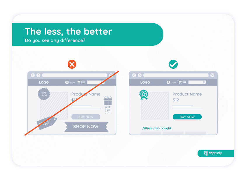
Nowadays, people receive loads of information within seconds. Therefore, they tend to scroll down a page and only read the very important elements.
This is where the KISS (Keep It Simple, Stupid) principle comes in. To effectively showcase your competitive advantages, use as few words and elements as possible and keep it simple. Emphasize the benefits of your product, rather than just its features, as this is what will ultimately sell it to customers.
While this may seem easy in theory, it can be challenging to execute. However, by putting yourself in your customer’s shoes and viewing your website from their perspective, you can make great progress.
Remember to highlight your most outstanding advantages in a meaningful way, using concise language. By doing so, you can maximize the impact of your web copy and let your product speak for itself.
Boost your website with our free conversion funnel optimization tool. Identify customer drop-off points to maximize revenue.
#5 Create FOMO!
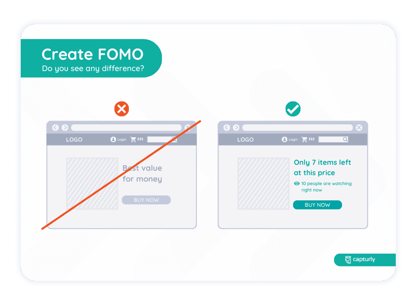
Morally questionable, yet every professional marketer uses this method. So don’t be afraid to appeal to people’s fear of loss. Everyone else is doing it!
Generally speaking, people tend to act faster when they feel that they’re urged. And the fact that they miss out on something because of their slowness is unacceptable to them. Researchers also certify this! According to StrategyTravel, 60% of young adults make purchases based on FOMO.
In 1984, Daniel Kahneman and Amos Tversky realized that negative feelings of losing something last longer than those positive emotions when receiving a certain thing because of the loss aversion effect.
Let’s look at an example! What if you wanted to book a hotel room and you were sort of forced to act fast because there was ‘only one’ left? You would feel twice as awful if you weren’t able to book it, wouldn’t you?
You could use many more methods. Such as limiting the availability of a program or a product, offering a discount for ‘early-birds’, using countdowns, displaying the best-selling items, etc.
#6 Use a different order for your navigation menu
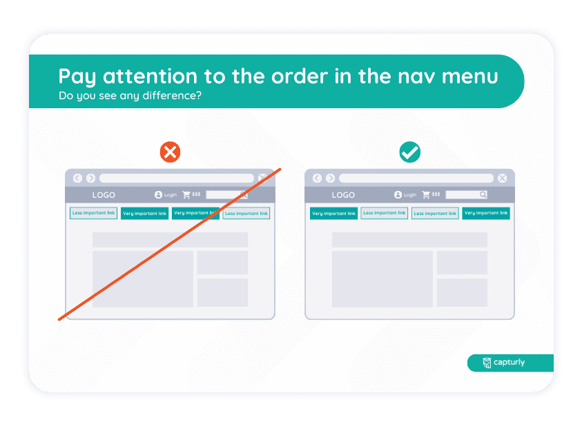
You should pay a lot of attention to the hierarchy on your website. Put the most relevant links at the beginning and at the end because people tend to focus on them due to a cognitive bias.
The Serial Position Effect, searched by Jacoby and Dallas in 1981, is the tendency of people to recall the first and the last few items in a row more easily than those in the middle.
This will make sure your consumers click on them. Since, according to marketing studies, people can recall the starting and finishing items the best. No matter if they read, listen or watch something.
Of course, it is not enough: links should be identifiable, and they should direct the visitor to an existing, relevant site. On top of that, you need to analyze it in terms of SEO aspects and make it accessible to all of your users.
#7 Forget stock photos for good!
When you want to display your product being used, show real people. This way, you can build trust and seem like a reliable person. And when people are shown how to use your product, consumers are more likely to purchase it. Because they visualize themselves with it!
Since you run an online business, using photos of real people is quite essential as there’s no way for the customers to try the actual product out beforehand.
Also, if you are able to do it, display dynamic photos or gifs. They are more attention-grabbing than their static pairs.
#8 The magic with pricing plans
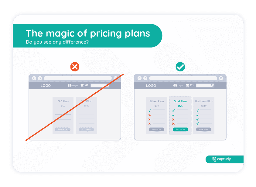
Don’t overflow the can of your very special offers. Otherwise, your customer’s glass will be filled with useless items. Moreover, if you had too many pricing plans, you would be unable to make decisions in the confusion of abundance.
This is called the Paradox of Choice. It was discovered by Barry Schwartz, who has shown that offering someone a lot of options can actually make the person feel depressed. The reason is that we get anxious when we make a bad decision and then see that with the other option we would’ve earned better results. So keep it simple!
You don’t want your customer to feel depressed because of picking the wrong plan, right? Remember that most of the time, less is more!
Try to differentiate the quality of those plans as much as you can, though! The premium one should be packed with the most items with a lot of extras. Thus, that one should be far more expensive than the previous ones. Most people won’t buy it, yet you don’t even have to sell it. Instead, focus on your mid-offer and try to convince people to purchase that one! You can make it easier to spot, as well!
Keep in mind that some plans are just there to assist! Of course, they will be purchased, but they are rather there to help your customers make the best decision. With price tags not growing proportionally with the value they provide, you’ll be able to raise best-selling items.
Above all these, don’t forget to offer free trials if possible! And if you’re able to split up the price of your plan, then give it a go! Doesn’t ‘10$/month’ sound better than ‘120$/year’?
Pro tip: picking a price with fewer syllables is easier to understand and sounds more familiar for the customers. Therefore, you crank up the chance of them buying your plan.
#9 Automate the nerve-wracking processes
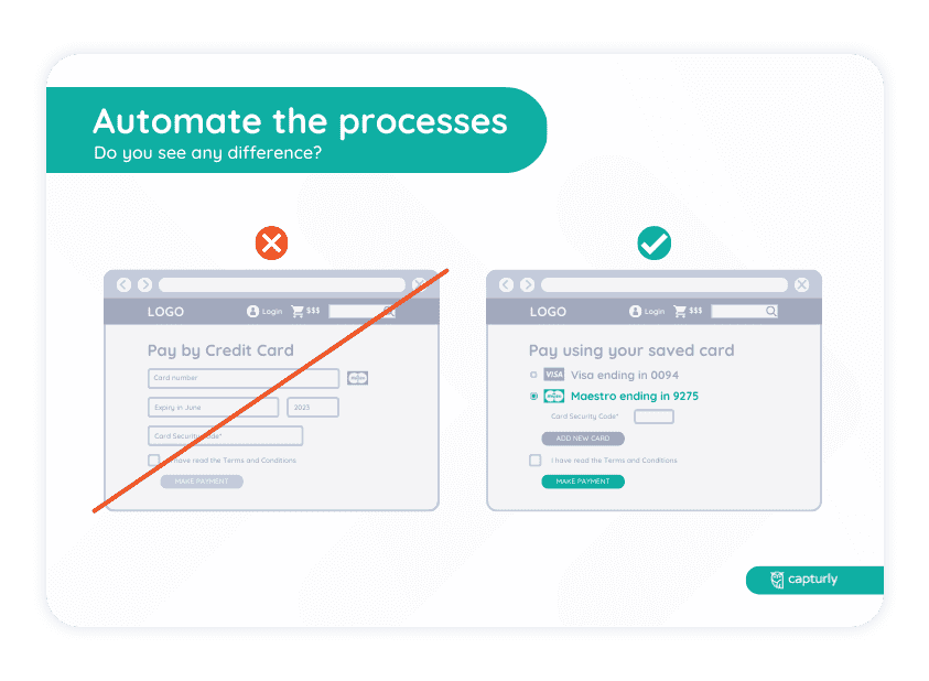
When people want to buy something, they want it now! So why don’t you help them automate this process? What you can do is save their payment data for later so that they can make a purchase faster. Also, help their signing in by offering the option to do that via social media accounts. In other words, try to improve the overall user experience as much as you can!
Amazon concluded in one of their studies that 88% of internet users are less likely to return to a website after a poor user experience. And we can’t blame them—it’s our task to ensure they enjoy their time during the buying process!
It seems hard to implement automation at first sight. It requires too many resources, and in the short run, you always lose. But ask yourself: would Google, Facebook, or Apple still exist, if they always focused on short-term decisions? No, not at all! They all had hard times, and they all invested in their future, rather than maximizing the revenue in the present. Follow this route, and believe: if you make cost, and rate of return projections, and the automation won’t lead you to bankruptcy, and the return rate is acceptable, do it!