Apps, websites that we use on a daily basis are not only about functionality anymore: they also should trigger emotions. Humans are curious beings; we like interactions and things that are responsive. This also applies to the Internet. People are looking for a way to connect emotionally. As UX is evolving, new methods appear. However, that doesn’t mean they are entirely new. In fact, it goes back to the core concept of User Experience.
Trust is one of the key factors when you wish to represent your product, service or yourself as a brand. It plays a significant role that determines how others will react to you in the first place.
Ever wondered how you or your brand can appear more user-friendly? More alive and human even if you communicate your messages, for example, via a webpage?
My goal with this article is to give a peek into the world of emotional design from a UX perspective. There are some tips you can use when it comes to designing:
So what is emotional design anyway?
Reading this expression, you might think of trending emojis, funny error messages, the little T-rex from Google and so on.

Although you’re partially right, these things are relatively recent innovations. However, it has been around for quite awhile now. Recently, new technologies have been evolving.
Donald D. Norman is the man behind the scenes. We can say that he’s the one who popularized the term in his book Emotional Design which apparently was his way of addressing the criticism of The Design of Everyday Things that was published in the late 80s. There he talked about “usable but ugly” products. In Emotional Design Norman writes:
“Usable but ugly. That’s a pretty harsh judgment. Alas, the critique is valid. Usable designs are not necessarily enjoyable to use. And, as my three-teapot story indicates, an attractive design is not necessarily the most efficient. But must these attributes be in conflict? Can beauty and brains, pleasure and usability, go hand in hand?” — Donald D. Norman

It turns out that attractive products are more attractive since they light up our fantasies. They are simply more interesting and interest is one step towards trust and tolerance. Yes, we tend to be more tolerant towards something that is designed to be catchy and functional at the same time. So when talking about emotional design, what you do is actually designing the context itself that triggers certain emotions. In other words, you are designing for emotions.
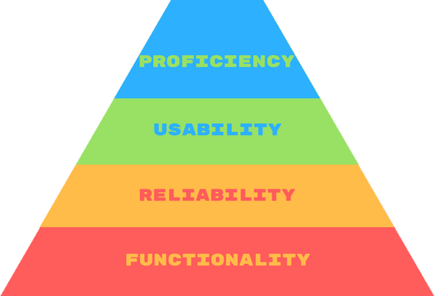
The Maslow’s Hierarchy of Design
“A chef in a restaurant wants his food to be more than edible, he wants it to be delicious. As designers, we should want our websites to be more than usable.” — Stephen Anderson
It is basically the pyramid of needs translated into product design and it works like a charm!
Functionality — the foundation of your project which starts with a great idea that has one single goal at this point: to work and serve certain needs. The old-school ToshibaT1100 could serve as a good example:
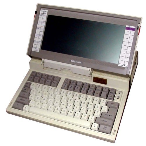 Not so pretty but hey, it works!
Reliability — now you are at the point where people want something they can trust; a product which not only functions under one condition but also offers multiple ways to rely on it. After dealing with skepticism and proving his words by selling almost 10.000 of the model T1100 in the first year, Mr. Atsutoshi Nishida told the audience in a marketing seminar that he has a vision. A vision of laptops having colored screens and the size of A4 papers. Then libretto 50 was born in 1997; the next year it was followed by 100CT, the smallest Windows 95 ever developed.
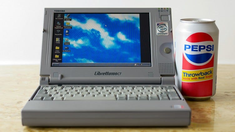

Usability — is often mixed with UX Design itself. In this context, it means that people want more and what you did so far is impressive but not enough. This is a good thing, it means you are on track and have the opportunity to make your project future-proof. Now you can think of form-factories, UI and so on. Going back to our example, the keyboard was the Achilles of the libretto. The users started to complain about how hard to type on it correctly. A year later a new solution was born, focusing mainly on usability. It was bigger than the libretto, but it also had the ideal keyboard, plus it was the thinnest at the time.

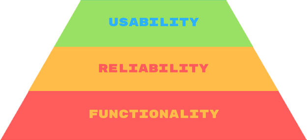
Proficiency — you’re half way through the pyramid. This is where it starts to get really interesting. Your product is not only functional but also usable and realiable. Proficiency is the way of converting a well-used product into more convenient, by asking yourself the following question:
“How else would the users approach my product?”
The evolution of mobile phones can be a great example to demonstrate this step. As laptops, mobile phones have their story starting with core functionality offered by the first portable Motorola phones.. Later, these phones not only got upgraded cellular networks but also shrank to pocket-size, becoming reliable in many situations. Then a design company and an engineering company came together to focus on usability and Sony Ericcson was born, bringing colors into the game. Then came the smartphones — I skip techonolgical part between then and now on purpose since the article would go off-topic — with big colorful touchscreens that offer a new convenient method: “gestures”.
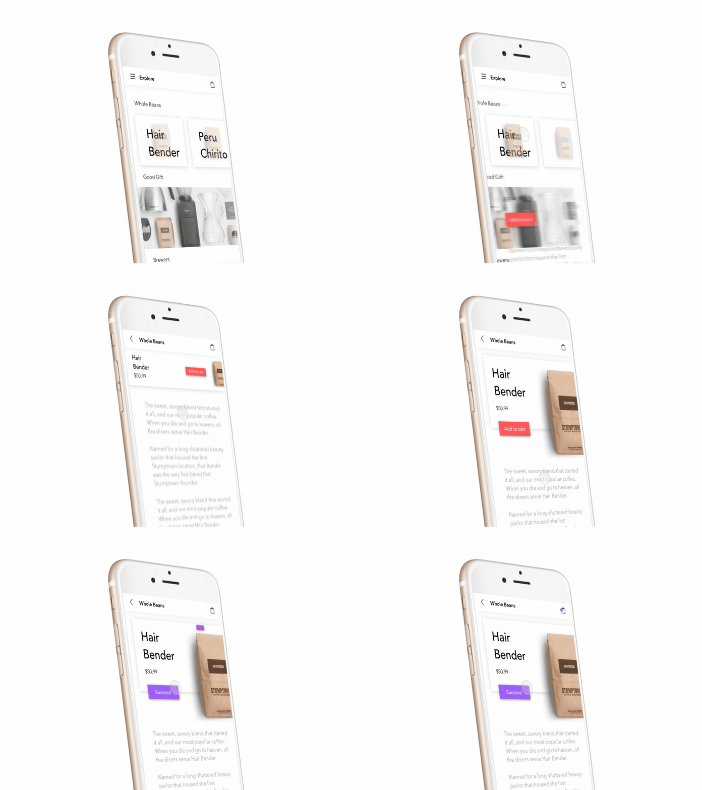
Creativity — stands on the top of the pyramid so this is the most enjoyable part of all. Your ultimate goal is to provide your users with a pleasurable experience. This part includes aesthetic beauty and innovative interactions where people fcan get closer to your product emotionally.
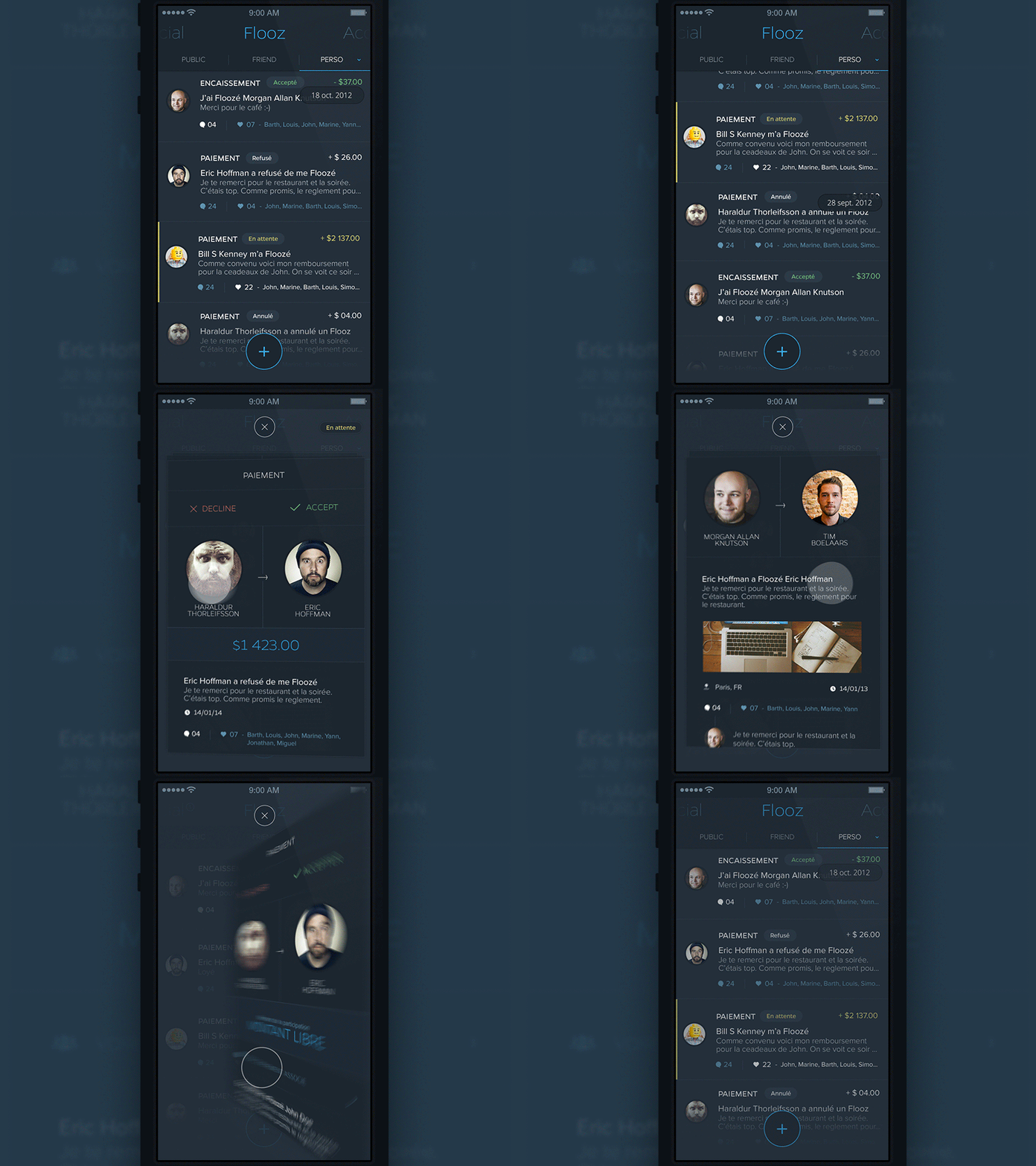
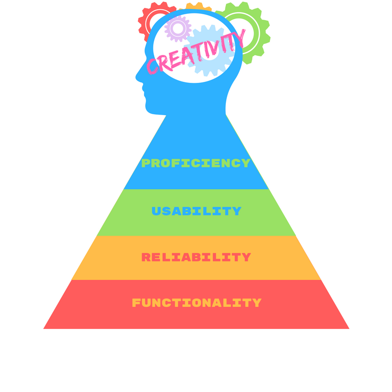
“This is where users say, damn I need this in my life, it looks so awesome!”
Designing for emotion
Key metrics that makes something emotionally valuable can be effort and success that walk hand in hand. Making things too easy will eventually lead to the loss of value and interest. Instead, when it comes to designing, make sure that you leave enough room for discovery. You don’t need to overuse tutorials, let them reveal your product and reward your users after completing a task or a series. Giving achievements and rewarding completion is a good practice that has been around for years
.
Emotions are a bit more complicated to determine. People tend to hide their feelings and even if they’re willing to talk about them, it does not mean they tell the truth. This is where UX meets technologies such as face recognition or eye tracking. These can deliver objectivity into the game, allowing UX professionals to collect valuable measurable insight on unconscious feelings. This leads to a new way of sculpturing the overall experience. To sum it up, combining usability with data gathered by using mixed technologies are the keys to emotional design.
Benefits of mixed technologies
How can UX Designers benefit from mixed technologies in practice? If we consider webpages as an example the different technologies can answer questions such as:
Eye tracking:
- Where do users look first or the most frequently (pricing, photos, CTAs)?
- Which element “locks” their attention for the longest time period?
- Do they scan the content by following the desired pattern? (F or Z)
EEG, facial response:
- How do their emotions change during browsing?
- Where does their excitement “top-out”?
Self-report methods:
This is a more direct way of carrying out a research since it involves the user in the process. For example, self-report methods such as the DRM method can reveal:
- What was the most meaningful experience?
- Why did the user look at certain elements?
- Why did the user feel a certain way when looking at particular elements?
- How did the user like or dislike a certain part of the webpage?
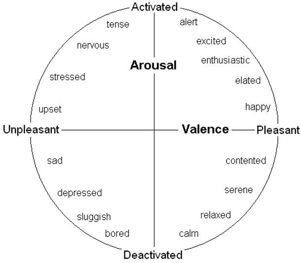
If we wish to describe certain feelings and connect them to different levels of engagements, it would look similar to the Arousal/valence model shown above.
Activated and Pleasant means the individual is:
- alert
- excited
- enthusiastic
- elated
- happy
Deactivated and Pleasant means that the individual is:
- contented
- serene
- relaxed
- calm
Deactivated and Unpleasant means that the individual is:
- bored
- sluggish
- depressed
- sad
Activated and Unpleasant means that the individual is:
- upset
- stressed
- nervous
- tense
Conclusion
With the rapid development of technologies such as face recognition, eye tracking, EEG or AI I think that we are getting a step closer each year to a new way of human-computer interaction. At the moment, we have apps that are functional, reliable and easy to use. Plus with the design trends behind us, they often look attractive. But still, they can’t determine whether you have a good or bad day, are you in a rush or not and often what we experience and decide to describe with words doesn’t correspond and represent the truth.
Let’s face it, we are human beings; we smile, we lie, we pray, we cry, we hope, we try.
Don't forget, sharing is caring! :)

3 Comments
Korona królów odcinek 6 online
2018-01-11 at 14:31Great article! We are linking to this particularly great post on our
website. Keep up the great writing.
Facts about Jharkhand
2019-06-26 at 14:49Amazing Article. I always believe UX design always showcases the emotional quotient of the designer. Great Read.
cs2 accounts
2024-01-09 at 01:55I appreciate you and hopping for some more informative posts