Christmas is close and shoppers go crazy, wandering from one shop to another. Those who plan to do the shopping from the couch do the same online. But what makes a good webshop good? What makes Airbnb so popular for private travel? How is it better than everyone else?
|An exceptional User Experience.
So there is no need to reinvent a wheel. What people need when browsing a website — or in this case webshop — is a pain-free and secure flow of user experience. Trust in online platforms is a key issue, especially if we expect people to reach for their wallets. A strong brand gives confidence, but what if it is not available? Let’s face it, not everyone is an Amazon.
The Good News – Online Shopping Habits
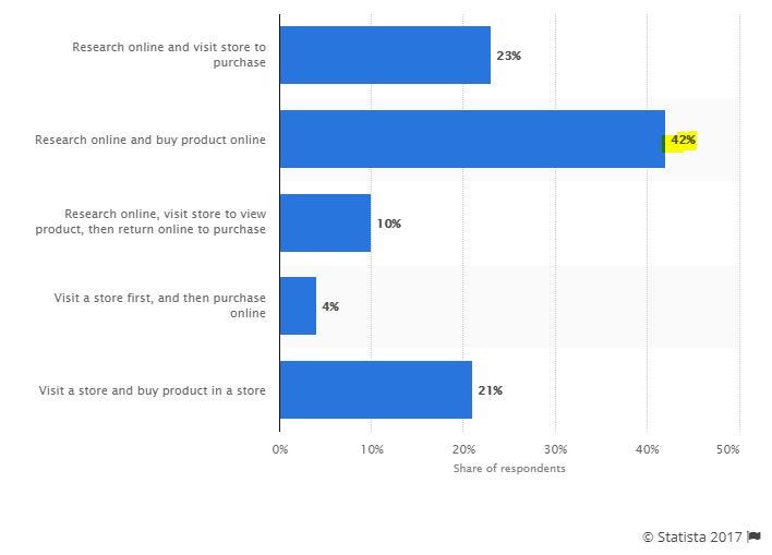
According to a recent survey by Statista, the majority of the shoppers — who purchase online-, get informed about the product and make the purchase without the need for a physical environment.
If you take it into consideration that roughly 4.2 billion people have access to the internet, there’s a lot of room for startups who want to run a webshop. Even if we narrow it down a bit to the United States or the European Union, we can see the huge potential. According to findings, about two-thirds of internet users in the EU shopped online in 2016. The number of digital shoppers can reach 230 million in 2021 in the US.
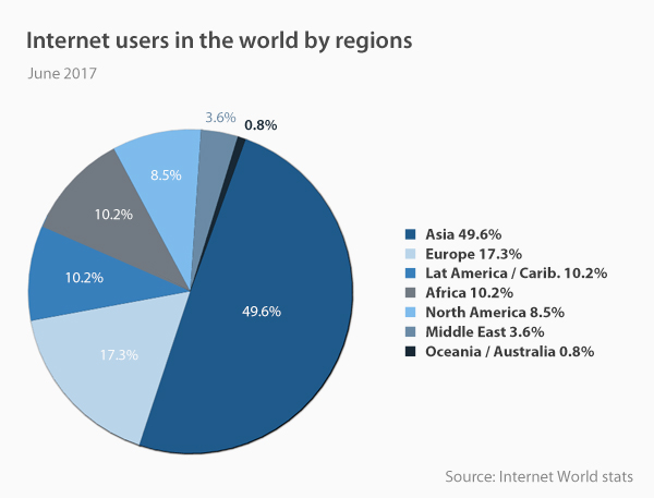
Source: VPNmentor.com
The Less Good News – How to Stand Out
Webshops have a big drawback compared to traditional brick-and-mortar shops. The main challenge is to have the product available immediately. In the offline store, you can just take it off the shelf, dump it in the basket and job done. In the offline version of commerce, every element of the interior has a role. The main goal is to convince the visitor to convert into a paying customer. Especially during the holidays, when you can feel the vibe.
|This is what webshops have to mimic.
There are tons of templates available to snap on your favorite webshop engine. Basically, anyone can pick these up and have a cool design for the holidays so there’s really no reason to skip this opportunity.

|So you have to stand out!
We all love discounts and a survey by Accenture verifies this fact. Apply huge banners and show them on your homepage to generate more sales. I would also like to emphasize the importance of great quality, professional images and product videos, along with eye-catching designs. An enormous ‘SALE’ banner can also be repulsive and show unprofessionalism without a talented graphic designer. High-quality images and videos can help to increase your sales as much as every other trick listed here. A great image will show the product clearly, focuses on all the features, it will also increase buyer trust. These are especially important when it comes to buying online, as there is a lack of touch, smell and people can observe the product extensively neither. Use web analytics tools, and make sure to optimize your website. If you have already done that, it won’t hurt you to double check. Click heatmap, scroll heatmaps or mouse tracking tools come in handy to see if everything is in its right place.
|People hunt for coupons.
Since coupons are a great way to save some extra money, most of the websites out there offer something extra. I don’t know about you but I always hunt for some extra percentages after I decide to spend a respected amount of money. It’s a smart idea to list your website on coupon collector sites. But wait there’s more! There are actual browser extensions for this sole purpose like Piggy for example. Piggy collects the best coupon available for the specific order and automatically applies it during the checkout process for the user.
It’s widely used and here are the reasons why:
- it’s 100% free
- supports over 2000 sites
- supports popular browsers Safari, Google Chrome, and Mozilla Firefox
- has an app version both for Android and iOs
Needless to say, that this provides a great amount of leverage when it comes to the payment stage of the customer decision-making process and also when it comes to recommending your site to others.
Need for Trust – The Role of User Experience
According to a survey by Komarketing: vendors need to establish trust and credibility with buyers as soon as they arrive at the website. Information needs to up-front, visible and easily accessed. It also needs to be current and explain what the vendor offers in jargon-free language. Almost 50% of respondents indicated they use the navigation menu. Contact information also plays a significant role. Imagine this like when you can’t find something or want to address an issue in your local store. What do you do? Look for a manager.
|What do you do if you can’t find help?
You get frustrated and tell your relatives/friends about the bad user experience you’ve gone through. This is the reason why you should optimize your website’s layout so that your visitors can click on the contact instead of bouncing off your site, or even worse: leaving the shopping cart packed with goodies. So pay attention to cart abandonment rates. In certain cases this abandonment is caused by design flaws, for example, there are too many outbound links on the site or the cart is way too complicated to use.
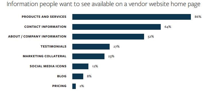
Source: Komarketing
Some reasons why your shopping cart abandonment rate is high:
- forcing visitors to register – let them fill the cart, let them make a purchase and make special offers – like coupons – to those who register. This makes the process feel rewarding rather than a waste of time
- too many questions – people hate forms. It doesn’t matter if it’s a registration form or not. Make the account creation process fast ask for the really necessary information and let them customize their profile later.
- additional fees – unexpected fees can be a real pain. If you plan to charge additional fees, then make this clear in the product description or at least in the early stage of the checkout process.
- not able to tell when – even if you can’t deliver the product within 1-2 business days like the giants, inform your customers about the estimated delivery time. Even if it takes multiple days/weeks let them know.
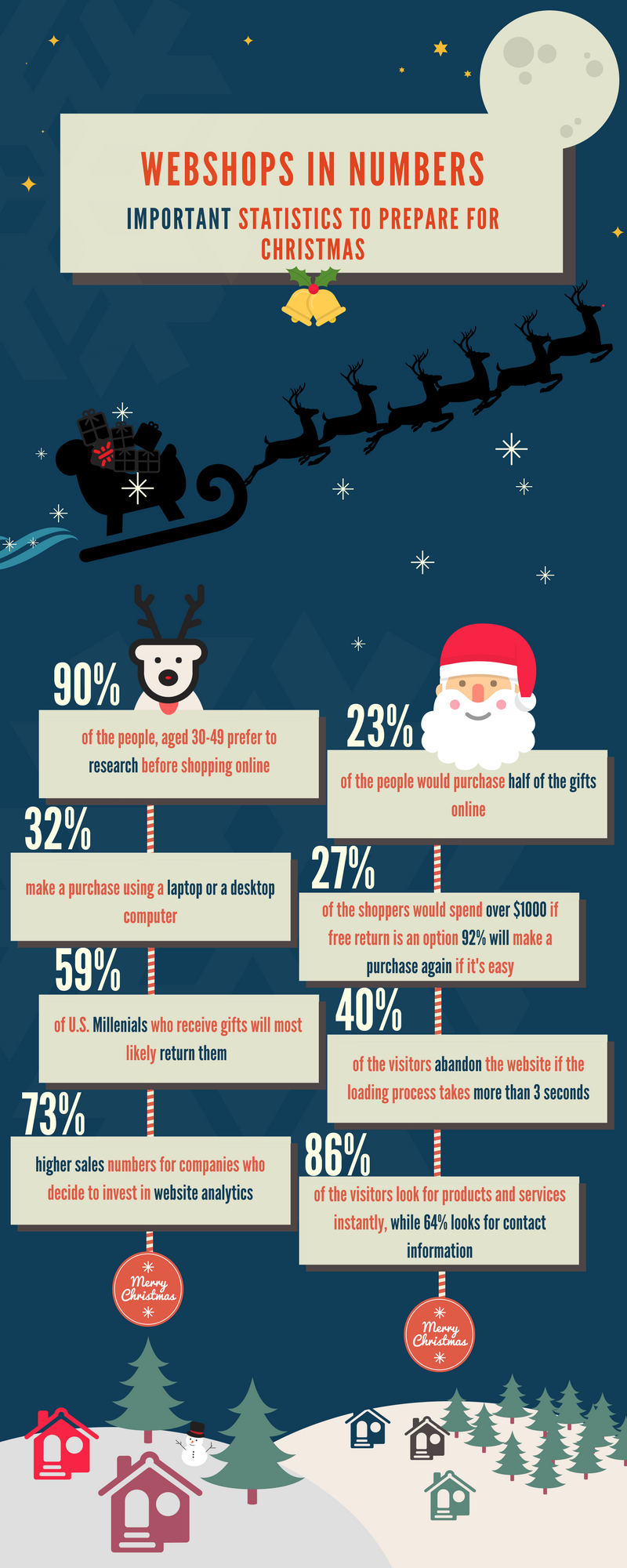
Here are a couple of numbers as a reminder of online shopping habits:
Don't forget, sharing is caring! :)

