It can be a real challenge to create a top-notch landing page. Not only that it needs to be eye-catching, but it also needs to be informative for your audience. If you already own a website, you should know by now how hard it can be to drive quality traffic to it and that’s only the tip of the iceberg.
So why should you even bother when you already have a killer web page, right?
A Landing page is often confused and referred to as the page in which a visitor is directed to through links. However, a landing page is a web page itself that serves as the entry point for your main website or a particular section of it. It needs to be specified and functional. The followings, for example, are extremely important:
- attract visitors.
- get contact information such as email
- convert visitors to customers
Their sole purpose is to make visitors click the call-to-action.
There are plenty of reasons to fire up a landing page right now:
- it gives you credibility — in the eyes of your visitors. This is because you can edit a landing page until it fits your visitors like a glove. In other words, you tend to solve a specific problem for them.
- improves SEO — a relevant landing page with quality organic content will skyrocket to the Moon and elevate you in search engines.
- increase your chances — regardless of the size and stage, a landing page is a great lead magnet. By building trust and – as mentioned above – credibility, it helps you to distinguish yourself from the competitors.
Sounds good right? But where should you start?
Before you jump right into the middle of templates, take your time and dive into the amazing world of UX.
UX stands for User Experience, and it comes from User-Centered Design (UCD) which is important because when you design something, you do it with a reason. It deals with how your visitors feel when they interact with your product, website or in this case, a landing page.
In other words:
“UX can make a difference between driving them crazy because of you OR for you.”
Tip #1. Emotional UX Design improves landing pages
Like it or not but we are driven by emotions – even if you consider yourself a real Marlboro cowboy. So when talking about emotional design, what you do is actually designing the context itself that triggers certain emotions. Emotions will connect you with your audience more effectively. Understanding their motives will help you discover what and how they want certain problems to be solved.
Ways to apply emotion:
- Text — that shows you care! Highlight their problems so they can see that you understand them. Don’t just write down stuff, engage in conversations. Don’t be afraid to use humor, or sadness if appropriate.
- Stories — show experience. Sometimes a simple “Been there, done that” draws more attention than “dry” facts. Just be legit and enthusiastic about it.
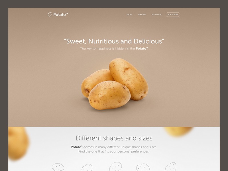
- Use powerful images— those trigger emotions and correspond with your product or service. Don’t just simply tell them how great you are when it comes to solving their problems, show them! Although stock photos can be “comfortable” solutions, you should look for real life scenarios with real people involved instead. Doing so will build social proof.
- Videos — can connect people like a thousand pictures. You can still get fast page load times even if you inject videos, so…

- People love gifts — they make them feel special, or that they are in just in time for something. Giving will make you look generous, just be honest about it. No hidden charges or conditions. If you give, you give because you mean it and by doing so you’ll be building trust in no time.
Emotional design in work:
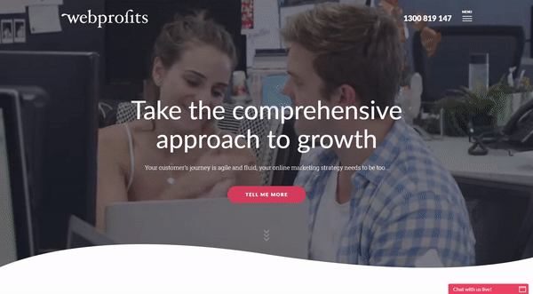
Source: webprofits.com.au
Source: 99designs.com
Tip #2. The psychology of colors
Choose colors wisely — I’m sure you’ve heard some urban legends about brands applying the color psychology to brainwash the audience. This might sound little off charts but the fact is, colors play a huge role. In a research, Hubspot tested the following hypothesis:
“So, which color would encourage more people to click? Would it be green, which connotes “Go,” or red, which connotes “Stop”? Would those connotations actually affect whether or not people clicked?”
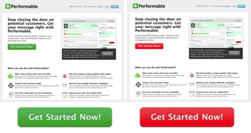
Source: Hubspot.com
After a few days and 2000 visitors later, they got an unexpected result.
“The red button outperformed the green button by 21%.”
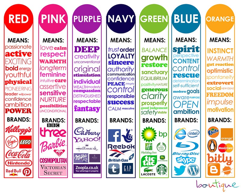
In a study by Joe Hallock, 232 participants from 22 countries were asked about their preferences regarding colors. It turns out that 57% of the males preferred blue as their favorite, while none of them voted for purple. However, 23% females tend to like purple, but blue — by 35% — still remains favorite in both genders.
So what’s up with purple?
Purple is sometimes connected with fear, but it also represents peace. Beauty and imagination are also often associated with it.
Tip #3. Contrast and accessibility
When it comes to contrast, people usually refer to the term as complementary colors. This is not the full meaning. Contrast is also about value.
Using low-value contrast can be a challenge to read for people with color vision impairments. The image below shows how they see red/green color, which is a very common and problematic combination for them.

Source: usertesting.com
Around 8% of the male population suffers from some form of color blindness. If you’re using colors with low-value contrast, be aware that users who have color blindness might not be able to figure out the words or the images. A dark red on a light background like shown on the image below solves this problem so you won’t lose conversions.

Source: usertesting.com
Users were much more likely to click on a CTA button that strongly contrasted with the background.
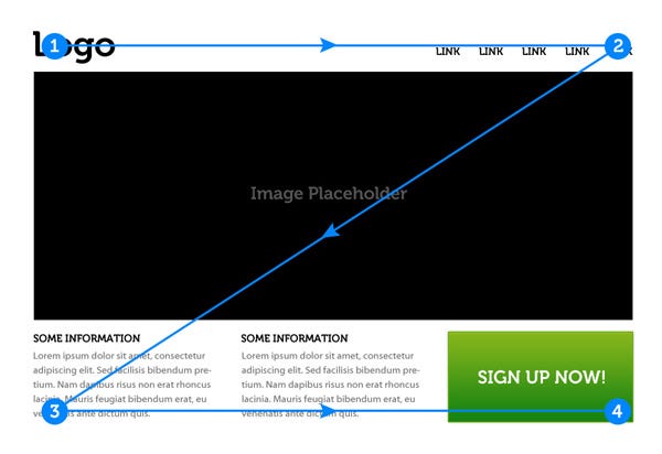
Tip #4. Visual Hierarchy
When a landing page is designed, different elements have different purposes and priorities. The closer the design gets to the expectations of the visitors, the better. The visual hierarchy has influence on where visitors look first. You might have heard about eye tracking studies. It’s been around since the 1980s and it proved its significance.
The two main patterns when designing the path of reading website content also applies on landing pages.
Following the F shaped pattern, users first start to read in a horizontal movement across the upper section of the page. This is followed by a second horizontal movement but it covers a shorter area. The last phase is when the visitors read vertically on the left side, moving down. It’s worth noting that there can be more horizontal movements involved in the reading process.
Source: 99designs.com
Another desired pattern is the so called Z shaped pattern. According to Jerry Cao, when users consume less text-heavy, but visually “richer” content, they usually follow a Z shaped pattern. Using scroll heatmap tools or click heatmaps can make it easy to decide what goes where.
Source: webdesign.tutsplus.com
Tip #5. White space
The space around images, the margins, paddings, the space between lines. White space or “negative space” is wasted space.
WRONG
White space is more than just plain emptiness. Think of it as a “less is more” rule that helps to avoid distractions.
Some benefits of using white space:
- improves readability and prioritizes content, UI elements
- essential for keeping up a clean, elegant look
- guides the user
White space is an essential element in web design and “is to be regarded as an active element, not a passive background,” – Jan Tschichold
Tip #6. Optimize your Forms
Optimizing your forms is one of the most important things to do when it comes to website optimization/landing page optimization. Imagine the forms as onions. They have layers, of which two are appearance and conversation. But the third, which is called relationship, plays a significant role in the game. If you need forms for your landing page, remember this simple fact:
People hate forms.
Especially registration forms. They won’t like it no matter what, but you can make them less hated by building trust. Your best shot is not wasting the time of your visitors. When they find it too time-consuming to answer your question, you’ll get bad quality information or simply false ones.
Avoid forms:
- with multiple-choice questions that don’t have the desired answer
- that ask for too much or too sensitive information
- that are too confusing and have to be filled out manually
The three main elements your forms should contain are:
- input fields — where the user enters the information
- labels — describe what type of information is required
- actions — these allow the users to send in the filled forms
The good news is that you can do a lot in order to optimize your forms and make them less annoying.
You must declare the purpose of the form. Why they should fill it, what BENEFITS will they get by doing so and most importantly, how will the provided information be used by you?
Tip #7. Stay simple and transparent
A landing page has to provide what it promises. The sole purpose of the landing page is to grab the attention after the visitors clicked on your ad, and convert them. Not more and not less.
Pick a purpose for your landing page and stick to it!
Decide what you want to achieve:
- registration on your website
- newsletter sign-up
- subscription to a service or purchase
The list goes on, but no matter what, pick one and stick to it. The worst you can do, for example, is to advertise a promotion, and when the customers land on the page, they’ll be swarmed by CTA (Call to Action) buttons of all kinds.
Speaking of CTAs and links, make them outstanding. The buttons — just like the whole page itself — should be able to tell what they are designed for.
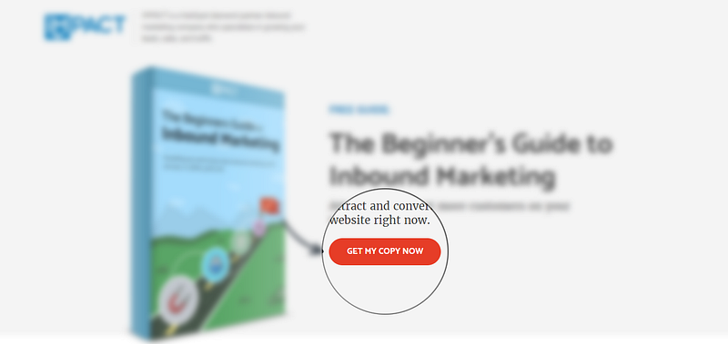
Source: impact.com
In a nutshell, a good CTA should always stand out and explain itself without unnecessary guesswork!
Conclusion:
Sometimes the definition of a landing page is misunderstood. It’s often mixed with certain portions/pages of a website at where visitors arrive; however, that’s not the case. A dedicated landing page can improve rankings in search engines, generate valuable leads or improve credibility overall. It can be easy to create one with very little investment. However, if you want to convert visitors into active customers you can do wonders by following a few easy tips.
8 Comments
earn money online the easiest way
2017-10-01 at 07:09Your style is unique in comparison to other people I’ve read
stuff from. Many thanks for posting when you have the opportunity, Guess I’ll just bookmark this blog.
Sophie
2017-11-02 at 10:53Thanks for your feedback! 🙂 Have a great day!
kredyt przez internet
2017-10-20 at 19:06I blog frequently and I really appreciate your content. Your article
has truly peaked my interest. I’m going to bookmark your blog and keep checking
for new information about once per week. I subscribed to
your RSS feed as well.
Sophie
2017-11-02 at 10:51Hey! Thanks for doing so 🙂
Digital Marketing
2019-05-20 at 08:03Landing pages are a key component of online marketing campaigns. Since landing pages are focused on conversions, improving their performance can lead to significant improvements in business results. Landing page optimization can help you lower your customer acquisitions costs, acquire more customers, and maximize the value of your ad spend. I am obliged for sharing those suggestions for landing page optimizations. It will encourage entrepreneurs to work more effectively on digital marketing and gain potential results from it.
Robert
2019-06-07 at 13:59Thanks for sharing your thoughts.
Stephan de Vries
2019-12-11 at 14:47So when should you start testing these tips? I’m guessing checking the difference between a green and red button is only useful when you have a large enough amount of visitors to get statistical significance. At what point would this be the case?
Andrew Glover
2021-08-31 at 16:12It was Really Killer Article. Thanks for Sharing